January 4th, 2019
2018 has seen a whole host of rebrands, from Burberry and John Lewis to Uber and BBC2. Some were widely celebrated, some a welcome change and some extremely controversial, but why do brands even rebrand? Some of the main reasons are that the direction of the business has changed, the brand is attracting the wrong clientele, the branding and design are outdated or the old brand doesn’t meet the needs of the audience. Although each of these are all valid and important reasons for rebranding, we think that the most successful rebrands are those that are done to re-establish the purpose of the brand – to retell or highlight the reason it exists.
It’s quite common for brands to get lost, deviate, take new paths and therefore lose sight of what they set out to do. Some change their purpose, vision or mission altogether, but a rebrand can be a fresh start, a chance to align the entire business behind a shared purpose – and then share that with audiences to engage or re-engage them.
Here we have looked back on some of our favourite rebrands of 2018 that have perhaps gone back to their premise and purpose. Whether through a name change, look-and-feel, a strapline or all of the above, they have focused on ‘purpose’ and created reflections of this in their brand.
John Lewis
….or should we say John Lewis and Partners. In one of the biggest and some would say controversial rebrands of the year, under the John Lewis Partnership, the once simple and simplistic John Lewis and Waitrose became John Lewis & Partners and Waitrose & Partners.
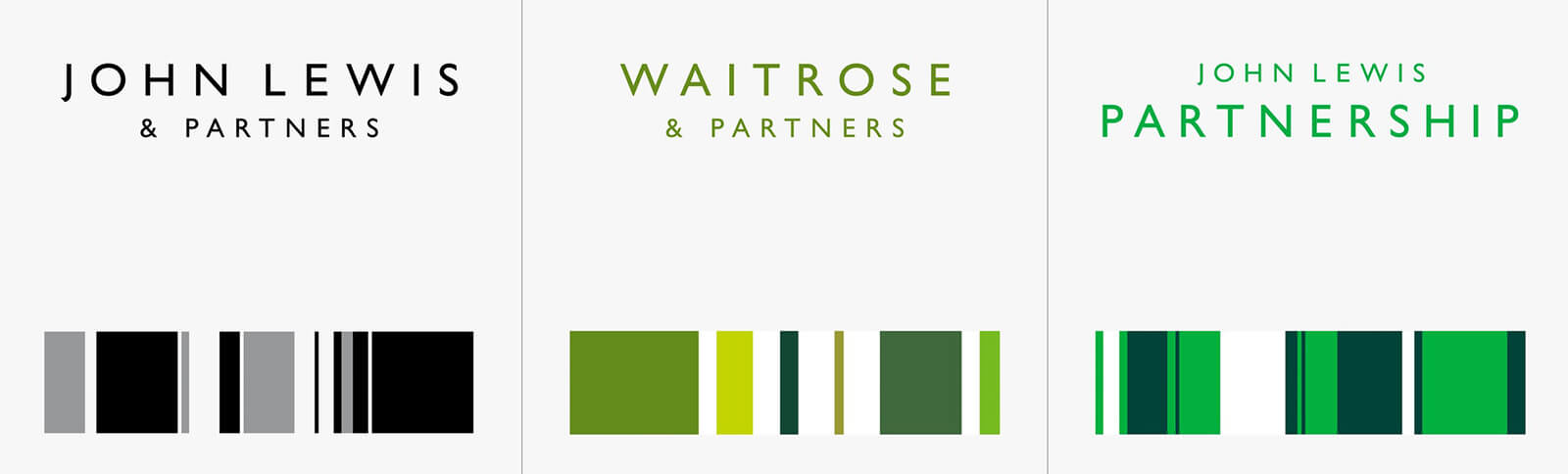
With consumers often making no link between the two brands, in a bid to unify them, the most obvious change and main feature in the rebrand is the addition of ‘& Partners’ into the brand names. As well as linking the brands and explicitly aligning them in the minds of target consumers, this change emphasises the organisation’s employee-owned business structure, a structure that has been in place since it started – which means that all employees have a stake in the company, making them a partner.
Harry Pearce, the man at Pentagram behind the rebrand explains this, “First and foremost, we wanted to bring the unique philosophy of all three brands to the foreground. Bringing ‘& Partners’ in shows the world the truth behind the brand, and emphasises that no matter what someone’s job is, they are a partner. We felt this was a really positive thing to celebrate, and should be written above the door of the business.”
![]()
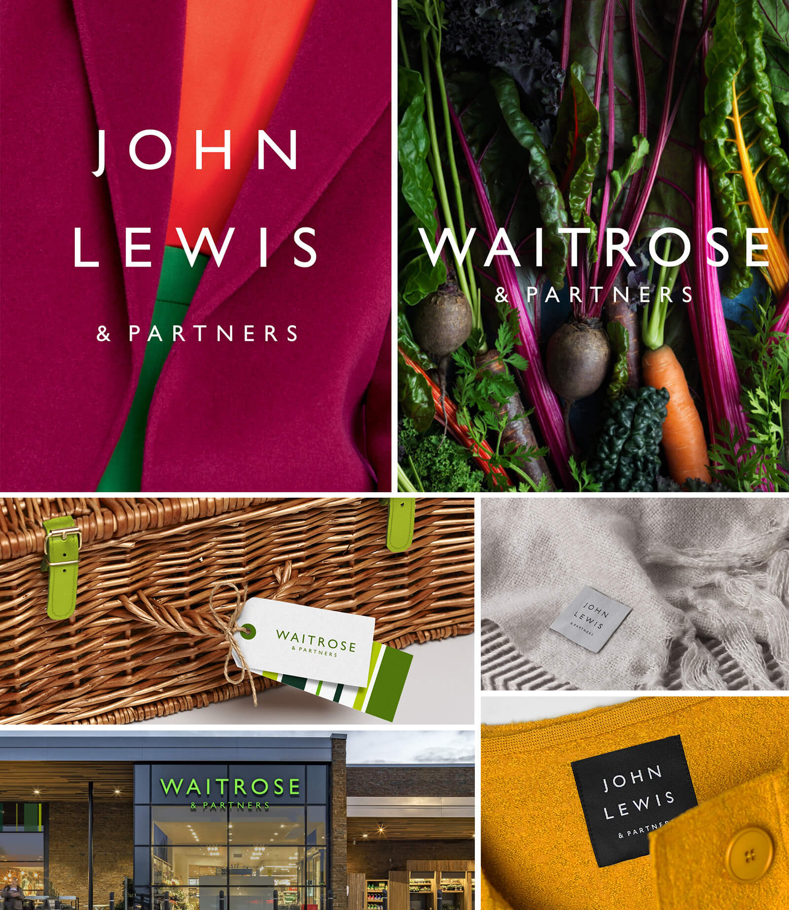
Alongside the name change is a new visual identity, which features the use of sans-serif typeface Gills Sans and a line-based graphic device, which is inspired by the company’s haberdashery history and its 1960 diamond-shaped pattern logo.
With John Lewis being such an iconic British brand this rebrand has been an interesting move as it has been the first major change for both John Lewis, Waitrose and the partnership in 18 years and it has proved controversial, with people often not liking change from the familiar. However we think this move is a good one. It has seen the partnership make a move towards its heritage and it has brought to the forefront one of its key attributes that makes the brand what it is – employees being partners of the business, which they have been since the partnership began in 1928.
It’s important for brands to stay true to what makes them who they are as this is what differentiates one brand from another in what is such a competitive, and for the high street, struggling landscape. If you lose who you are as a brand and what is important to you, you will lose your presence, authority and consumers, as consumers will feel little confidence in a brand that feels lost. In what has been a tough few years for John Lewis, this move, back to its core, will hopefully bring it back and restore itself to being Britain’s most loved brand.
“In an age where consumers increasingly expect brands to be principled and good, the partnership’s commitment to John Lewis’ original model is an authentic differentiator that it can be proud of. The new identity celebrates this by enshrining the partners into the forefront of the John Lewis and Waitrose brands.” – Pentagram
Canal & River Trust
If you’re not familiar with the Canal & River trust then you should be – roughly half the population of England and Wales lives within five miles of a canal. They are a charitable organisation that maintains and regenerates waterways across England and Wales, ensuring they are used and enjoyed and this year they had a rebrand.
When given the rebrand, Studio Blackburn, the agency behind it, were tasked with revitalising the brand and creating a memorable look that will maximise awareness and support for the Trust and represent the brand’s vision of living waterways transforming places and enriching lives.
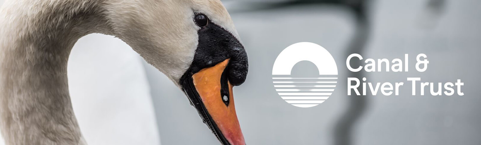
In one of the more controversial elements of the rebrand, the new logo, named ‘The Reflection Symbol’, sees an abstract interpretation of a bridge reflected onto the rippling water of a canal. As well as being more relevant in representing the charity’s work, the new logo aims to represent the idea of ‘transition’ – moving from ‘the old to the new’, whilst still retaining the bridge element of the previous logo. This makes the logo much more relevant to the actual work and purpose of the charity, with the focus being on the canal as opposed to the previous logo which very much focused on the swan.
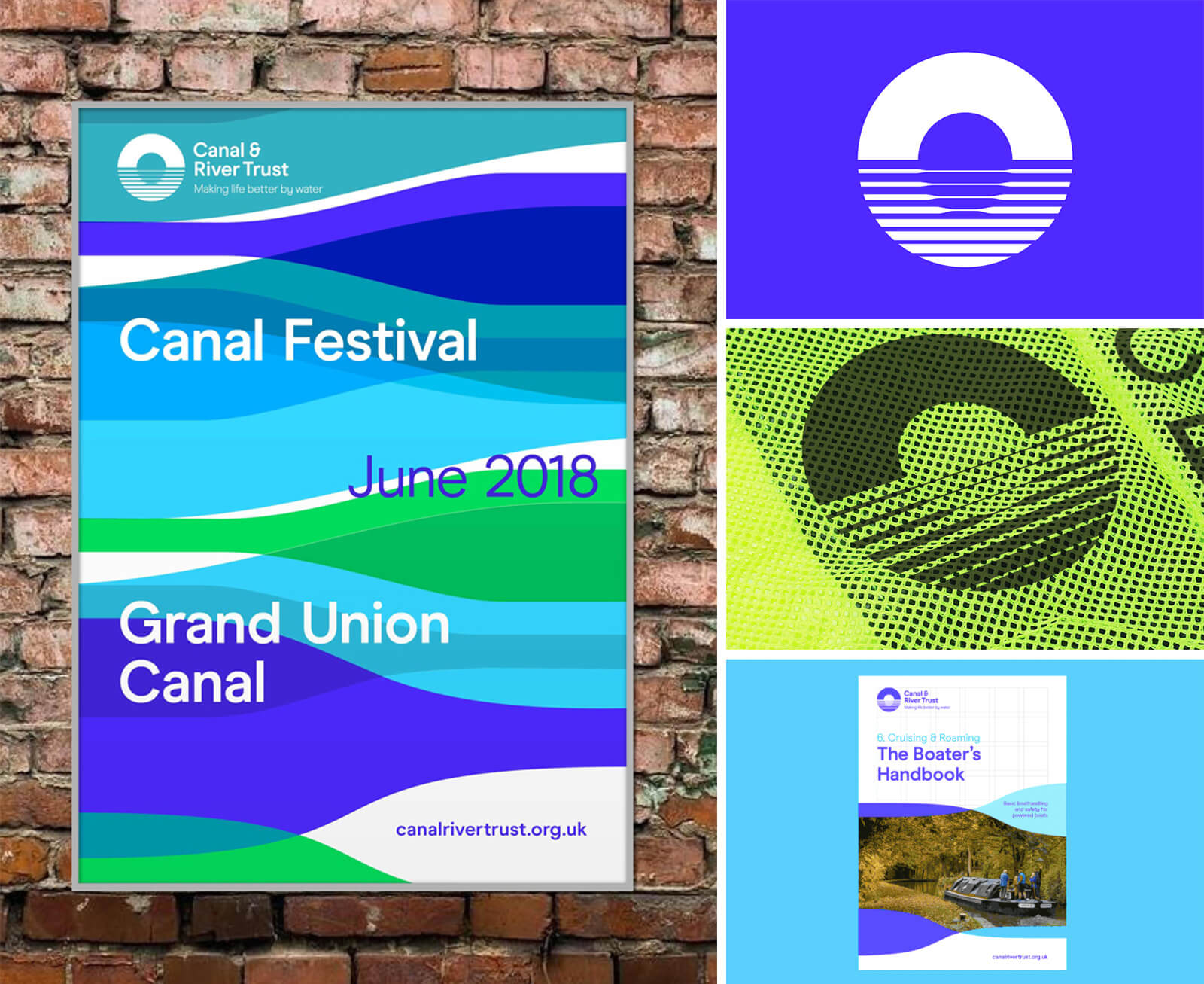
A bright and refreshing colour palette is introduced alongside the new logo, with two blues and two greens which will be used alongside white, symbolising nature and water, two important elements of the trust. With the previous logo being black and white, these new vivid, brighter and happier colours will also further reflect the Trusts purpose of hoping to enrich lives with the use of the waterways. A new contemporary sans-serif typeface, Modern Era, has also been introduced to modernise the brand and improve legibility.
All of these elements come together to create a distinctive look and feel that hopes to reflect the new brand strapline of ‘Making life better by water’, representing the Canal and River Trust’s mission to transform canals and rivers into ‘spaces where local people want to spend time and feel better’.
The rebrand has caused some divide within the Trust’s community. Unfortunately, it yet again, probably comes down to that age old problem that often change is not welcomed but sometimes change is something that needs to happen – the trust is currently spending more on the waterways than they have ever spent before, yet public awareness is still very low.
The Canal & River trust is facing the same problem that many other brands are facing too. Times are changing and they need to be future facing in order to appeal to a wider, younger and more diverse audience. Studio Blackburn explains “we were trying to create a brand system that gives the [charity] more flexibility to develop as an inclusive, modern and sociable brand to a much wider audience, rather than the current, and inaccurate, perception of ‘those people who maintain the canals’ ”. Some may argue ‘if it ain’t broke don’t fix it’, but can you imagine, if we never revolutionised anything, we would still be stuck in a black and white age. Although brands do not want to alienate their current consumer they must also seriously consider the future and their much wider potential audience. As a charity especially, it’s essential for more people to know you, understand your purpose and feel passionate about what you do, so it’s imperative that your branding communicates this. The Canal & River Trust took this risk, as for them, securing the future of the waterways is above anything else.
“We need to stay relevant in order to survive and we’re incredibly fortunate that over the last five years we have naturally become more relevant to more people. Our new brand positioning will ensure that in another 100 years, the canals are still thriving.” – Allan Leighton, chairman of Canal & River Trust
Battersea Dogs & Cats Home
Battersea Dogs & Cats Home have lost their Dogs and Cats. Okay not literally, but in their rebrand they have lost them in their name, they will now be known just as Battersea. The change of name came down to the word ‘home’ which wrongly implies a permanent dwelling for the animals, which contradicts the main purpose of the charity, to re-home Dogs and Cats with families. It was also felt that it implied that the charity was just in one location, when in fact, they now have three locations across the UK. The rebrand now, instead, sees the introduction of the tagline ‘Here for every dog and cat’, which communicates the main sentiment of the charity and their commitment to unconditional care whatever the circumstances for all Dogs and Cats that come through its doors.
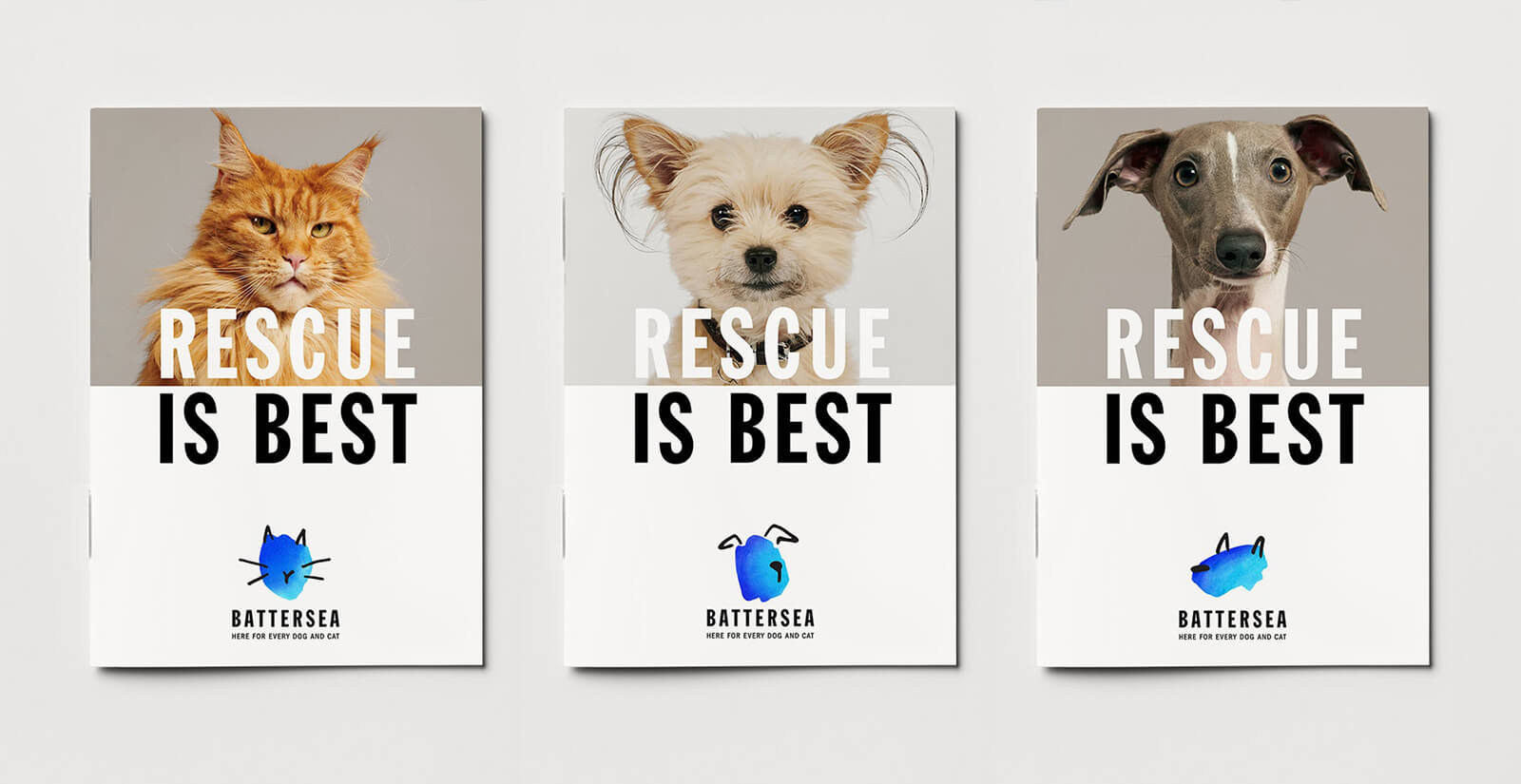
The rebrand also sees the introduction of a collection of watercolour illustrated characters as its new icon. Using its signature blue colour, emphasising is commitment towards every Dog and Cat, the simple yet expressive illustrations each represent a variety of Dogs and Cats, subtly communicating the charity’s story of any Dog and Cat is welcome. Pentagram, the design agency behind the rebrand says, “The abstract illustrations are designed to subtly communicate Battersea’s story; they appeal to people’s compassion and humanity, without victimising or stigmatising the animals. While the characters are devoid of facial features, they remain expressive and retain a strong sense of individuality. They celebrate the diverse range of personalities found among Battersea’s dogs and cats, while emphasising the human intervention required to make them whole.”
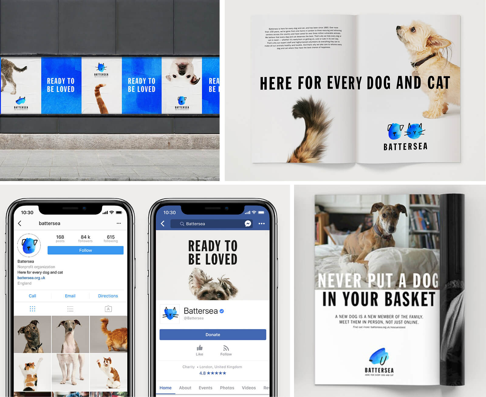
Over the years, despite its nearly 160 year history, Battersea has had an inconsistent approach to its branding and communications, so it has not clearly communicated its expertise, services and purpose. From their own research, they have found that although many people have heard of their charity, they have a very out of date perception of them and what they do. This is something that the rebrand addresses. This rebrand modernises the brand, clearly communicating what it does and its purpose and is consistent across all levels of communication. This is something that should be achieved with any brand. If above all, your branding should at least communicate what you do and your purpose in some way, however obvious or subtle it is, and your brand should be clear and consistent across all platforms that a consumer comes in contact with so they can clearly identify and recognise that it is your brand. This is especially important with a charity in order to encourage as many donations as possible, gain new donors and consistently keep regular donors, something that hopefully the new Battersea rebrand does so they can continue to be there for every Dog and Cat to help them find their forever home.
Each one of these rebrands took place because they realised that their incumbent branding may have not truly reflected who they are or their values. They didn’t just want to change their look, they wanted to re-establish their purpose.
Whilst we believe these rebrands will create great success for these businesses, time will truly tell. A rebrand isn’t a project that happens and then it’s business as usual, it goes beyond making a first impression – it’s about making a lasting one. Brand is about living it and having the conviction to follow through on purpose and promises made. In 2019 and beyond we’ll see whether these brands ‘walk the walk’ and will witness how consumers, current or anew, will interact with them.
Image Credits:
Image 1, 2 & 3: Pentagram; Image 4 & 5: Studio Blackburn; Image 6 & 7: Pentagram


