September 15th, 2015
At Hatched, we aim to build websites that can be used as long as possible. We accomplish this by creating flexible, responsive, easily edited and updatable websites. Our theory is that instead of building page templates, we build page modules (modular web design). For example, instead of creating 20 page templates we create 20 modules. What that means is that those modules can be used in many different combinations to create much more than 20 rigid page templates. We know, it’s not necessarily a ground-breaking new theory, but it’s one that surprisingly hasn’t been employed more often.
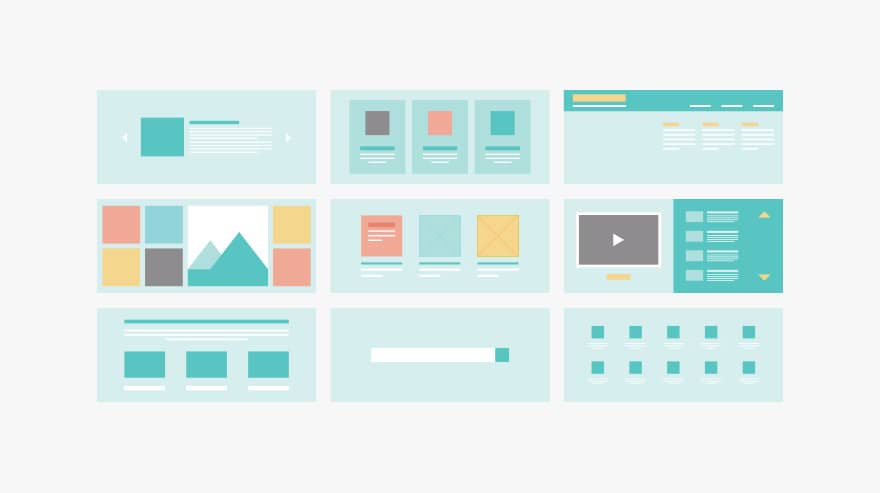
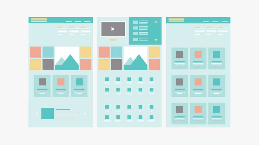
Modular web design arms the brand with building blocks, to create new pages and present new ideas in different ways for other pages. At the same time it maintains user experience due to visual familiarity and tightly designed user interface. We are able to offer the user not only new content but eventually new pages without going away from the visual look-and-feel of the brand, reducing further spend in creating new pages.
Yes, we might refresh modules in the future to adhere to new brand requirements, but this is a cheaper and more efficient option than entirely new add-ons and pages. Of course our initial design set-up includes basic page templates made up of these modules so that we can allow for quick duplication, but that flexibility is upheld where those default pages can be edited and customised to taste or content requirements, as well as completely new custom pages.
Managing and manipulation becomes not only more efficient, but it means it’s easier to have a vision for the future growth without starting again five years from now or creating something from scratch.


