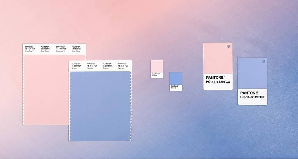
January 19th, 2016
Pantone has announced its Colour of the Year 2016, but this isn’t like any other year, for the first time ever Pantone has named not one, but two new, soon to be explained shades; Serenity and Rose Quartz. Not to add confusion into the mix, but rather than referring to their choices as ‘colours of the year’, Pantone is sticking to the singular concept and makes it clear that this is a combination of two shades not two colours.

Initially we were wondering the reason behind the pastel shades and questioned whether this reflects design prospects for 2016. For us, it wasn’t an instant win on first glance. However, we were convinced once diving into the rationale and thought process behind these colours.
“Consumers seek mindfulness and well-being as an antidote to modern day stresses, welcoming colours that psychologically fulfil our yearning for reassurance and security” says Pantone.
“Joined together, Rose Quartz and Serenity demonstrate an inherent balance between a warmer embracing rose tone and the cooler tranquil blue, reflecting connection and wellness as well as a soothing sense of order and peace.”
The combination of Serenity and Rose Quartz also challenges some more traditional perceptions around the way we use colour in today’s society.
“This more multilateral approach to colour is coinciding with societal movements toward gender equality and fluidity” said Leatrice Eiseman, Executive Director of the Pantone Color Institute.
As a brand, Pantone has one of the most influential impacts on brands and designers. These soft hue colours are already said to become the colour trend of this year within design, fashion and interior – a trend set with previous Pantone selections. Whilst we agree that both colours combined succeed in creating a calming and relaxing space with a beautiful, elegant gradient of colour, we question whether it is likely that we will start to see these shades of colour being used within all elements of design in the year to come?
With the right brand and message, we believe we can see beautiful designs being created with these shades, but once these shades are used in the wrong tone of voice, or in a design that isn’t representing the brand, it won’t work. Colour is so powerful within design and is capable of portraying messages without any words, it’s what our eyes sees first and foremost before functionality and even content.
With that said, below we have selected a few projects that we have come across so far this year that may have been influenced by the Pantone approach, or may have even been the influence for the new Pantone shades.


Using similar shades, along with complementary colours, Paul Smith & Carandache utilises colour to create a digital experience. The brand’s colour palette represents the differences and variations within their products as well as the collaboration of the two brands coming together. The project shows how incorporating the Pantone colours along with digital interaction and typography can create a playful brand.

Here, similar colours are used in the design of a catalogue for Matter designed by Lottanie Minen. The design is in it’s simplest form, utilising space and a muted colour palette. Using similar aesthetics adopted from the Pantone colours; Serenity, Rose Quartz along with a collection of other pastel shades, the editorial piece becomes calming and possesses a premium quality representative of the contemporary minimalistic products.

A personal branding project by designer Iwona Kilinska takes a playful approach by using the new Pantone shades to create a gradient that represent the brand. Iwona explains “Acid & Mist is a place where colour meets intense acid and delicate mist.” The branding makes a simple aesthetic although when using muted tones and pastel shades detailing can be lost and we feel the previous projects above work well because of the contrast of dark colours against the lighter shades.
Let’s see what the design world will bring us in 2016.


