March 9th, 2016
Function dictates aesthetics or ‘form follows function’ (Louis Sullivan), but who’s leading who, product designers or web designers? Does how we access, engage and interact with content influence smartphone and device designers or is it web designers who determine how we truly engage?
Our smartphones have become our companions and a by-product of this is the need to know where users are actually accessing content?
Evidence suggests that 34% of adults check their phones within the first five minutes of waking up and almost 20% of content consumption is done whilst on public transport. Collectively, UK consumers look at their smartphones over a billion times a day (Deloitte). This need to constantly access content affects and influences the ergonomics of our devices and how a website is designed. Being able to scroll on-the-go, (left, right, up and down), means we don’t need both hands and are able to engage with content more effectively and efficiently. #multitasking

The large increase in users accessing content on their mobiles, devices and tablets, as opposed to their desktops, has triggered a shift in how web designers cater for this surge. Designers now have to consider, not only all the normal attributes that go into creating a successful design, but they must also incorporate how the users interact with the design, and how it animates and responds.
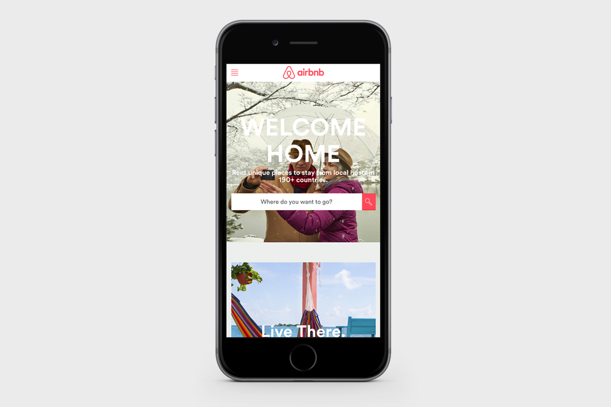
Mobile first and responsive web design is not a new topic of conversation, but it’s a vast one, and it’s growing every day as trends are captured and analysed. Mobile first is the future facing strategy whereby a website is first designed for mobiles or smaller screens. Responsive design differs in that the CSS and HTML is used to resize, hide, shrink, enlarge, or move the content to make it look the best it can on any screen, for maximum user engagement. Airbnb is a great example of excellent responsive design, the mobile version of the site is as easy to use, if not better than the desktop version, making those holidays just as easy to book on the bus, (guilty) as it would be booking on your desktop, see below.
2015 statistics indicate, a third of internet users see their smartphone as the most commonly used device for going online, which has jumped from 22% in 2014. 54% of UK households own a tablet (Ofcom).
And a small but growing Internet population of users exists, who spend over 90% of their total internet time on mobile (marketinginsidergroup.com). My guess is Gen Y, Z and those crazy kids from Gen X, who actually understand Snapchat. Imagine what this generation will expect from websites in 10 years time? #wearables.

Smaller screens have had such a huge influence on how we engage with content and has resulted in a level of expectation from users. When I design, I design for the “worst case scenario”, meaning small screen and shortest attention span.
The “mobile first” strategy, where a designer will design the mobile version (small screen, slower processors), before designing any other platforms, is the obvious solution to the smartphone revolution and a really clever one. Design a website for the user’s first port of call, but with that comes an array of limitations which has affected web design trends dramatically.
UX has always played a fundamental role in web design. With the increasing user expectation that they will land on a website and find the exact piece of information they want, means without carefully considered UX, a designer can run the risk of losing their audience. Clients must realise the impact that UX has on the effect of their digital marketing platform and factor this in when commissioning a design or redesign of their website. Deliveroo’s efficient site makes ordering a takeaway so simple, keeping trim will be tricky.

Deliveroo mobile site.
The size of the average screen is smaller and limits what actually goes on the page, meaning designers are having to get their message across quicker.
The non existence of Flash on all Apple products meant there was a need to create movement on devices in a new way. Thank you World Wide Web Consortium and WHATWG who developed HTML5, which brought another dimension to device experience; this limitation inspired the more subtle animation trends we experience today, not only on mobiles and devices but desktops too.
Flat design and bold grids are very in vogue, an obvious reference to small screens suiting more subtle responsive solutions over big elaborate or intricate executions. Spotify’s Year of music site highlights this trend perfectly.
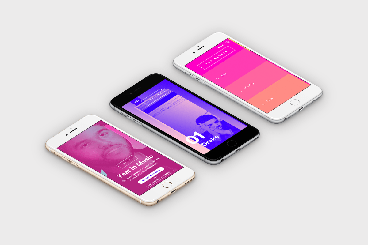
Spotify’s Year in music website.
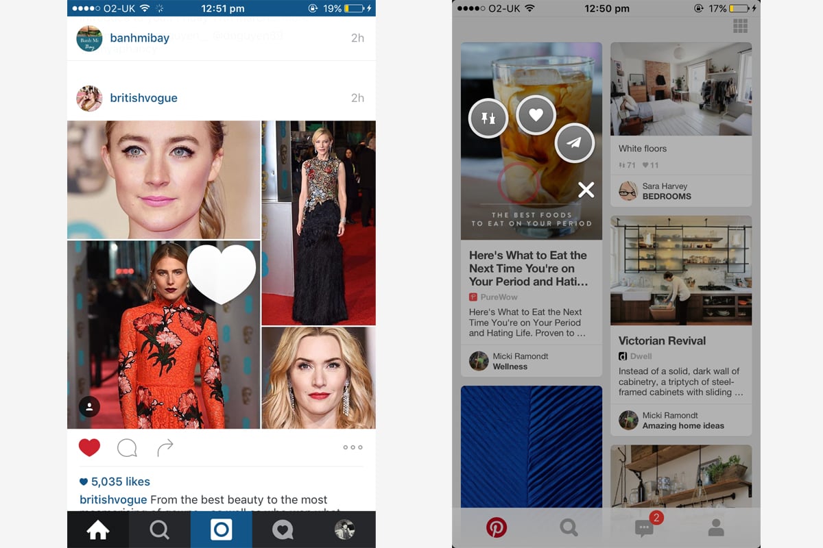
Touch technology has altered how we interact with our devices. In the app world, Pinterest and Instagram are good examples of a platform understanding its users and enhancing their experience, utilising double clicks and extended touch to activate further functionality.
Users will always prefer a beautifully designed site to one that isn’t, it’s part of human nature. Beauty evokes an emotional response in us.
“A beautiful product triggers positive emotions that inform your judgment of its usability. The product does not necessarily function better, but you perceive it as functioning better because of its looks.”
If aesthetics influence our perception of something’s function, it raises the question ‘are all beautiful websites functional?’ Not necessarily, but a user is more likely to engage longer with something that is beautifully designed.
Technology plays a huge role in engagement, and small screens have pushed user interaction to new territory. A good designer will always consider the needs and expectations of users in their designs but work out what is at the root of a user’s needs. I don’t think we can definitively say that product design is leading web design or vice versa, what we can say it’s apparent that a fusion of technology, design and content exists which inspires and motivates to create intuitive, easy and beautiful designs.


