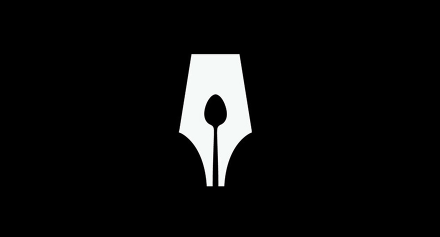
November 3rd, 2016
Today the internet is full of companies offering cheap, 24-hour turnaround packages for logos. Flooding the market with generic, sub-standard designs. We often wonder how this affects a company like Hatched. The answer is not much at all, although we find it sad that businesses are being led this way and might not be getting what they need. For a brand communication agency, a great logo is but one piece of the puzzle (although quite an important piece) in a much larger branding picture.
In terms of a visual identity, a logo should be considered along with other design elements like typography, colour palettes, imagery, etc. All of these makeup and represent the brand and everything it stands for. For this post, we would like to purely focus on the age old graphic design tradition of logo design.
So, what makes a great logo? Is there a formula? Does it have to be clever? Should there be a hidden thought or a deeper meaning? Or is simplicity key? A simply constructed logo will always outlive a more complicated one. Longevity and timelessness should be the ultimate brand goal. So avoiding ‘current trends’ and over complicated typography is normally a good idea. This can be difficult to do nowadays with the millions of typefaces available, not to mention the potential for infinite options of custom lettering at your fingertips.
Below, we’ve pulled together six points which we think are the ‘holy grail’ of what should be considered in logo creation. These are points of reference which are relevant and scalable to any designer, agency or client.
1. Entice
Know your audience – understand who your primary target is, what makes them tick and, in turn, how a new logo mark could attract that proposed audience.
2. Be unique
A great logo mark needs to stand-out and be remembered. Every brand is unique in some way. At Hatched we love to dig deep to find this ‘uniqueness’ for the brands we work with to uncover and hero individual personality. We love that ‘eureka’ moment you get when you realise there is something clever or surprising within the mark, even more so if this motif helps tie everything together.
Here are a few examples:

Not only one of our favourite chocolate bars in the office, but also one of our favourite logos – the world famous, Swiss Toblerone. This great logo is the image of the Matterhorn mountain which borders Switzerland and Italy. But, more interestingly, as a homage to the town of Bern, where Toblerone was originally manufactured, the logo hides a bear, the official symbol of the town, within the graphic construction.
Additionally, the name Toblerone is a portmanteau, a word which is made out of two or more words. A combination of the creator’s name, Mr Tobler, along with the word ‘torrone’, a traditional type of nougat originating in Italy.
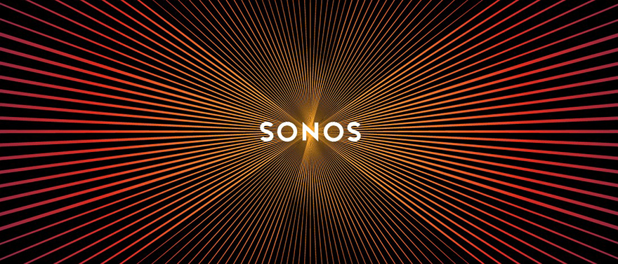
The Sonos logo by Bruce Man Design is brilliant for two reasons. Not only is this great logo a palindrome, a word that can be read the same way from either direction, be it forwards or backwards or even upside down in Sonos’ case (which we discovered when accidentally installing a speaker upside down), but also the logo’s moiré affected lines resemble sound waves and pulse like a speaker when scrolled. It’s beautiful, clever and unique.

We come into contact with this logo a lot but failed to see the genius behind it for a long time. MyFonts logo, designed by Underware, a Netherlands-based type studio, is composed of a beautiful custom made handwriting type where the ‘My’ part of the logo also doubles as a sketch of a hand. It explains succinctly the entire concept of the company, which is to ‘get your hands’ on a vast collection of fonts at ‘hand-grabbing’ speed. Genius!
3. Timelessness
This is a big one and probably the hardest to achieve. With technology and media developing so fast, consumers’ tastes are being pushed and shoved along at an exponential rate. But rising above internet trends and ‘flavours of the month’ is important. Longevity can be achieved if you strive for boldness and create your own trend rather than following others.
Take a look at the work of some of the greats whose logos seem to remain eternally relevant:
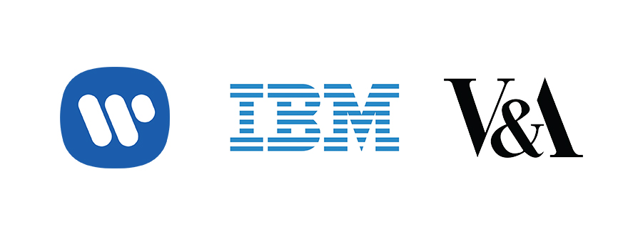
Saul Bass‘s Warner music logo was created in 1974 and is still used today (in fact, the average lifespan of his logos are 34 years). Paul Rand‘s IBM is unbelievably from 1956!!! Alan Fletcher‘s V&A logo was created in 1989.
4. Relevance
This is a more obvious one but still very important. The mark needs to reinforce and represent the brand. Long forms or short forms of the logo should portray a visual summary of the brand that will aid identification and noticeability.
5. Consistency & adaptability
The perfect logo reads in seconds and is memorable. It’s equally comfortable on a business card or on a billboard. Consistency, consistency, consistency! Clearly defined, straightforward logo rules enable safe and consistent reproduction. 100 page ‘War & Peace’ brand guidelines can be spectacular to your peers but completely overwhelming to everyone else outside the creative industry. Brand ‘cheat sheets’ are a very useful way to express the brand in a concise and compact way. Adaptability is a basic need for any logo mark. Does it work on a small scale as well as it does on a large scale? All colour reproductions need to be covered, black & white or monochromatically. The mark needs to be clear, crisp and, always, easily identifiable.
6. Know the rules but anything goes
The great Saul Bass said: “There are no secrets. You just got to learn how to do it.” He’s right, there are no magical formulas or tricks to creating a great logo, but achieving 75% of the above is a great start. Knowing the rules and honing your own process which ticks the above points will go a long way. In the end, it’s a very personal process for client and designer.
At Hatched we really like to celebrate and savour the logo and brand creation process but ultimately the mark has to exist outside of the context of our studio; success will always be judged upon the relationship it strikes with its intended audience. Perfection is reached once that audience has developed that strong positive connection and lasting impression.
Here are a few examples that we believe have achieved that:
Airbnb rebranded in 2014 in an attempt to becoming the world’s first community super brand. We love everything about this logo.

