February 6th, 2018
Today marks the centenary of the women’s suffrage in the UK. To celebrate, we wanted to hero one of our favourite graphic designers, Margaret Calvert.
Often considered the ‘Mother of modern-day information design’, born in South Africa, Calvert moved to England at the age of 14. Studying at Chelsea College of Art, it was here that she met tutor Richard “Jock” Kinneir, who went on to ask Calvert to assist on the design of the new wayfinding signage at Gatwick Airport. Here, the infamous black on yellow scheme was founded, a scheme that continues to live on today, some 60 years later.

In 1957, Kinnier was appointed the head of signs for Britain’s roads, and in possibly one of the biggest graphic design jobs ever, Calvert was briefed by Kinnier on the creation of a new signage system for Britain’s roads. In what has now become an iconic visual language, Calvert helped develop this simple and easy to understand graphic language that lives on every signpost and roadside sign the length and breadth of the country.

Alongside her recognisable ‘Britain’s roads project’, we would also like to give recognition to a few more of Calvert’s infamous works that we all unknowingly interact with and use on a daily basis.
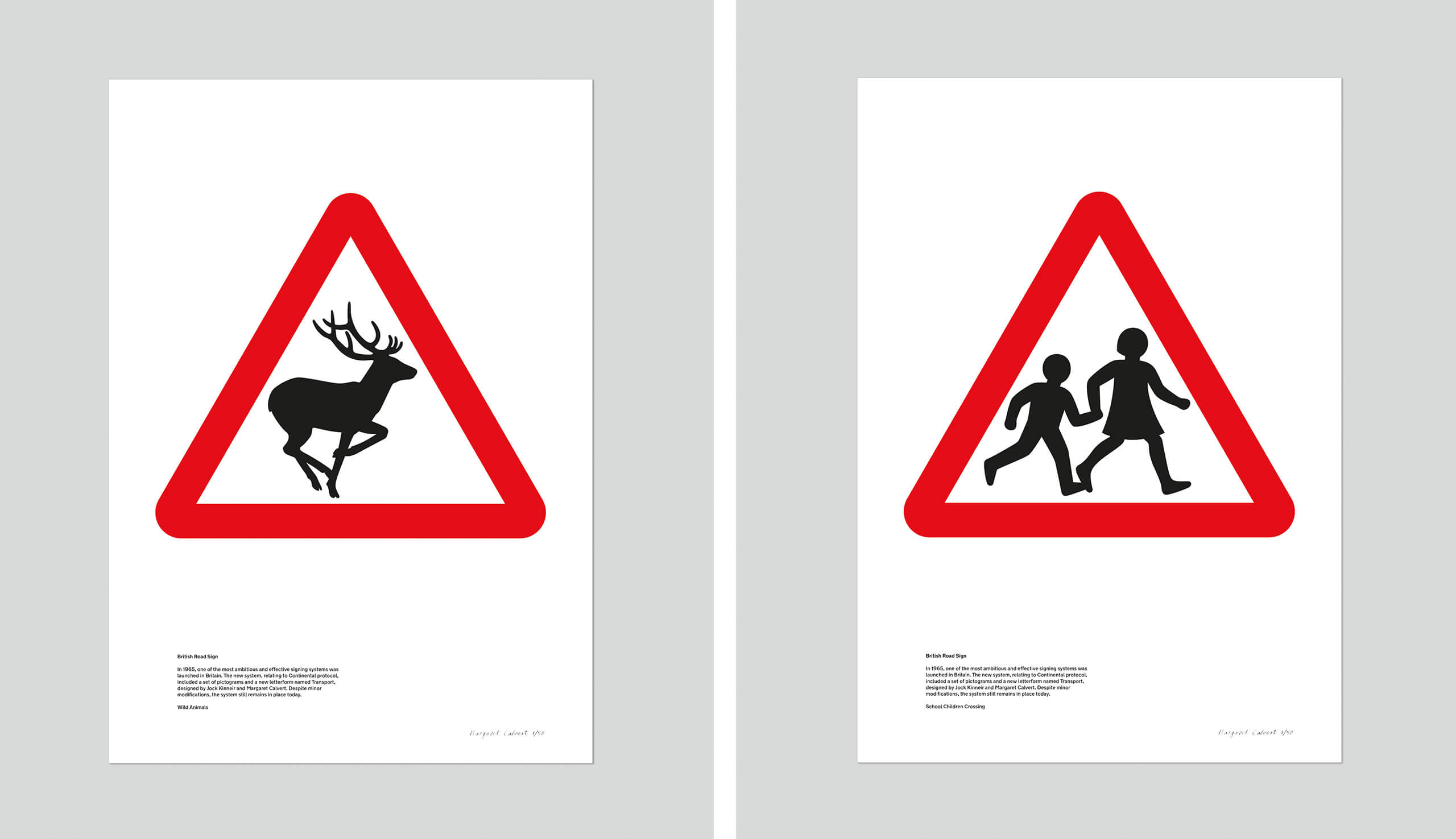
UK road signs – 1965
As part of the new road signage system, on the pictogram warning signs, Calvert would often base these on her own memories. The animal signs reminded Calvert of her relatives’ Warwickshire farm and the school children crossing sign was modelled on a photograph of herself as a child. In what looked very ‘grammar school’, in order to make it more inclusive she replaced the image of a boy in a school cap leading a little girl, with one of a girl with a younger boy.
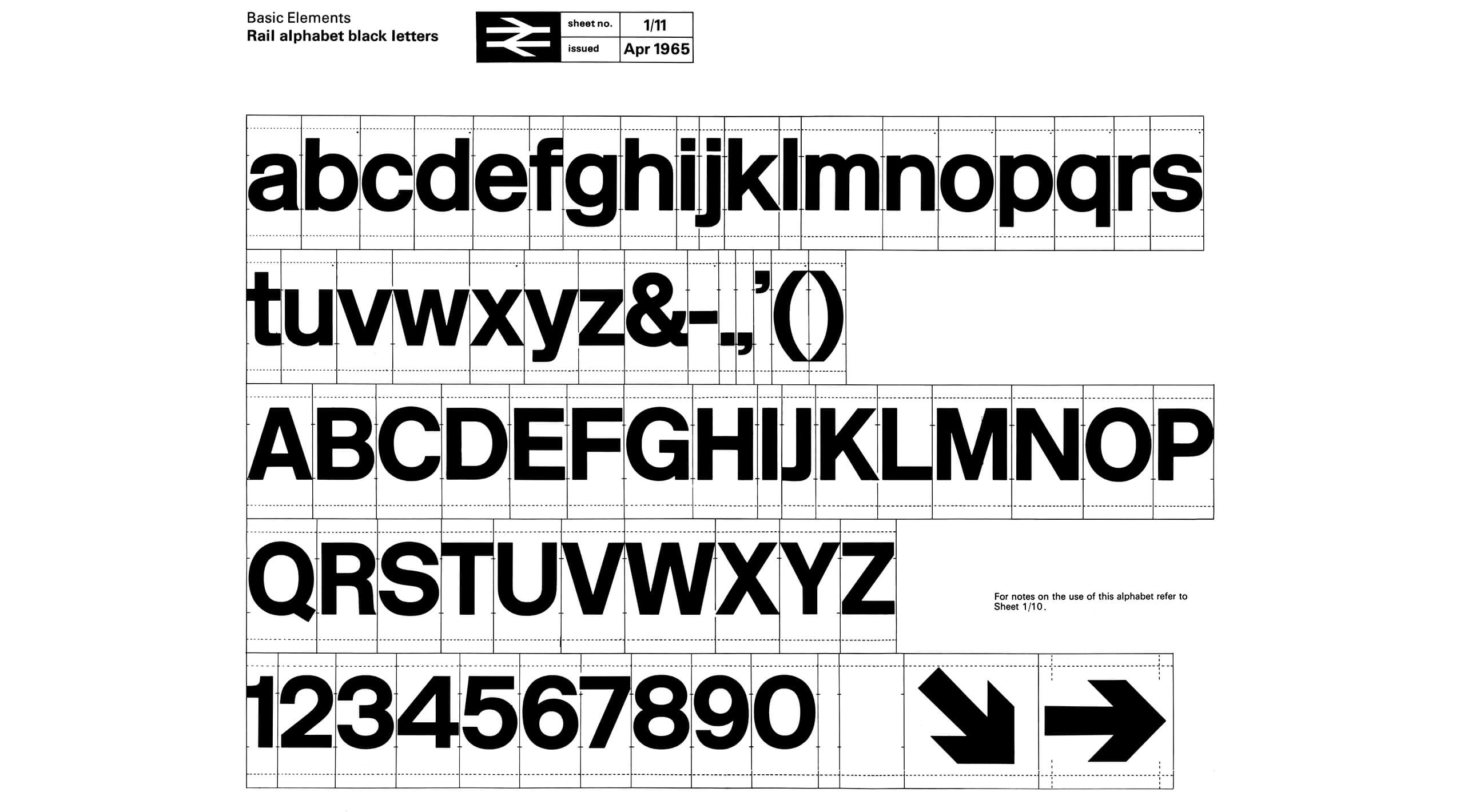
Rail Alphabet
The rail alphabet typeface was designed for use on the British railway system. Similar, but not identical to the widely used weight of Helvetica, the typeface was first used at London’s Liverpool Street Station. It was then adopted by the Design Research Unit as part of their comprehensive 1965 rebranding of the company. The typeface became British Rails most successful and long-lasting element of their corporate identity.

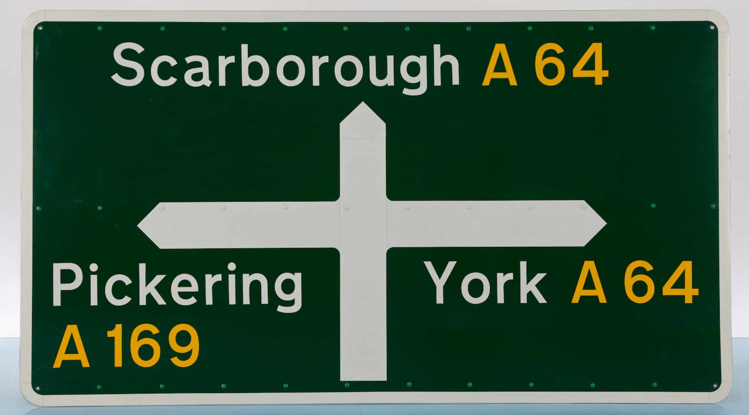
Motorway Typeface
In 1958, Britain’s first motorway was opened, the M6 Preston bypass. With this, an easily comprehensible and consistent typeface was needed for signposts and giving directions on motorways. This transport font has been applied to every motorway sign across the country ever since and is even used in other countries including Ireland and Portugal.
Each and every one of Calvert’s designs have become an integral part of the national landscape and it is hard to imagine a time when they didn’t exist.
As most of us often take our surroundings for granted, Kinnier pointed out the importance of these iconic designs, “Direction signs and street names, for instance, are as vital as a drop of oil in an engine, without which the moving parts would seize up; one can picture the effect of the removal of this category of information on drivers in a busy city or on pedestrians trying to find their way in a large building complex”.
With the work that Kinnier and Calvert achieved, it’s no surprise that in 1965, after reviewing the entire network of road signs throughout Britain together, Kinnier, who had previously set up his own practice, renamed it Kinneir Calvert and Associates, a recognition of the partnership with Margaret Calvert.
100 years ago today, the Suffragettes took to the streets and began their fight for equality, something that sadly many (or most) women still struggle with today. And so then it shouldn’t be lost that the signs that stand on our streets and roadsides, some 50 years on, directing the entire nation, were designed by a woman, and an inspirational and distinguished one at that.
Image Credits:
Cover Image and Image 1 : The Independent; Image 2: Twitter; Image 3: Pinterest; Image 4: Pinterest; Image 5: The beauty of transport; Image 6: Special design studio; Image 7: Pinterest


