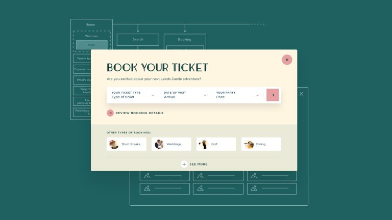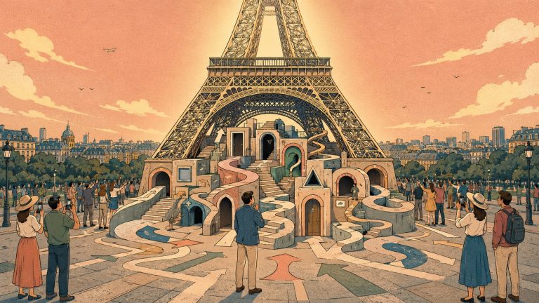
Visitor attractions are complicated places. Behind the scenes there might be admissions, events, memberships, education, accommodation, hospitality, weddings, retail, fundraising, conservation and a dozen other teams keeping everything moving. Your visitors don’t care.
They shouldn’t have to understand how your organisation works to work out what they can do when they get there. Yet visitor attraction website design has a habit of reflecting the organisations that create them. New sections appear as the offer grows. Departments need somewhere for their content. Campaigns add landing pages. Events multiply. Somebody needs a new button on the homepage.
None of these decisions are unreasonable on their own. Over time, though, they can leave visitors navigating the organisation rather than planning their day. And planning a day out should be simple. What’s on? What will the kids enjoy? How much is it? Where do we park? Can we eat there? Is everything included? What time should we arrive? What happens if it rains?
If those answers take too much effort to find, adding more content probably isn’t the answer.
More to discover. Less to work out.
We see this a lot when reviewing visitor attraction websites. The attraction itself can be brilliant. The content can be rich. There can be beautiful photography, exciting events and more things to do than anyone could fit into a day. That abundance is an asset. Digitally, it can also become the problem.
Everything starts competing for attention. Navigation gets bigger. Homepages become a negotiation between different parts of the business. Calls to action multiply. Important information gets pushed further down the page because there is always something more exciting to say first. The visitor is left to sort it out.
On mobile, there’s nowhere for that complexity to hide. For instance a sprawling navigation becomes a long menu, three competing calls to action fill a screen or information that feels reasonably close on desktop can suddenly be several swipes away.
The answer isn’t necessarily to say less, it’s to understand what matters and when. Someone browsing for ideas on a Friday night has different needs from someone standing in your car park on Saturday morning. A parent comparing days out needs something different from an existing member checking what’s on. Someone considering an overnight stay may move between inspiration, availability, dining, activities and price before they’re ready to commit.
Good UX recognises those moments rather than asking everyone to follow the same route.
When we redesigned the Kent Attractions website, this became fundamental to the experience. More than 60 very different attractions needed visibility, but simply presenting a bigger directory wasn’t going to help visitors decide what to do. The website had to work around discovery – who’s going, what do they fancy doing, where they are and what might turn an ordinary free day into a great one.
It sounds obvious when you put it like that, but there’s a simple reason attraction websites become complicated – the people managing them know too much. They know the difference between an experience and an event, the know which ticket includes which area, they know that the restaurant has its own section, they know what the internal name for that membership scheme means etc. etc. etc.
Your visitor has none of that context.
Which makes occasionally looking at your website with fresh eyes surprisingly valuable. Give it a go. Try it on your phone for instance. Give yourself a few everyday tasks, find this weekend’s opening times., work out what a family of four would pay, check what’s included in the ticket, find somewhere to eat, discover something you didn’t already know was there…
Don’t use your knowledge of the website to take shortcuts. If something simple feels difficult, your visitors are probably feeling it too.
There’s a commercial reason to care. Visit England reported that attraction visits in England grew by just 1.4% in 2024 and remained 27% below 2019 levels. When every visit matters, losing someone who was already interested because they couldn’t confidently plan their day feels particularly wasteful.
There’s another side to this too. Simplifying the journey doesn’t mean stripping away the character, richness or surprise that makes an attraction worth visiting in the first place.
Our work with The Historic Dockyard Chatham had to accommodate family days out, events, education, donations, retail and hundreds of years of history. The answer wasn’t to flatten all of that into a handful of generic pages. It was to create clearer routes through it, based on what different audiences were actually trying to achieve.
A ‘complicated’ attraction can be a wonderful thing but a complicated visit rarely is.
Sometimes you’re simply too close to your own website to see where the complexity has crept in. If your digital experience has grown alongside your attraction, but the journey through it hasn’t, we’d be happy to take a look.
Feel free to get in touch. We’re here to help.