December 14th, 2016
Recently we have seen some of the biggest brands launch a new identity which have been heavily influenced by their heritage and previous logo marks. In the recent past we’ve seen rebrands for companies such as Uber taking on a modern approach, using flat colour, striking contrast and contemporary sans-serif fonts but it seems, there is another popular trend afoot.
Brands such as Polo, Kodak, Co-op, Mastercard and now Carlsberg are all going back to their brand roots. They have taken a common approach and delved into their design archives and brought back logos from as far back as the 1960s. When a company has an array of assets and history behind it, it would be clumsy not to at least investigate those assets and explore potential rebirths or recycling of them for any new identity.
I have taken a look at a selected few and how their new identities merge heritage and present branding together to deliver a successful rebrand.
The Co-op
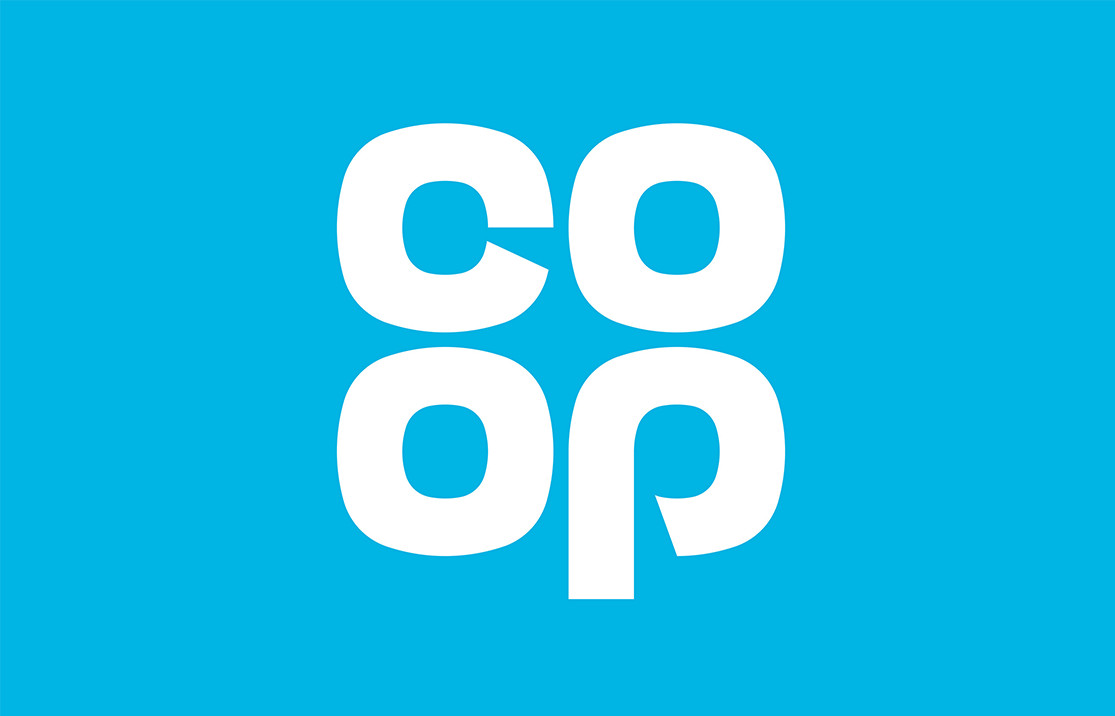
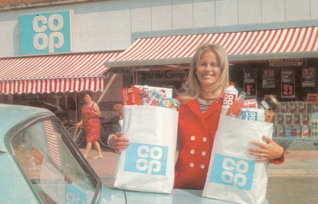
The Co-op rebrand created a lot of discussion, both positive and negative, as the brand returned to its old ‘clover leaf’ logo from the 1960s. Designed by North, they have (re)created a classic logo that retracts the more corporate feel the brand had been moving towards over the years. The new identity uses a lighter, more playful blue, as opposed to the previous branding, immersed in a midnight blue, instantly making the identity more vibrant.
“We thought, let’s not invent something new when there’s a perfectly good logo here. It’s a plain English approach. This logo is simple and memorable, there’s nothing fancy about it. It’s practical and it will tie everything together, as well as working brilliantly across digital, which we’re developing.”

With that said, and although I agree with Ben’s approach, the new identity is a direct reincarnation of the previous logo from 1968. In design, we don’t always have to design something ‘new’, but understand what is best for a brand’s visual language and how to best represent that brand. The first version of the logo, created in 1968 was drawn by hand and although the new identity doesn’t take a refined ‘perfect’ geometric approach, like a lot of other brands, or like their 1993 logo, keeping the hand drawn element humanises the logo and indeed the brand, directly connecting the brand to people.
For older generations, an exact replica of the 1968 logo is recognisable to childhood, bringing that nostalgic feeling, and confidence in their heritage and experience. For me, a 1990’s kid, it is clear the new identity balances a vibrant colour scheme with minimalistic collateral design. This balanced with the unique and characterful logo mark form a rebrand that hits the mark for Co-op.
Mastercard
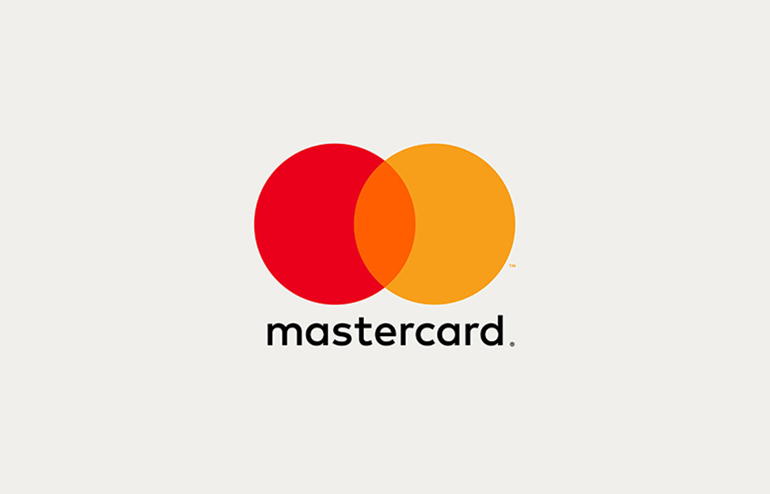
Whilst the Co-op took a recycled replica approach, Mastercard went with ‘evolution’ and who doesn’t love to witness this sort of design journey. Directed by Pentagram’s Micheal Bierut and Luke Hayman, the new identity keeps the iconic circles, but with simplified changes mimicking the logo more closely with that from 1979.
The new logo brings back the flat, geometric tone, saying goodbye to the patterns and unnecessary shadows and now using bright, overlapping, flat colours to create three tones. Using the heritage and recognition from the interlocking circles logo mark, the brand uses other elements throughout their collateral to express the digital future of banking.
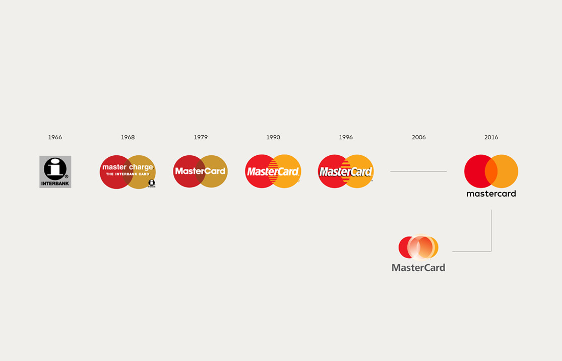
Although the iconic circles are recognised by many without even saying ‘Mastercard’, a new sans-serif typeface called FFmark was developed with the logo losing the dated italic font and drop shadow. With the wording in lowercase form, and with its circular structure, the font compliments the logo mark, creating a strong logotype without it needing to be contained within the logo.
From the mobile application and digitalised bank cards, to the roll out of ad campaigns, the new identity infuses a sense of evolution across all mediums. Keeping the sense of familiarity and values, mixed with the contemporary use of new mediums, such as the app, goes to show how the brand’s identity works in various ways, yet is still instantly recognisable, even in its new form.
“Mastercard’s new symbol returns the brand to its fundamental roots. At the same time, its basic characteristics have been used to generate a completely coordinated system of shapes, colours, and typography.”
– Luke Hayman
Natwest
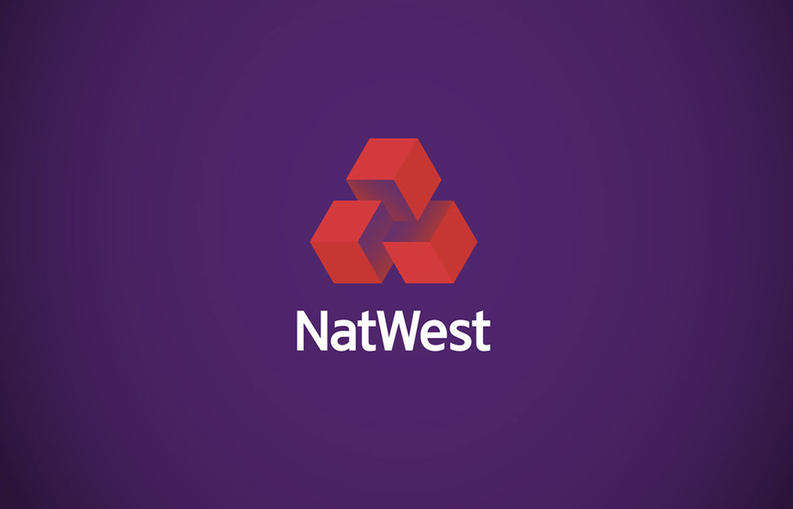
Another bank to undergo a rebrand this year, NatWest revealed a new three-dimensional, animated logo that (d)evolved from the flat interlocking chevrons, known as ‘the cubes’, from 1969. Adding the three-dimensional look to the logo creates a digital feel and represents the cube shapes in their truest form, a shape which had been lost through simplification and that were actually found in the guidelines from 1968.

Although textures, gradients and 3D elements have been added to the logo mark it still upholds a sophisticated look and modern feel. Designed by FutureBrand, they said the cubes represented “three separate banks coming together under the brand”, they continued, “it was a gentle evolution of the brand rather than a reinvention”.

To extend further, the new logo is being used through a bespoke alphabet collection and geometric illustration style, along with bright colours and textures. I feel the loud approach really stands out against all the other banks in a typical high street, engaging a younger audience with a youthful palette but I do wonder if the brand assets will stand the test of time.
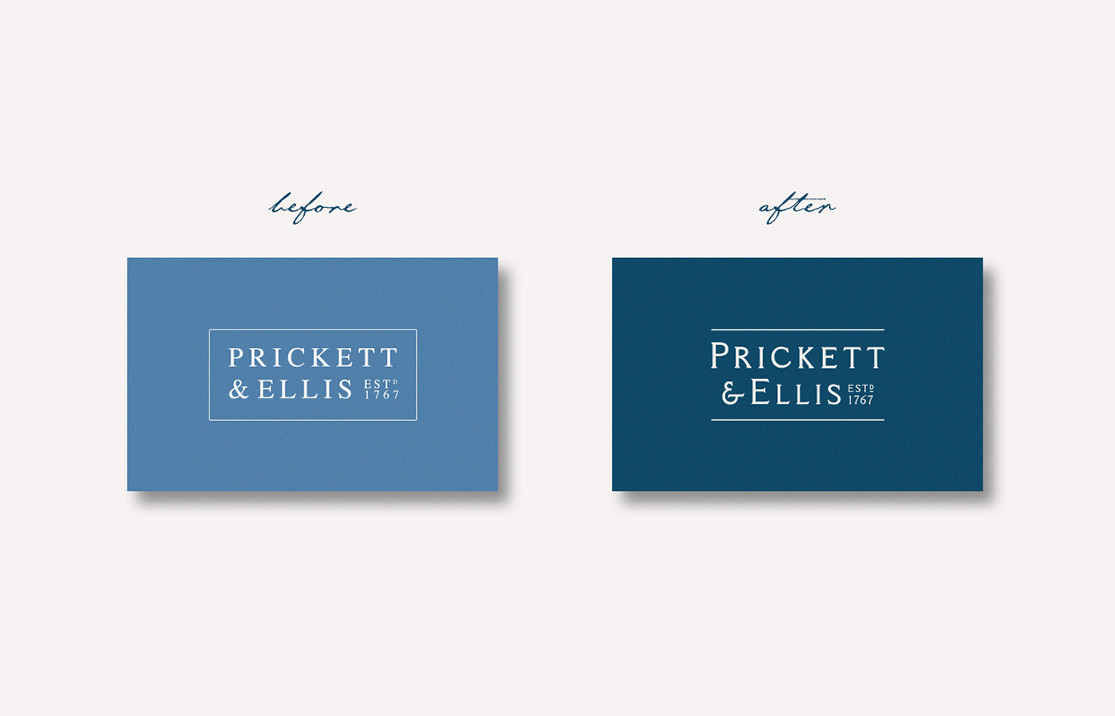
Prickett & Ellis

Even here at Hatched, we pursued a heritage based rebrand this year with Prickett & Ellis – a North London family estate agents with 250 years heritage. We were briefed to align their brand identity with their ambition to become North London’s leading estate agent, as well as it’s most experienced.
With a 250 year heritage, we were delighted to discover a folder (literally) full of collateral that was produced throughout the brand’s lifetime. We knew we had to reflect this experience within the new branding and it was quite the journey.

The logo design and typeface were inspired by typography and line elements used in the legislation papers, adverts and notices from over a century ago. We wanted to show an evolution, rather than a direct copy from previous logos or assets used. The bespoke typeface in the logo represents the history and possesses fine letter qualities.
With the rebrand, we wanted to keep the iconic blue colour that had become recognisable with Prickett & Ellis, but by shifting the tone to a deeper, richer colour it emphasises the sophistication and integrity of the brand.
By looking at these brands and approaches that we as agencies are taking in design, I believe that when a brand has a positive reason to show its past, then that should be highlighted and represented within the brand’s identity. With a lot of brands growing up with certain generations, it can be difficult to speak to a wide range of aged audiences and appeal to them. There has to be balance.
For the older generations, using the power of nostalgia can be a great weapon. Nostalgia can help people remember where they came from, where they are now and think about where they want to go – nostalgia helps people to measure their achievements and ultimately their lives but at the same time helps people to escape momentarily. For newer, younger generations a brand has to appear approachable, engaging and trustworthy. Utilising the previous branding can promote a sense of authenticity and authority and hopefully then that trust.
Is it then any wonder that a lot of brands and agencies are taking this approach – to simplify and (potentially) subjectify themselves to a wider audience, becoming more accessible in a predominantly digital environment, but then still hold and represent their values and origins and demonstrate those visually.
The logo is afteral not just a mark – it is in fact the patron saint and key representation of the brand, its mantras, manifesto, values and everything else in between.


