January 19th, 2018
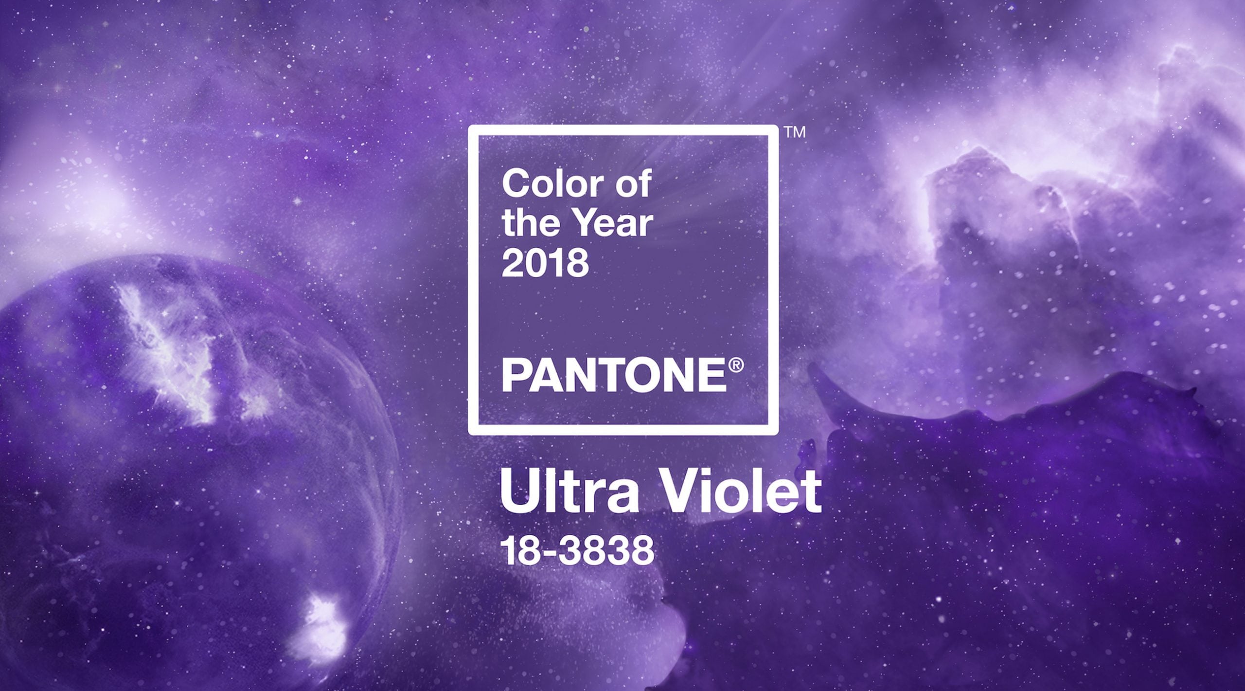
For anyone asking themselves ‘where next?’ after Millennial Pink, Ultra Violet, Pantone’s colour of the year for 2018, might be the answer.
If last year’s greenery was all about reconnecting with nature and keeping your feet firmly amongst the grass, Ultra Violet asks us to turn our eyes upwards to the galaxy and to the future. As Leatrice Eiseman, Executive Director of the Pantone Colour Institute, explains:
“Ultra Violet takes our awareness and potential to a higher level, from exploring new technologies and the greater galaxy, to artistic expression and spiritual reflection, intuitive Ultra Violet lights the way to what is yet to come.”

As noted by trend forecasters, WGSN:
“The joy of this colour is that it exists on the very edge of the light spectrum, which gives it a sense of mystery and makes it a highly engaging colour to use in light installations and experience design.”
This shade is one that embraces a 1980s futurism and a fantasy of high-tech modernism, stunningly shown in Blade Runner 2049.

As in Blade Runner, purple can evoke an atmosphere of gritty, exciting urban adventure; blurring of pink and blue neons, the darkening sky.

On the opposite site of the association spectrum, purple is linked to new age practices and mysticism, as well as the more aesthetically peaceful mindfulness movement. Pantone states:
“Historically, there has been a mystical or spiritual quality attached to Ultra Violet. The colour is often associated with mindfulness practices, which offer a higher ground to those seeking refuge from today’s over-stimulated world. The use of purple-toned lighting in meditation spaces and other gathering places energises the communities that gather there and inspire connection.”

Ultra violet has had plenty of screen time on Instagram already, via food snaps. Purple foods tick two boxes: hyper-coloured foods and healthy eating. Antioxidants called ‘anthocyanins’ were hitting the news in late 2017, described by the BBC as “beneficial plant pigments which give fruit and veg their deep red, purple or blue hues.” Taro lattes, purple cauliflower and, most of all, purple yams in anything, were very popular.

Pantone’s choice is also a fitting tribute to the lost stars of recent years, especially Prince – an artist synonymous with purple. Pantone released a specially formulated colour in August 2017 called, fittingly:![]()
Pantone’s announcement shouts out to creative legends:
“Enigmatic purples have also long been symbolic of counterculture, unconventionality, and artistic brilliance. Musical icons Prince, David Bowie, and Jimi Hendrix brought shades of Ultra Violet to the forefront of western pop culture as personal expressions of individuality.”

As a side note, on the opposite side of the colour spectrum to purple, sits orange. Pairing these two shades leads to vibrant results.

There’s a nice symmetry between Pantone’s 2016 duo (binary) Colours of the Year (blue and pink) working in harmony and this year’s perfect fusion of these culturally gendered tones. Explaining their 2016 choice, Pantone announced: ‘in many parts of the world we are experiencing a gender blur as it relates to fashion…this more unilateral approach to colour is coinciding with societal movements toward gender equality and fluidity‘. Pantone’s Ultra Violet is the colour version of Prince’s ‘Love’ symbol, created by combining the male and female symbols.
Each year Pantone’s Colour of the Year announcement gets more bold, far reaching and philosophic. Part of Ultra Violet’s optimistic charm is that it asks us to look beyond our usual limits. By naming their colour of the year after a part of the spectrum that’s not actually visible, they are challenging us to reach beyond our current perceptions. If 2018 needs one thing, it is for people to look to, and adjust to, a new future and not pine for the past.


