The Inland Waterways Association has spent decades campaigning to protect, restore and champion more than 6,500 miles of Britain’s canals and rivers. It is a cause powered by volunteers, local branches, restoration groups and passionate supporters, all united by a shared belief that the waterways deserve a thriving future.
The organisation had never lacked commitment. What it lacked was a single identity capable of bringing everyone together.
Following a comprehensive brand review and strategy programme, we were asked to develop a new positioning, visual identity and brand system that could unite the charity under one clear direction while celebrating the diversity of the waterways themselves.
Heartbeat
One of the most revealing moments came during the strategy workshops. People rarely spoke about the charity first. They spoke about the waterways. About restoring forgotten canals. Protecting wildlife. Preserving engineering heritage. Volunteering at weekends. Introducing new generations to places they loved.
The identity therefore needed to celebrate a shared purpose rather than the organisation itself.
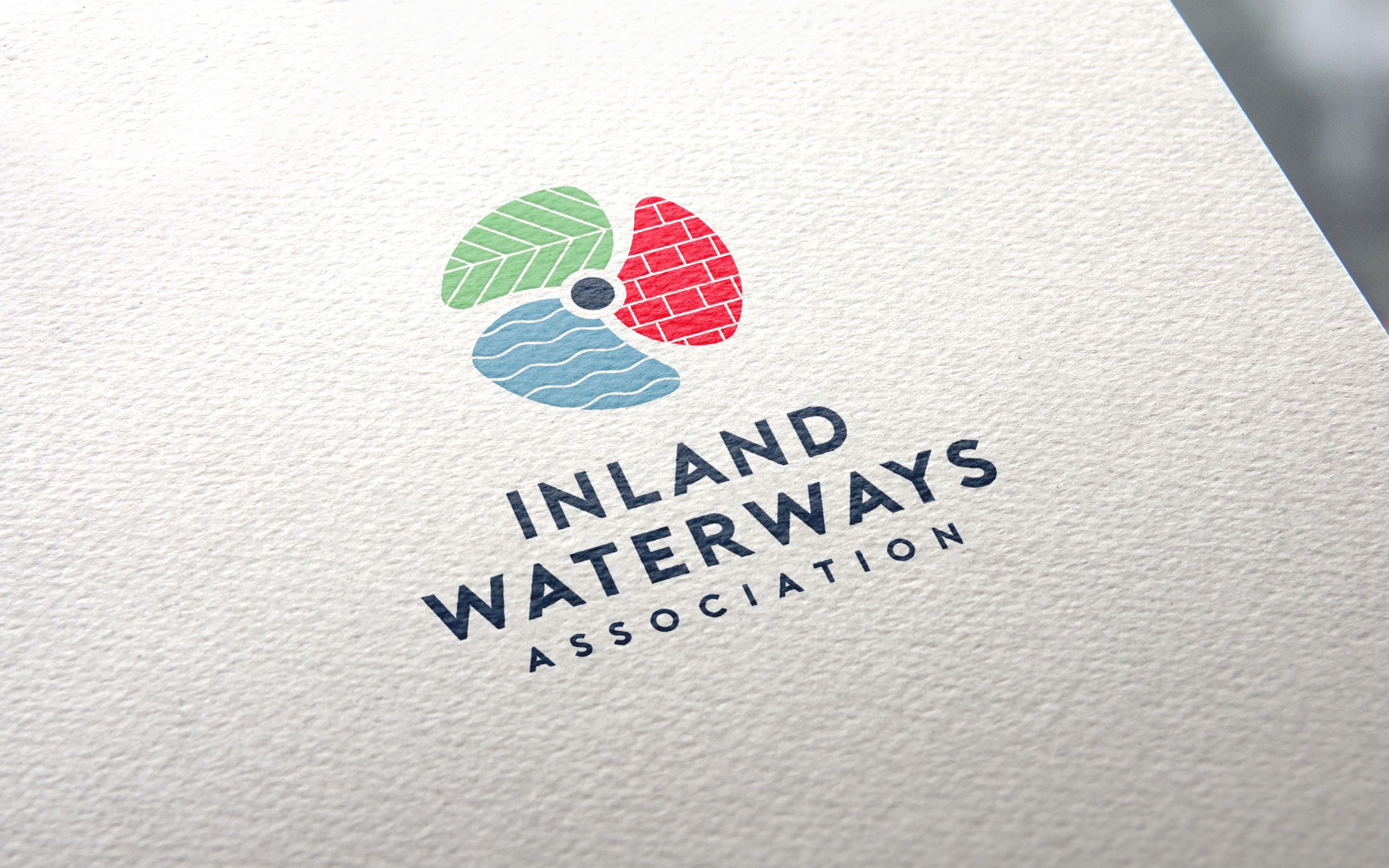
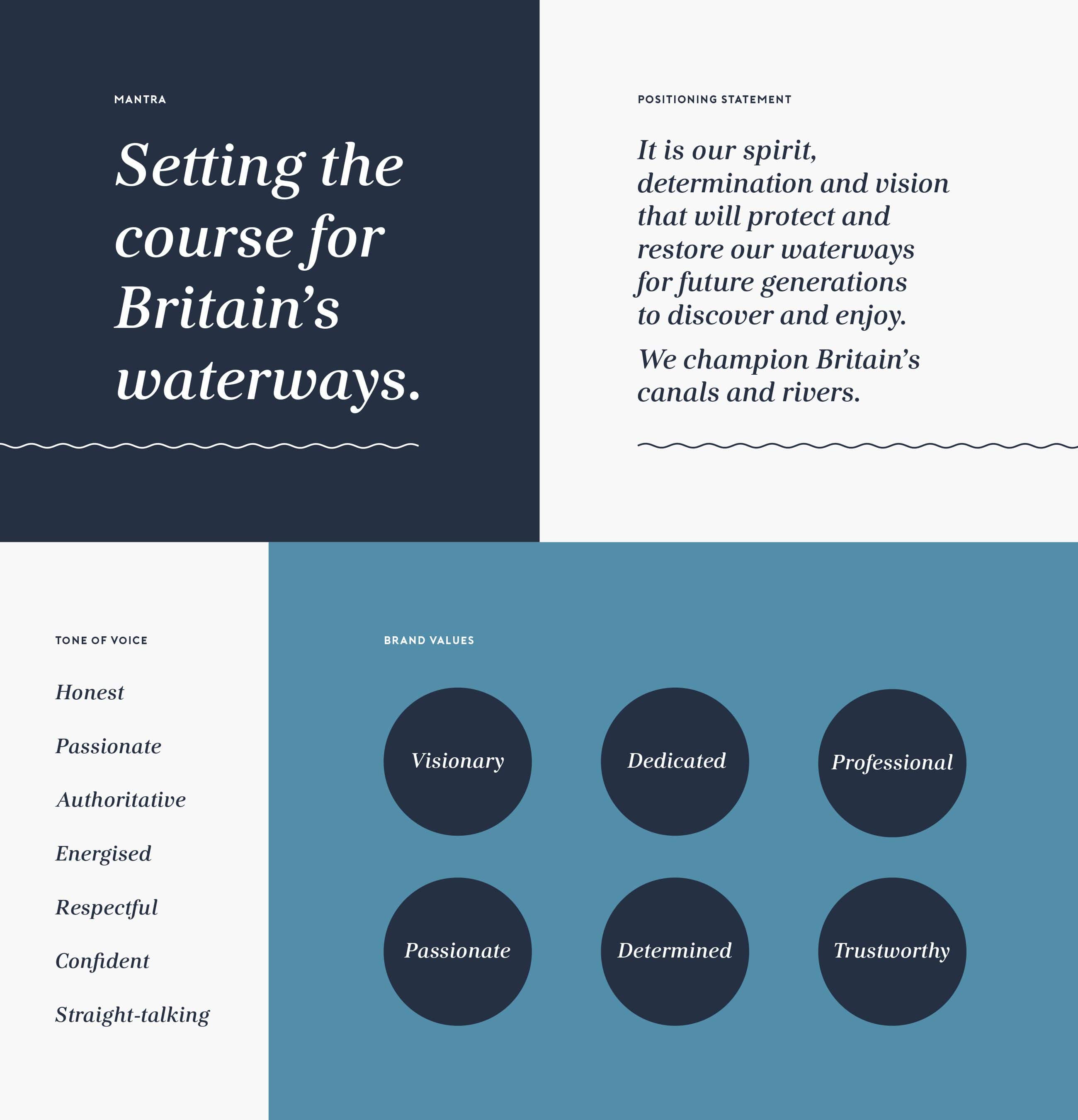
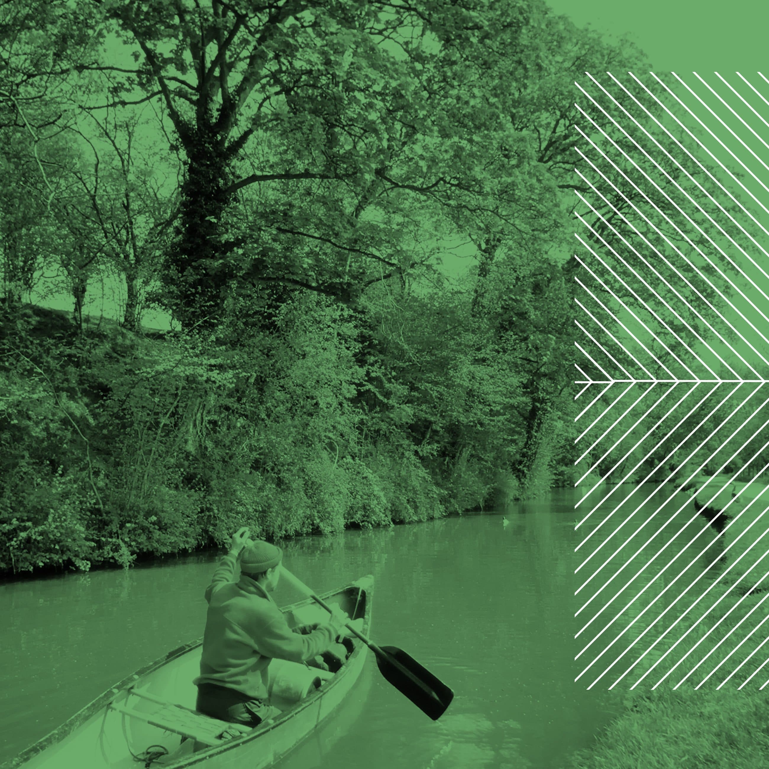
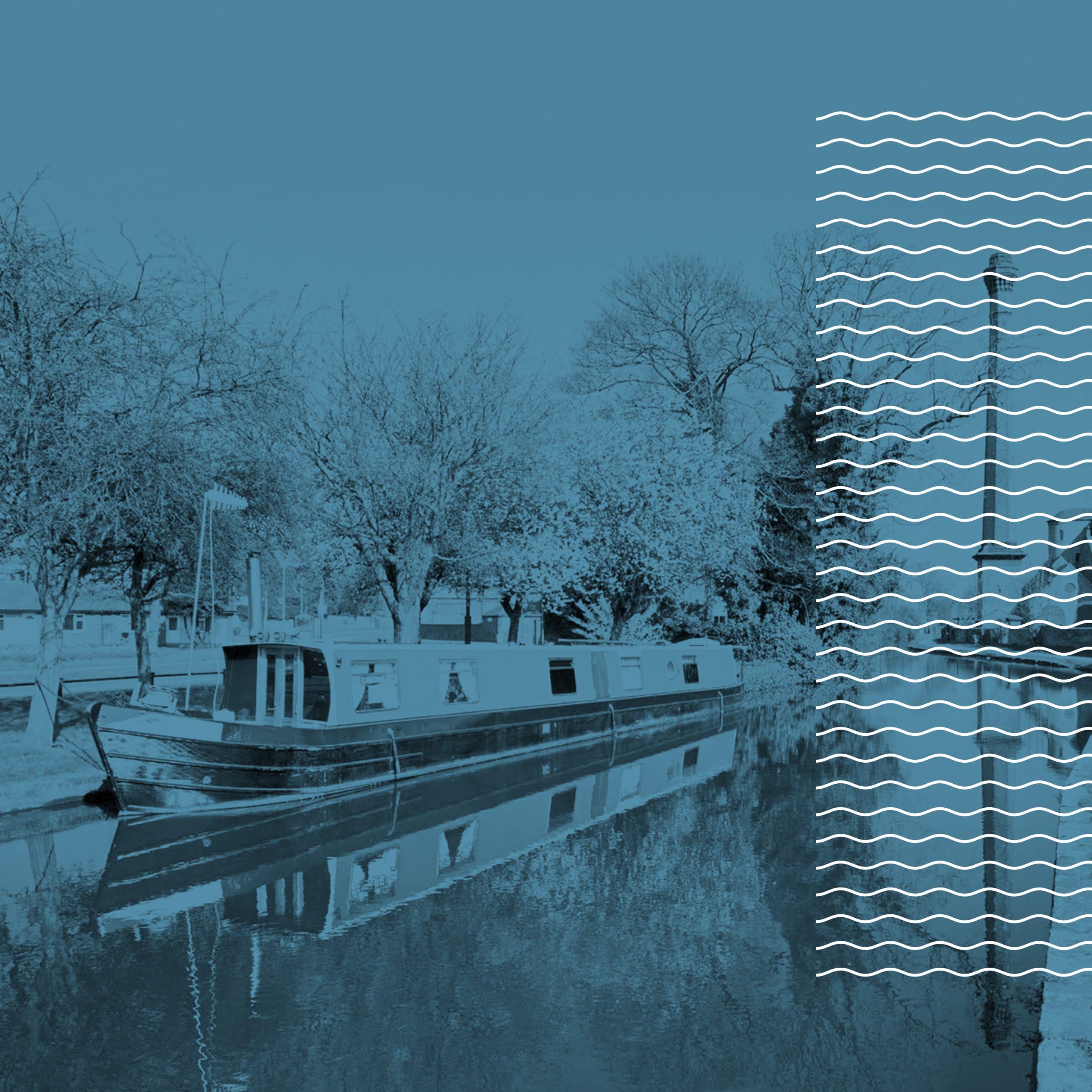
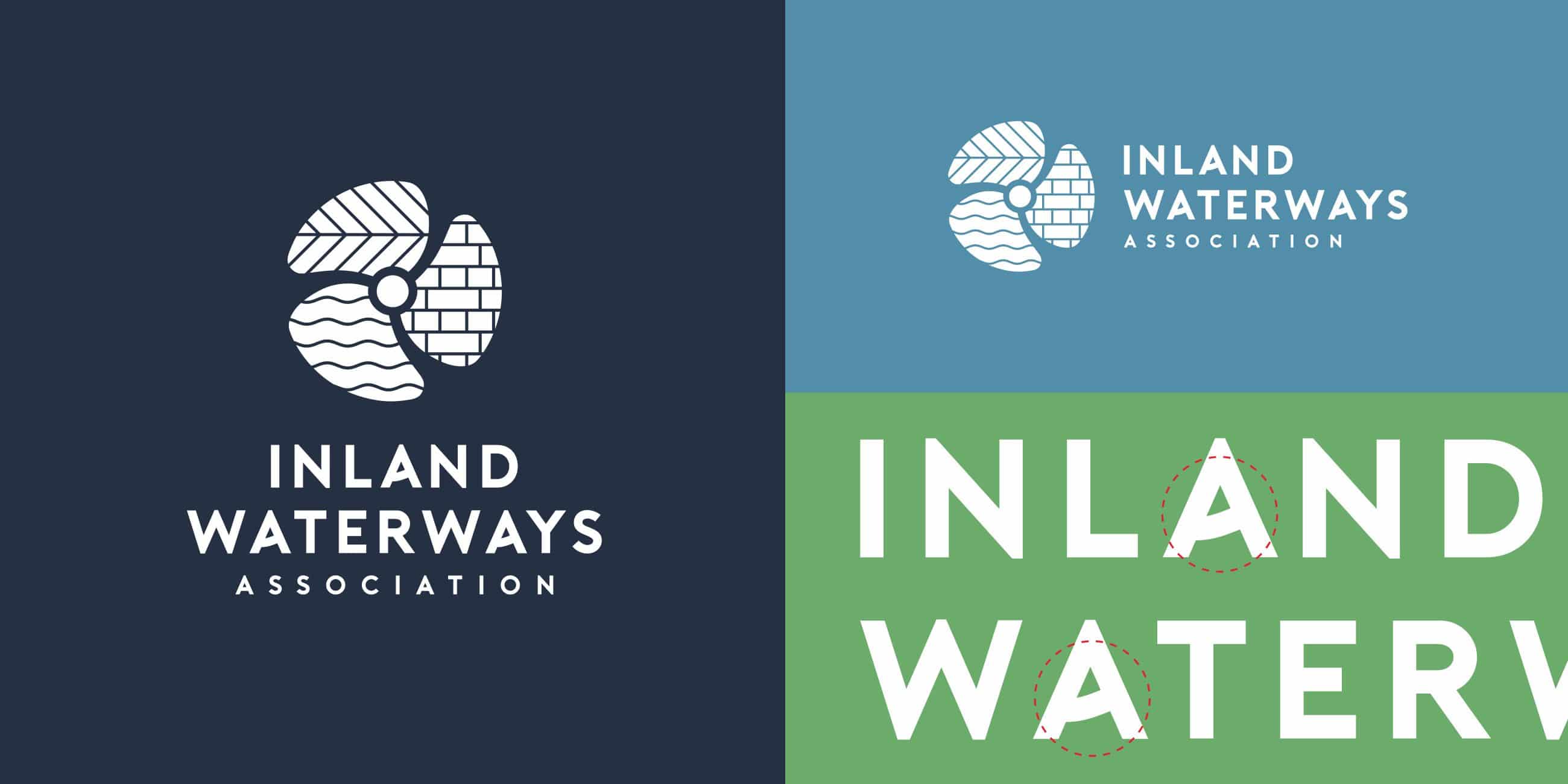
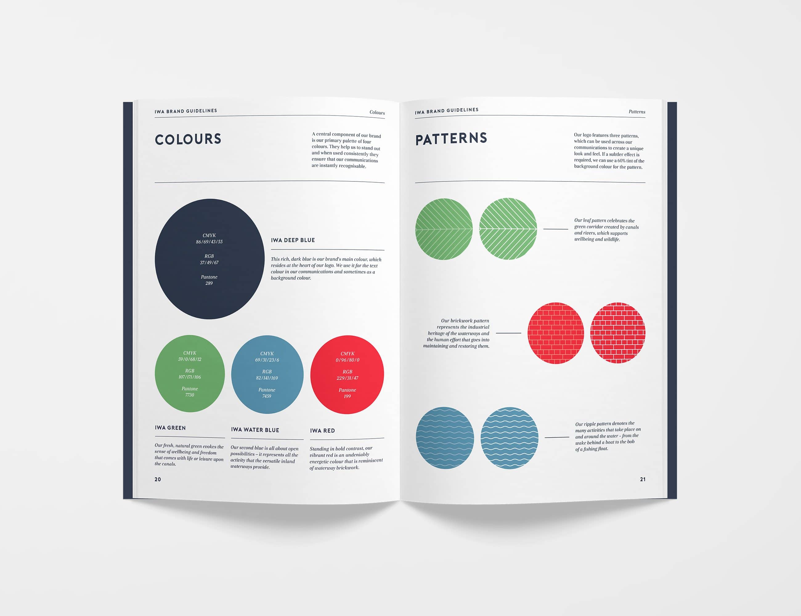
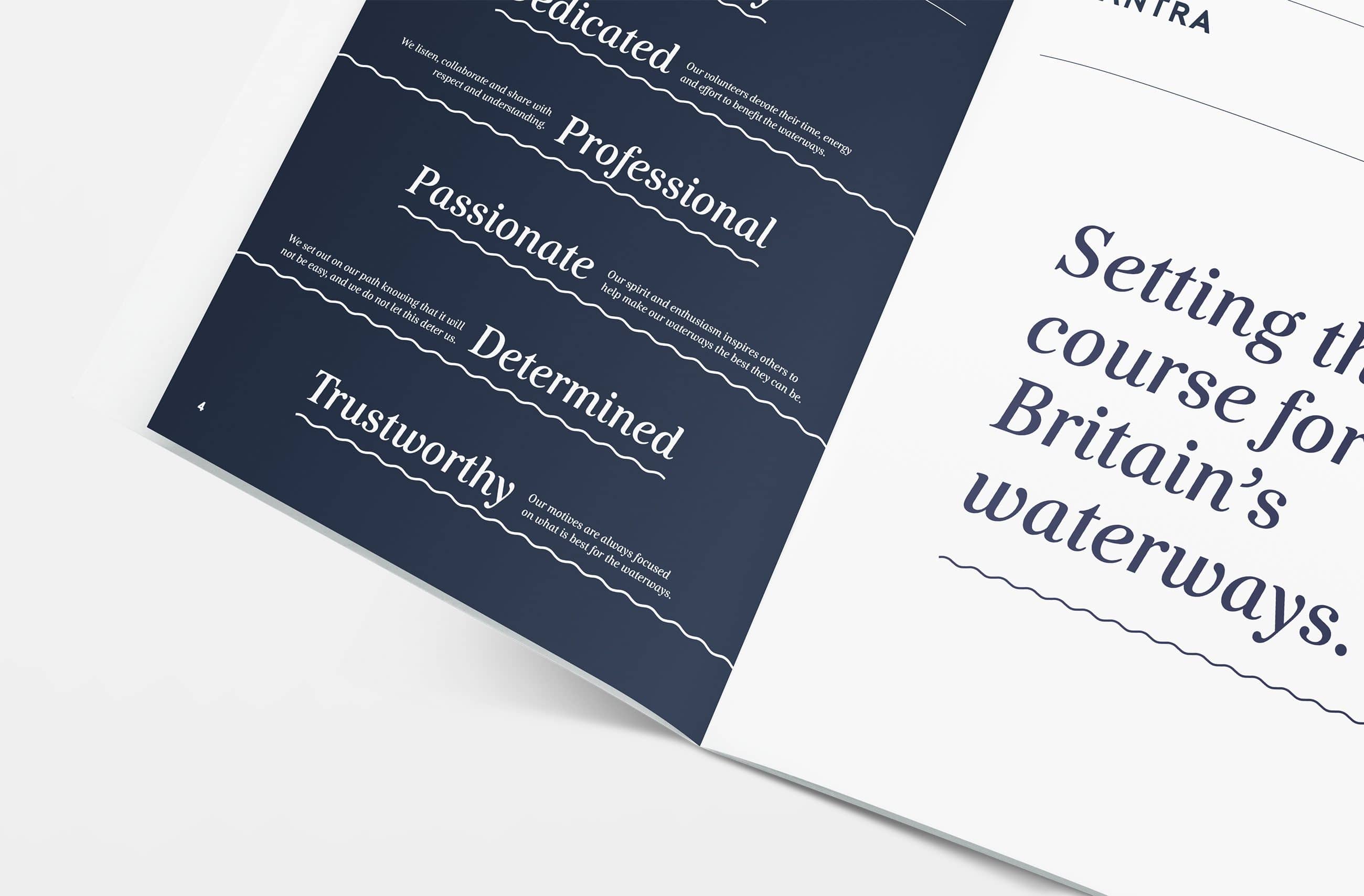
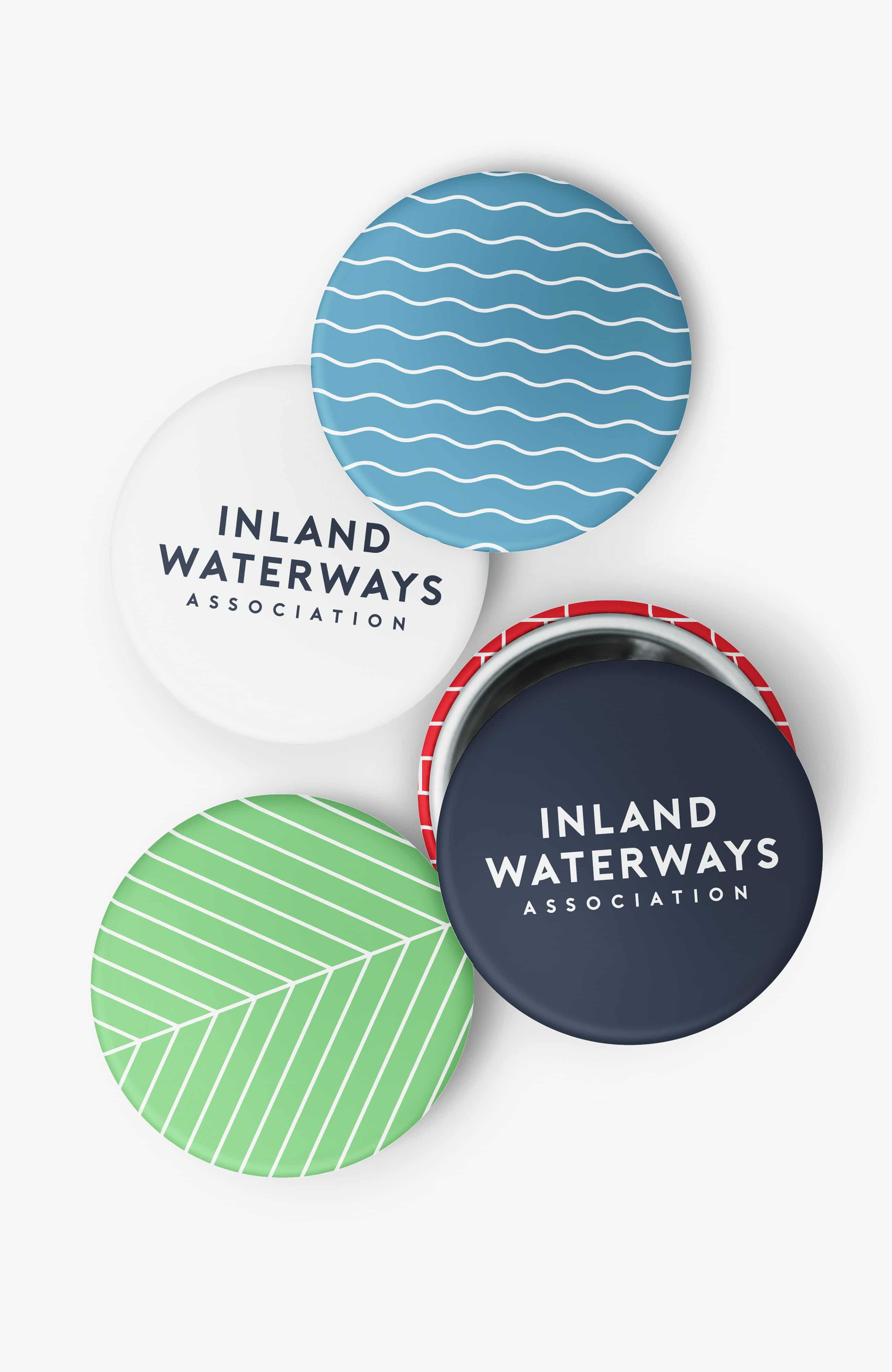
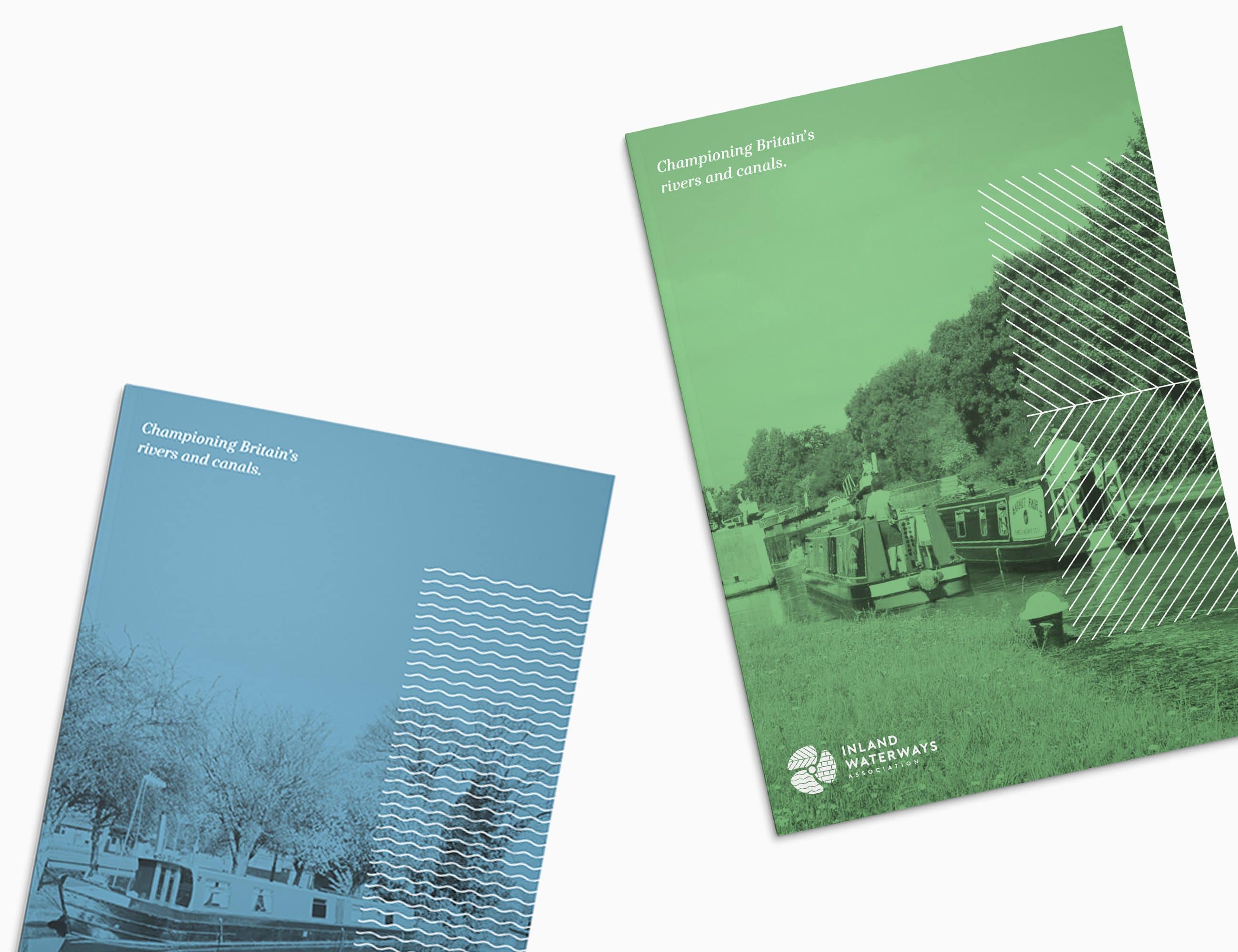
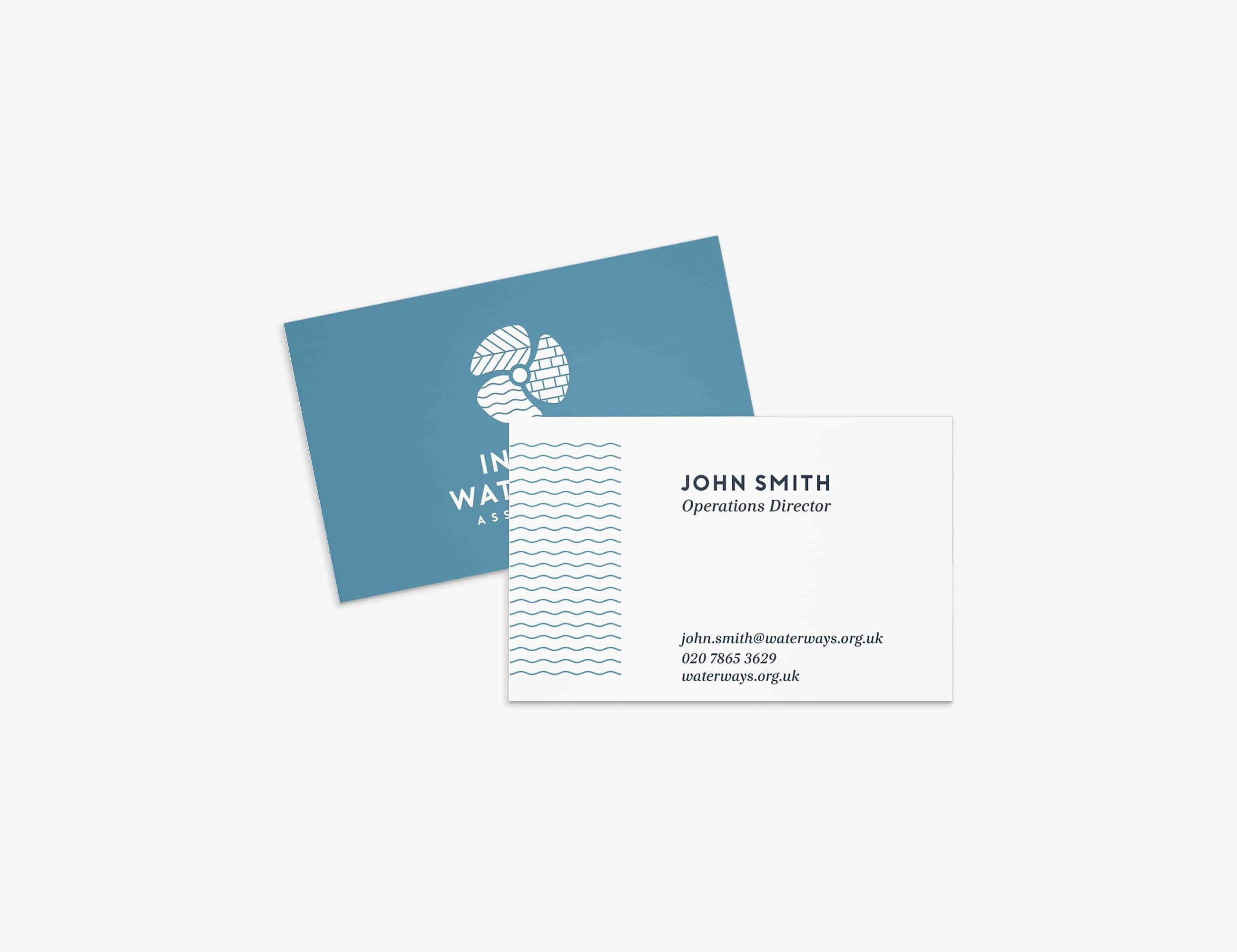
The new positioning, Setting the course for Britain’s waterways, became a rallying call that every volunteer, campaigner and supporter could stand behind. That idea informed every part of the visual language. A propeller-inspired marque symbolised momentum, driven by the people at its centre, while three distinctive graphic patterns represented the breadth of the waterways: nature, heritage and leisure. Combined with a brighter, more confident colour palette and bespoke typography, the system gave IWA a recognisable identity that could flex across local branches, national campaigns, clothing, vehicles, publications and events without losing consistency.
Impact
More than a visual refresh, the project gave the Inland Waterways Association a renewed sense of unity. Local branches, volunteers and campaign teams finally had a shared identity that reflected the scale of the organisation and the ambition of its mission.
The brand continues to support IWA’s campaigning today, providing a consistent foundation for fundraising, advocacy and volunteer engagement while helping the charity speak with one voice across Britain’s waterways.