February 12th, 2017
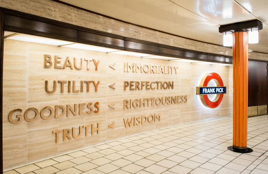
At the end of 2016 a memorial to Frank Pick at London’s Piccadilly Circus station by Langlands & Bell was unveiled. So, we felt it was quite fitting to have our say on what we believe to be one of the Great British Brands – London Underground.
London Underground is a significant London icon of global recognition. It is both visually renowned and followed, mimicked and revered for its innovation in construction and service throughout the world. It sees and services 3.5 million passenger journeys a day, makes over £5 million every year from merchandise aifrlone and carries more people during the week than all of Britain’s other trains put together. And as part of TfL, London Underground is one of London’s largest landlords.
Since its inception in 1863, where 40,000 people turned out to witness and take the journey, via early steam trains from Paddington to Farringdon, the Underground has seen London through it all. It famously became an air raid shelter during WW2 and has suffered through tragedies such as the King’s Cross fire and the 7/7 bombings. It has carried and seen all sorts of people from all sorts of places. It is part of our daily lives; to service our journeys to work, to socialise or to see different parts of the capital. It has always had, and needed, a strong identity and brand – a strong way to communicate with its customers so they can stay informed, serviced, excited and, most importantly, safe.
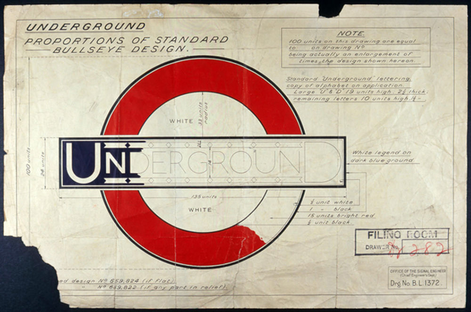
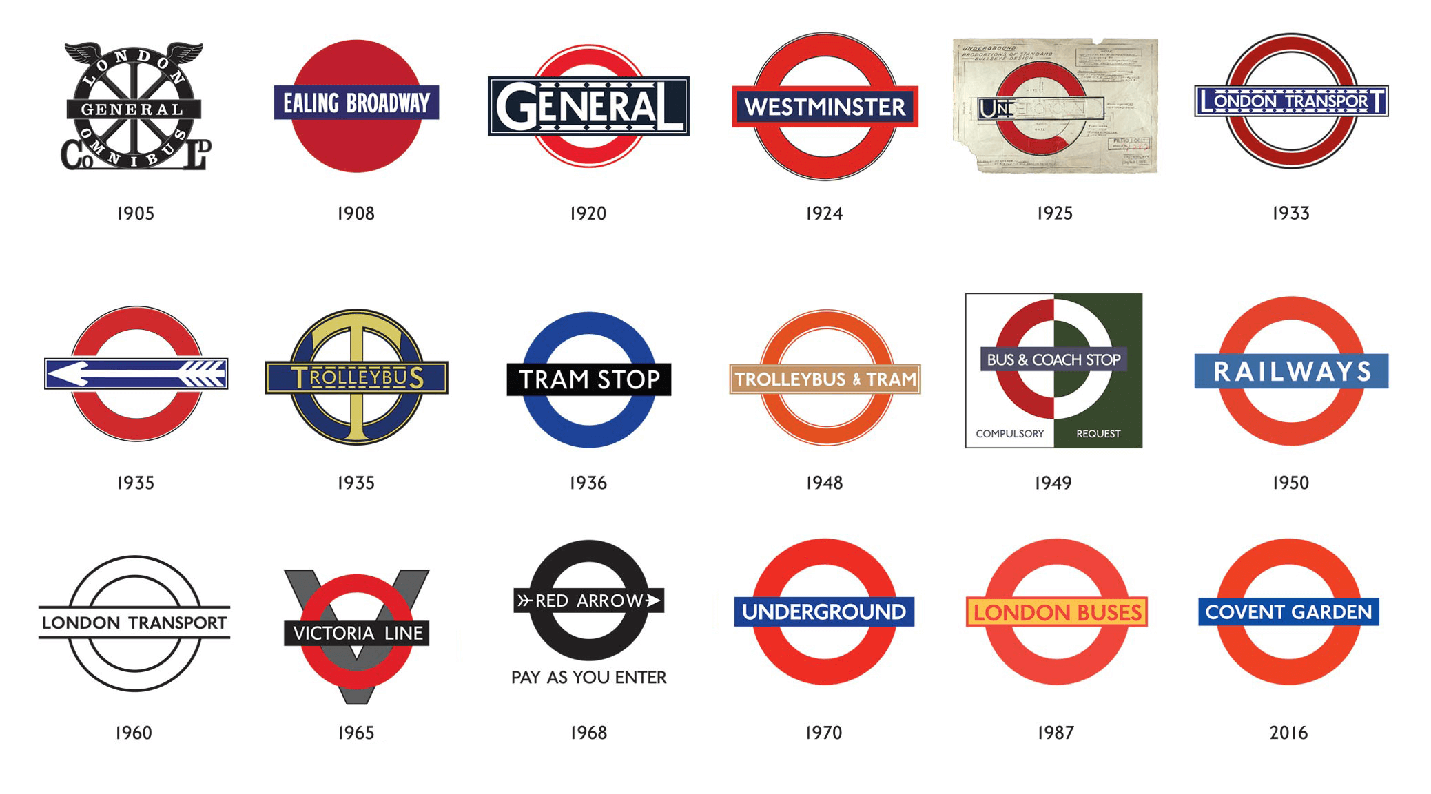
The roundel of the Underground’s infamous logo first surfaced in 1908 on platforms across London. The graphic device of the blue bar sat over a full red circle gave prominence to the name of the station, and helped commuters distinguish it from commercial advertising, other signage and the noise of the city.
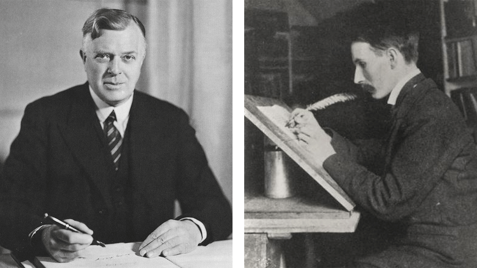
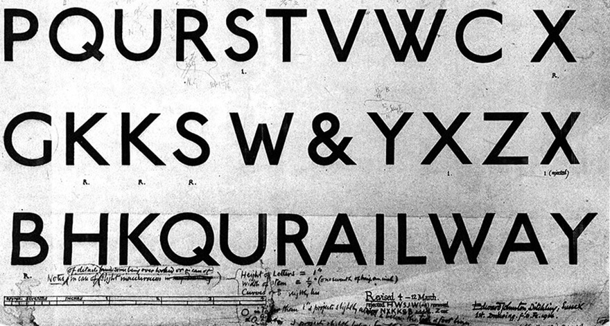
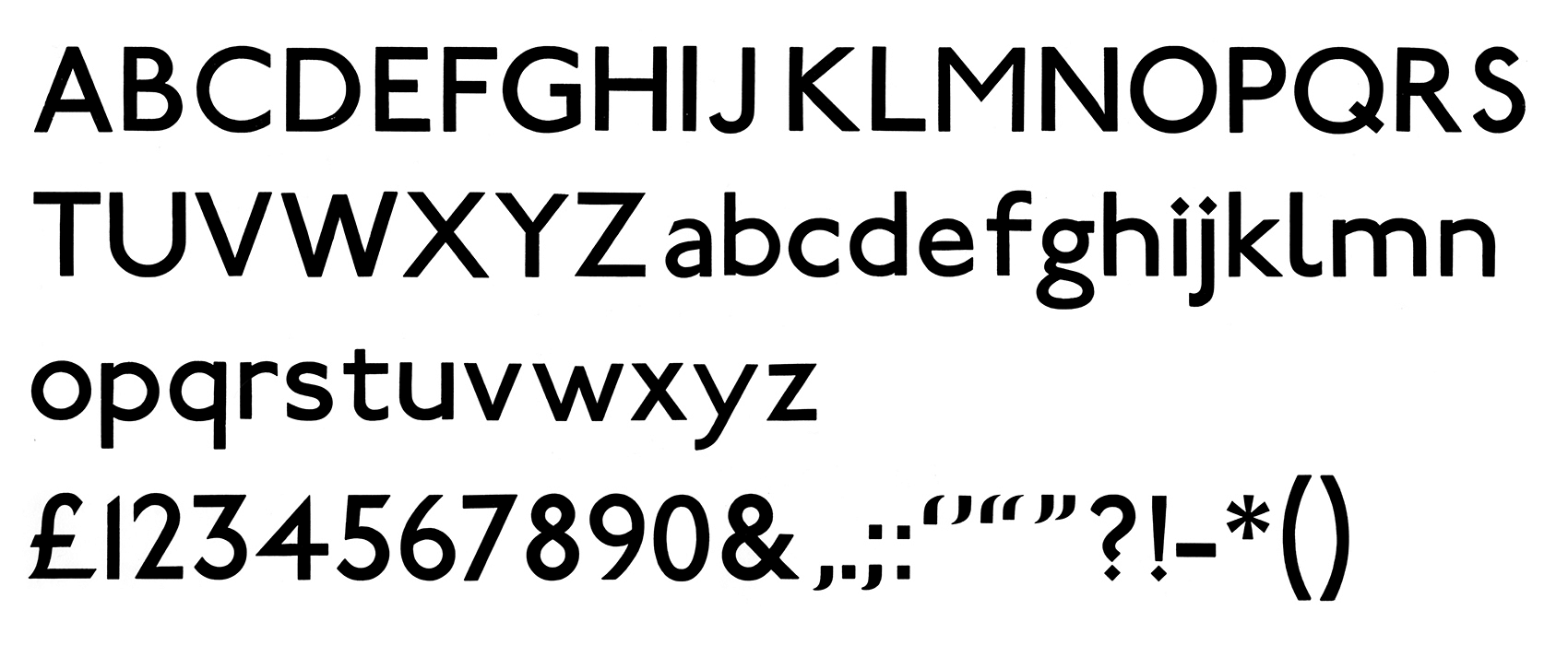
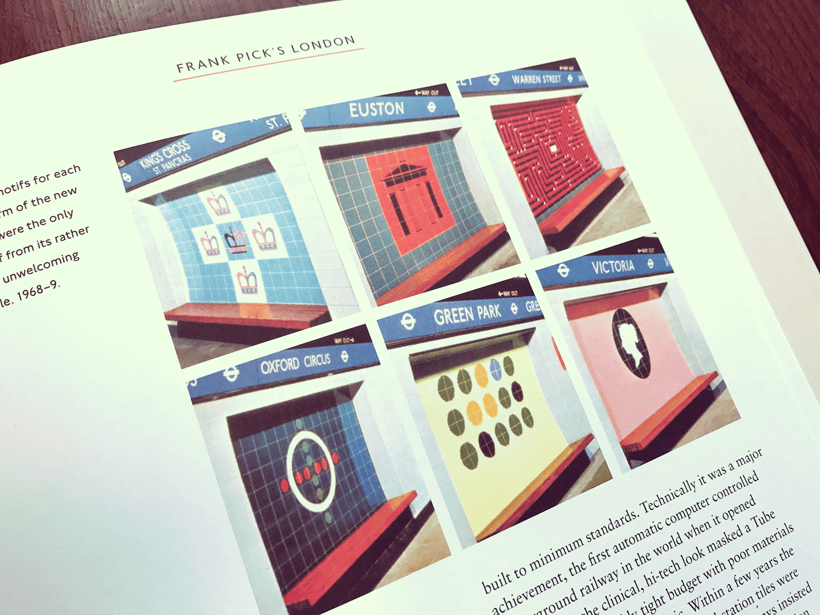
In 1913, publicity manager Frank Pick, commissioned typographer and calligrapher Edward Johnston to design a custom, company typeface. The brief was to create: “the bold simplicity of the authentic lettering of the finest periods”, while “belonging unmistakably to the 20th century”. By 1917, the roundel was developed to suit and incorporate the new typography. The solid red disc became a circle, and the new logo was registered as a trademark.

Pick didn’t stop there, through his constant revisions and frustrations of the map, he finally appointed Harry Beck to create the map that is today celebrated as a masterpiece of graphic design and emulated all over the world.
Surprisingly, Beck wasn’t even a graphic designer, he was an electrical draughtsman. In 1931 he created a new style map. Basing his design on an electrical circuit board, Beck painstakingly refined the whole idea of the map down to its primary purpose – to clearly signpost direction of the lines rather than true geographic locations.


The Underground is also home to one of the world’s largest ad spaces – both in the stations and on trains – and it is utilised by London Underground as well as thousands of other brands from around the globe. The average dwell time is about three minutes on the platform, engaging with cross track adverts, and 13 minutes absorbing adverts inside the Tube carriages. Underground users are six times more likely to recall adverts with a 79% response rate, which is now said to grow due to internet accessibility.
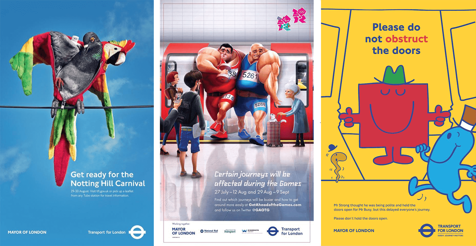
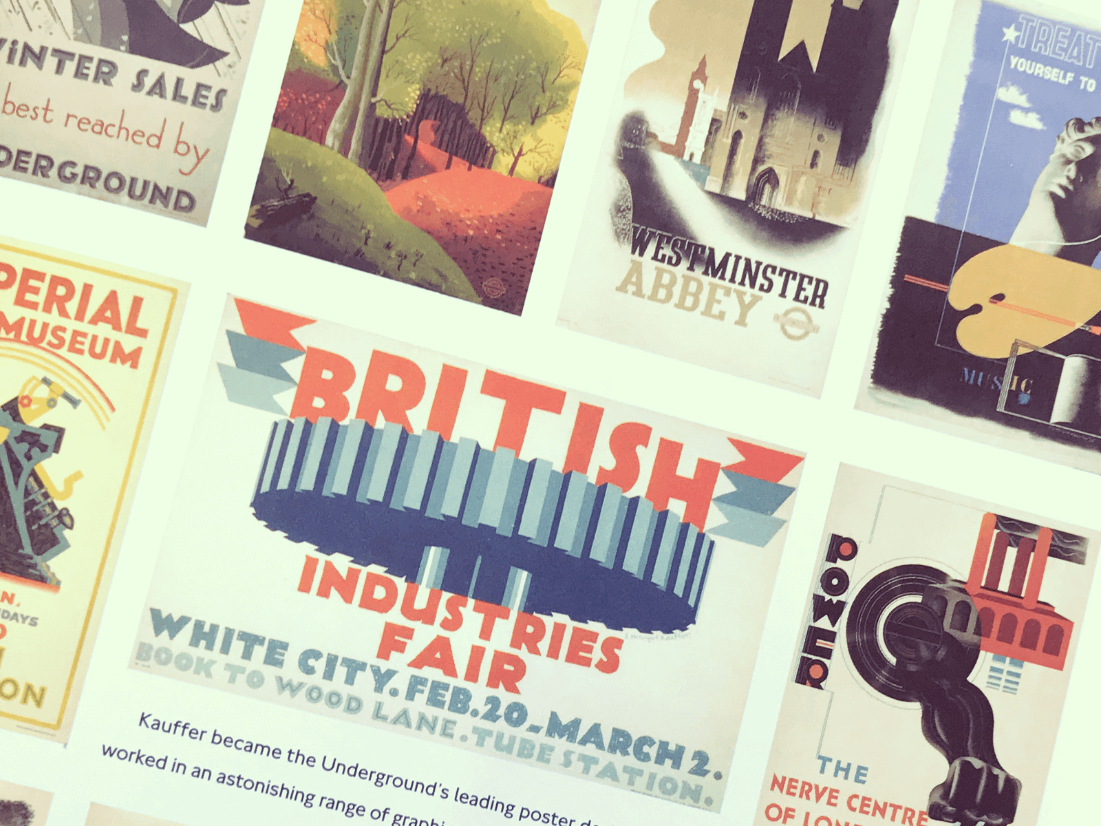
London Underground’s (and TFL’s) advertising has seen an array of ideas, styles and artists printed and billed on its walls through the years, and has always embraced technology in digital, targeted (timed) advertising. It has introduced online accessibility at stations, as well as experiential innovations along its walkways. Whether they advertise announcements, promotions, updates or exhibitions, they have always championed different artists, designers and collaborators with new ideas to carry their serious, but playful, tone of voice and message. Under the initial guidance of Pick, London Underground’s visual identity and communication adorned a style that continues to influence design and ideas in other brands.

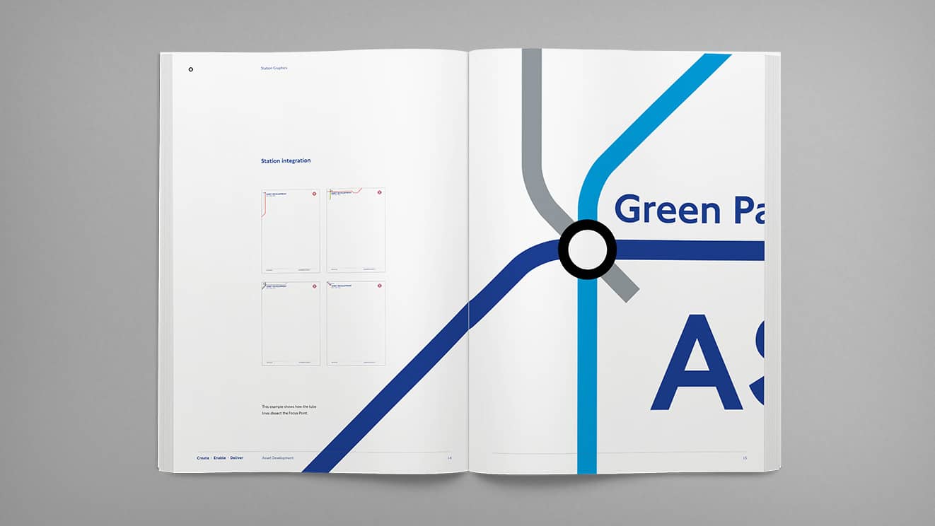
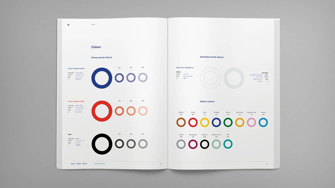
In working with the London Underground and TfL, on the Asset Development brand identity project, we got to work with and use the London Underground brand and design guidelines. Some of the most comprehensive guidelines you’ll see. Guidelines that are protected and strictly adhered too. We couldn’t have been happier to oblige. It was a privilege, to say the least, to be working with assets created through the vision of Pick, Beck and Johnston. That was the mark of a great brand for me, because although certain things have evolved over the years such as the map or the Johnston typeface, in believing in the brand guidelines it has held the same concept of a logo since the 30s and hasn’t had to completely rebrand because of the brand’s power, recognition and what it represents to millions of people all over the world. It is a visual identity that has already stood to test of time and will continue to for years to come.
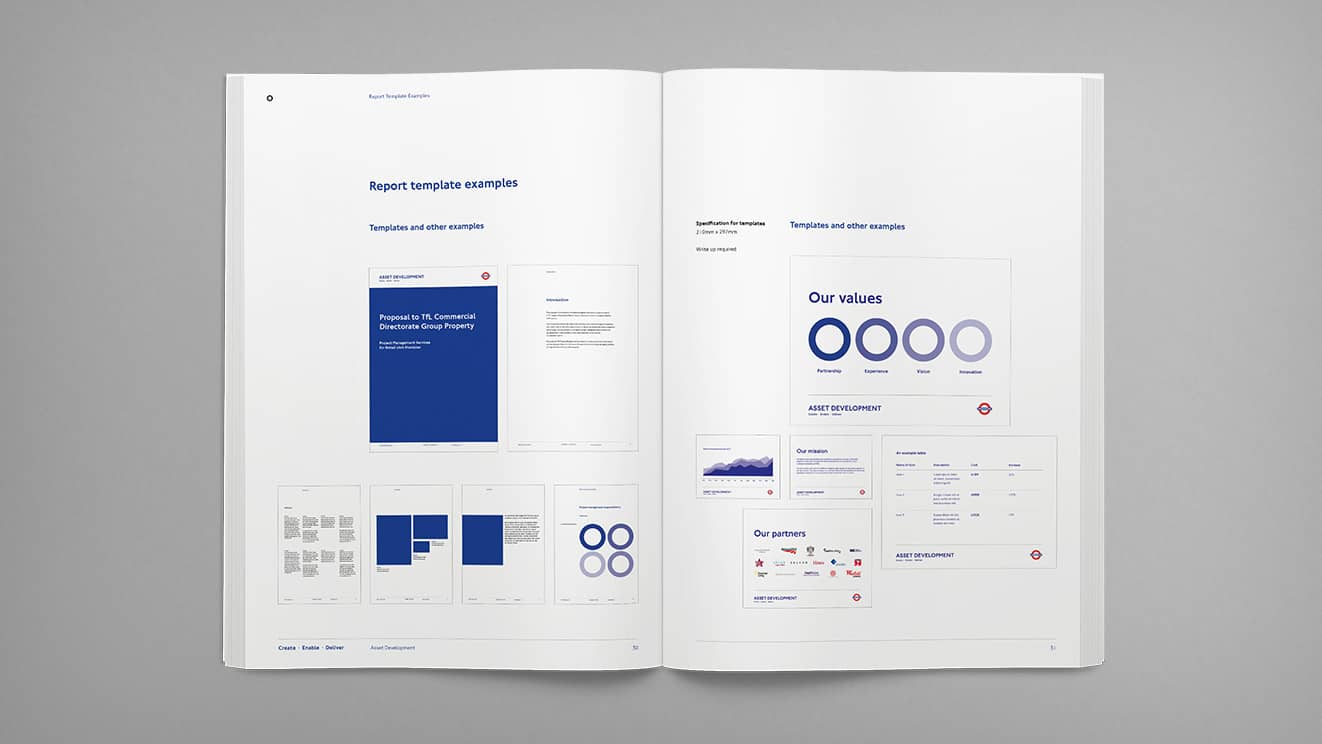
Asset Development guidelines that we worked on, maintaining the LU and TFL branding
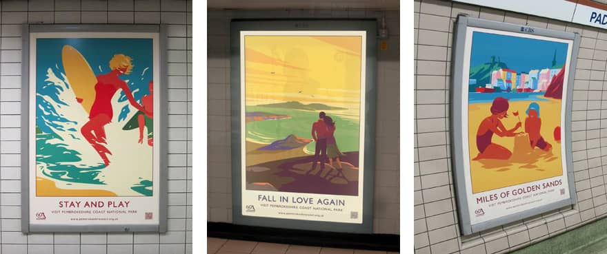
We’ve also had the pleasure to work on campaigns for a variety of clients to be placed on the Underground adspace and they by far have been our most successful. Our most ‘famous’ being the Pembrokeshire Coast National Park Summer and Autumn campaigns we created a few years back. A campaign we felt, through its notoriety, has gone on to inspire similar style campaigns, as we were inspired by yesteryear rail and Underground advertising in our approach.
Aside from aesthetics, what makes London Underground the Great British Brand I believe it to be today is what it represents in my eyes as a British civilian: diversity. Whilst the brand follows a strong, unwavering path, it is open enough to let the world in. From the range of marketing that runs through its stations and tube trains, to the people that service and use the service, it is a global brand that celebrates the past, present and future, through all walks of life – which I consider to be British values.
As a daily commuter on the tube, I take the short journey from Vauxhall to Oxford Circus. And in that four stop ride, in the 20 minutes from when I head down the stairs at Vauxhall tube station and then up again at Oxford Street exit 1, I see and hear a glimpse of the world, and it’s in the people and the brands that use London Underground as part of their everyday. In the staff I see and hear the over-excited American conductor at Victoria, the elderly Asian voice at Vauxhall and the Punk rocker (and his immense Mohawk) at Oxford Circus. In the commuters and tourists, I see and hear people taking the time to relax, reflect, think, converse or connect, alone and/or with each other. And in its advertising and design I see the expressions from thousands of brands and people behind those brands trying to connect with their audiences – from the desperately mundane to the weird and wonderful, from the crass and crowded to the beautiful sculpted.
The London Underground is an ambassador for the city as it reflects so many of the same ethics. The Underground is an advertisement in itself for London and all that happens within it. It’s all-inclusive and epitomises why I love London and call it my home. That’s why I believe London Underground is one of the Great British Brands, if not one of the world’s.
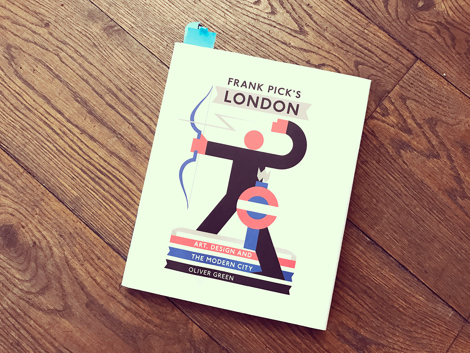
Frank Pick’s London: Art, Design and the Modern City by Oliver Green. Buy it!
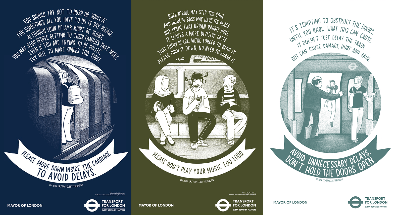
My absolute favourite, from one of my favourite artists, McBess, The Travel Better campaign.

 P.S Here’s something for your ride home 150 fascinating facts about the tube. You’re welcome.


