arrow-circle arrow-down-basicarrow-down arrow-left-small-white arrow-left-small arrow-left arrow-right-small-white arrow-right-small arrow-right-white arrow-right arrow-up arrow closefacebook instagram linkedin new-tab pinterest quote search tick-small tick twitter whatsapp video-icon

Hever Castle & Gardens brand identity

Creating an experience to remember.

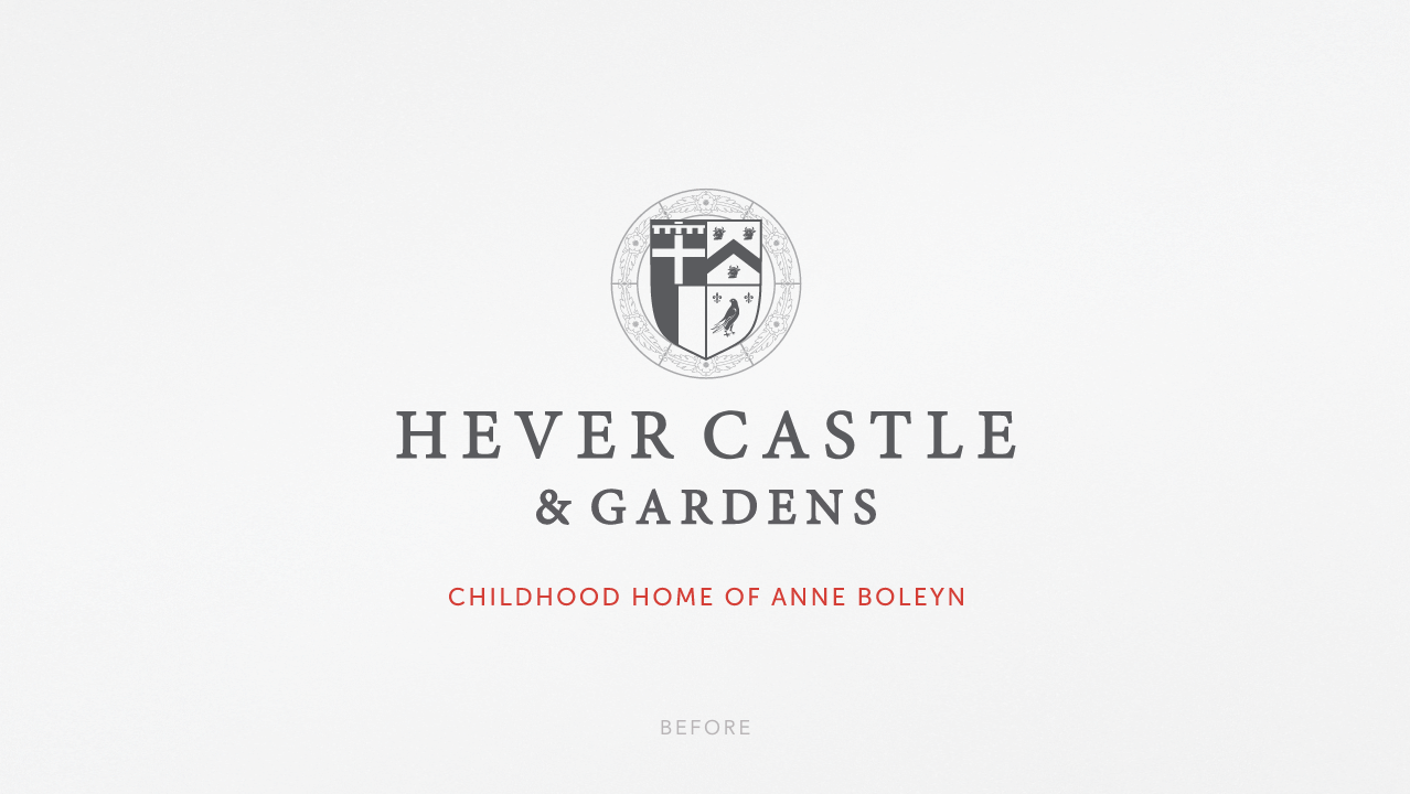
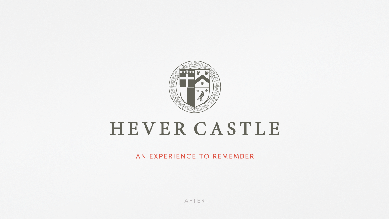
Moving on from 'Childhood Home of Anne Boleyn' to an experience to remember.

For generations, Hever Castle was known as the childhood home of Anne Boleyn. That history remains one of its greatest assets, but it had also become a limitation. Visitors were arriving for far more than Tudor history. Award-winning gardens, luxury accommodation, golf, wellbeing experiences, family events and seasonal attractions had transformed the estate into one of the country’s most diverse visitor destinations. The brand, however, was still telling yesterday’s story.

Our brief was to create a unifying identity that celebrated every part of the estate without losing the heritage that made Hever so special.

Heartbeat
This wasn’t about replacing history. It was about giving it company. The new proposition, An experience to remember, shifted the conversation from where Hever had been to what visitors could experience today. That simple change allowed every part of the estate to sit beneath a single idea, whether someone was visiting the gardens, staying overnight, enjoying a spa treatment or spending the day with family.

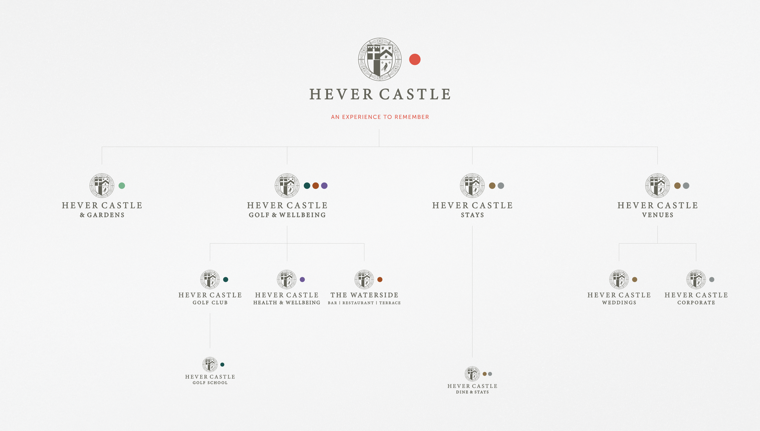
Rather than redesigning everything from scratch, we built a flexible brand system that could grow with the business. A distinctive framing device helped organise the expanding range of experiences, colour coding made different parts of the estate easier to navigate, and a refreshed icon set improved accessibility across signage and printed materials. Alongside this, illustration became a defining part of the identity, bringing imagination and storytelling to seasonal campaigns where photography alone couldn’t capture the atmosphere or magic of the experience. The result was a brand that felt unmistakably Hever while giving the marketing team the flexibility to communicate an increasingly diverse destination.

Impact
The refreshed identity unified a growing family of brands under one clear strategic direction, replacing fragmented communications with a consistent visual language that could be applied across advertising, visitor information, events, print and digital channels. It also laid the foundations for the wider Your Story Awaits destination campaign and the digital-first evolution of the estate, proving that heritage brands don’t need to choose between protecting their past and embracing their future.

Brand Identity

A brand evolution, not revolution.

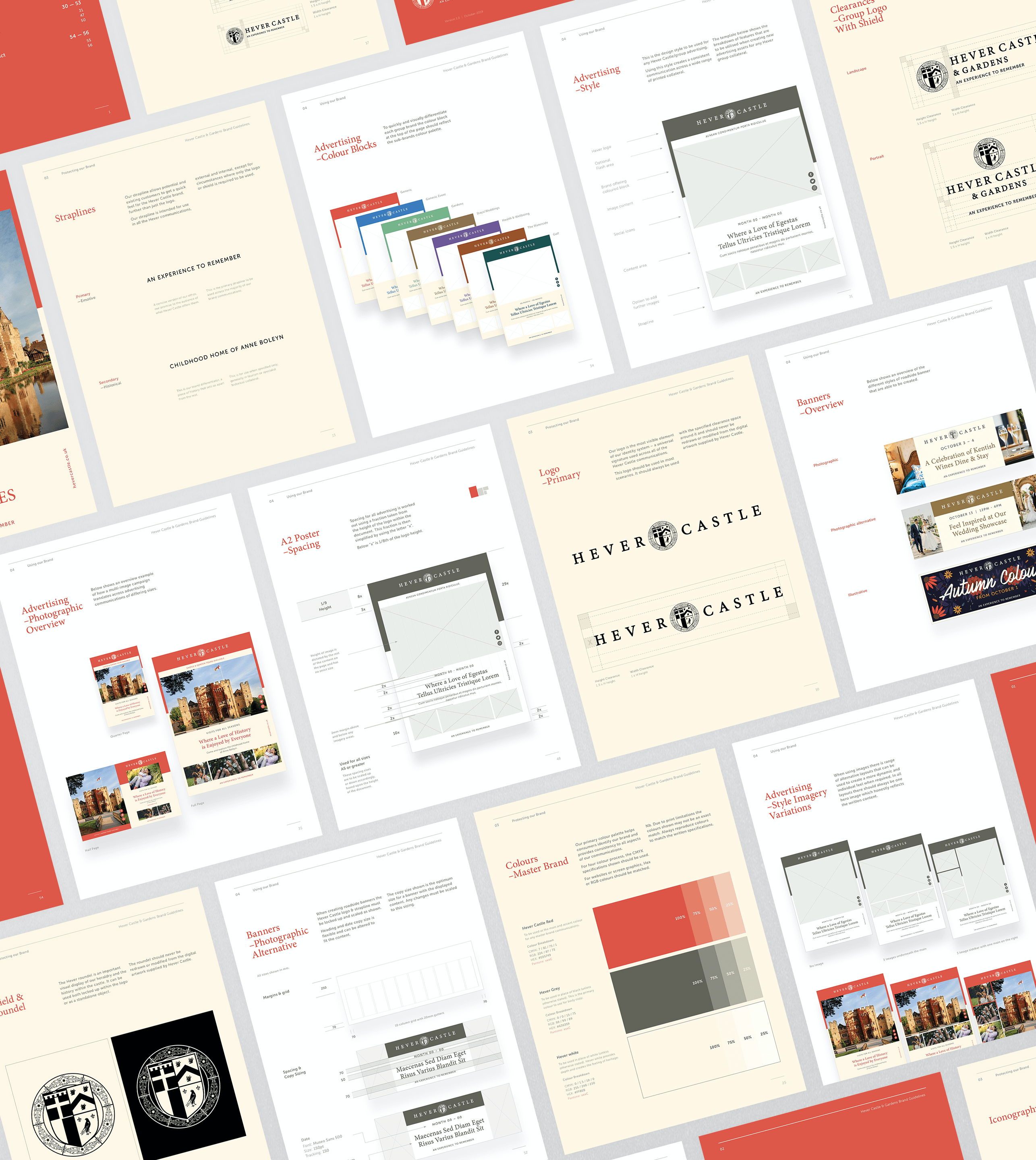
We addressed all of the areas of the brand that needed a review and set out the initial rules for the new guidelines document. This was around balancing an identity that was quite well-known, with a more well rounded, contemporary vision.
The aim was to create a framework that was simple in its approach, allowing the content to differ and sing out from the unified foundations of the design, using as few elements as possible.

Framing the content.

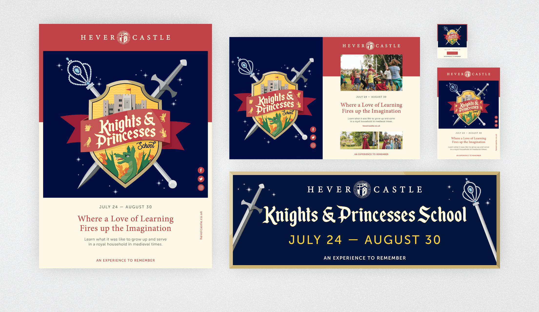
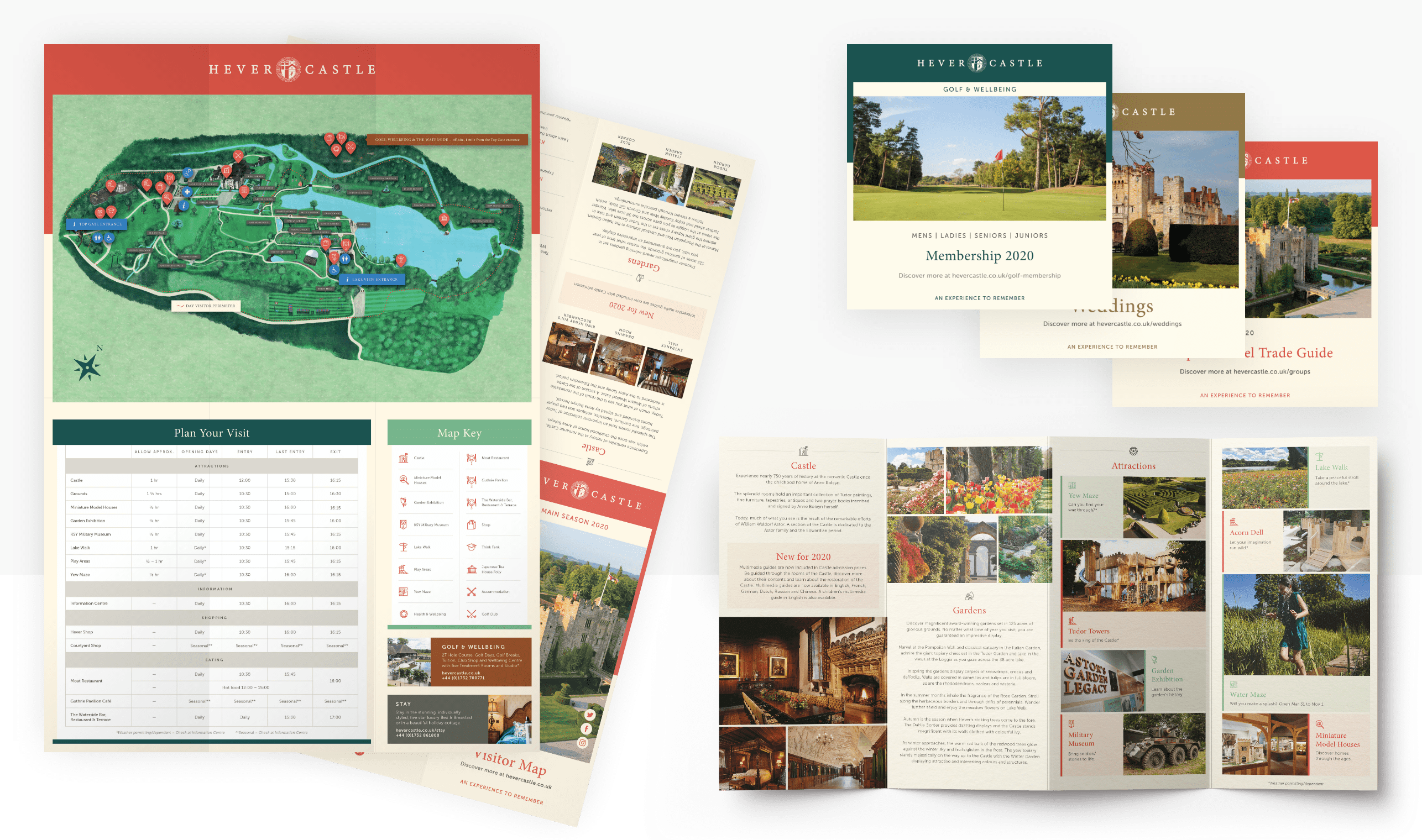
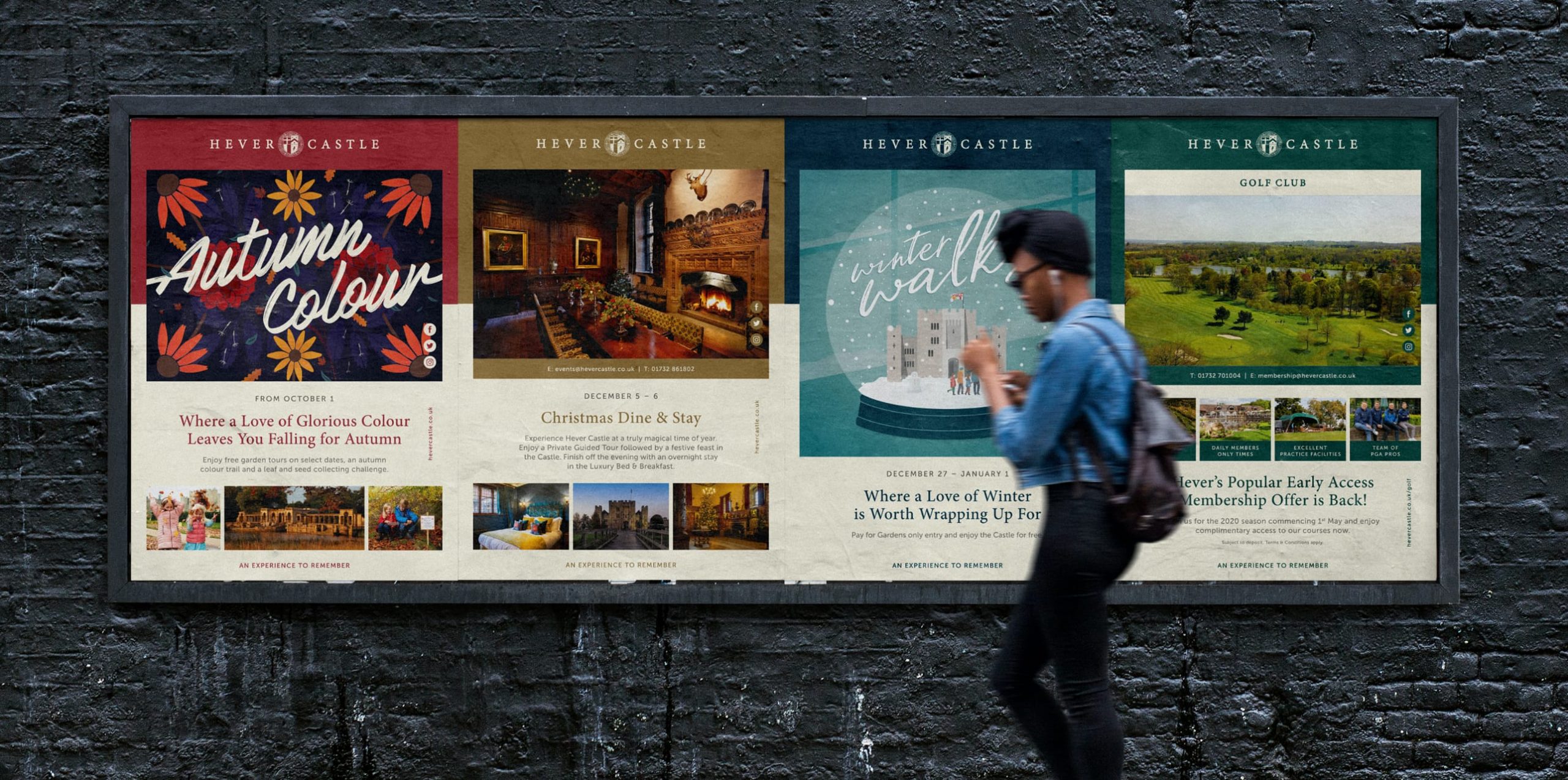
With the goal of making Hever a truly unique place to visit, and harnessing the idea of ‘An experience to remember’ with all of the different offerings, it was important to visually differentiate each from one another so that visitors quickly understood what they were being met with and where they could find it. Utilising a simple framing system coupled with the Hever brand family colour palette meant that whether it’s a row of posters, a grid of leaflets or a section of the website, the audience could begin to recognise each service and pick out which is most relevant to them at any time.

Refining the iconography.

Offering something for everyone, Hever receives a widely diverse range of visitors daily. Attracting people of all ages, and from many different countries, iconography plays a hugely important role when it comes to accessibility of the estate and helping people to find their way around the grounds as easily as possible. With an existing set of icons already in use, the aim here was not to ‘reinvent the wheel’, but instead simplify, stylise and expand the set to create a cohesive palette of icons that work at both the largest and the smallest of sizes, across a range of marketing and comms material.

Illustrating the magic.

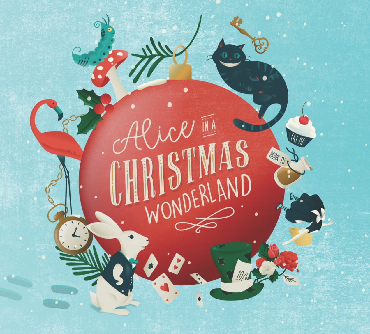
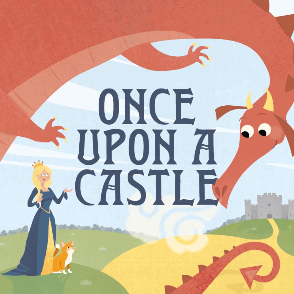
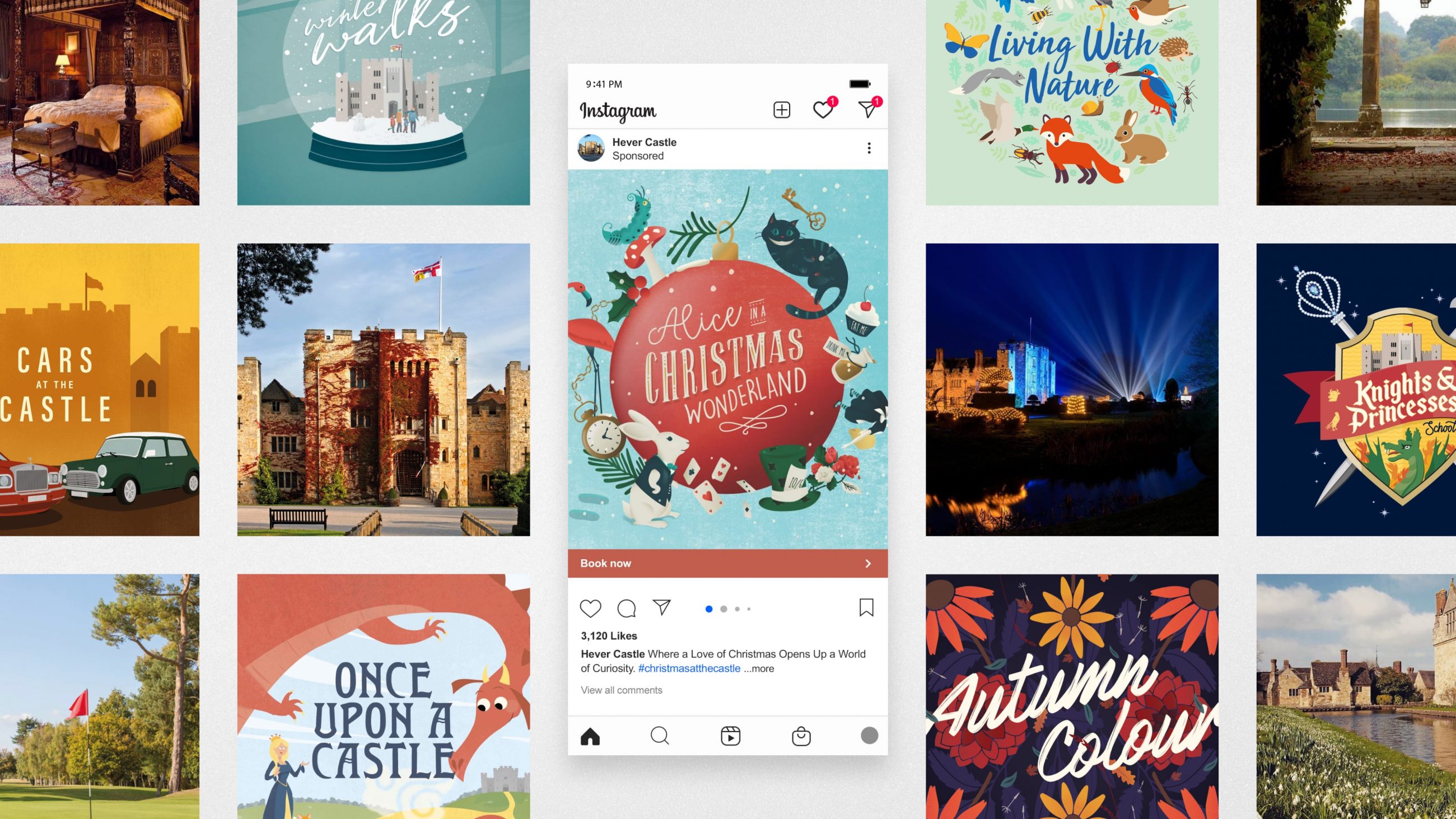
Throughout the year Hever Castle puts on a wide variety of different events to attract, educate and amaze visitors. When it comes to advertising the events, it can be a challenge to represent the event in its entirety. We introduced illustration to capture imaginations and a narrative for the event. Mixing illustration with typographic event titles has become a major part of the brand identity. By using different styles within a branded template, we’re able to vividly depict events when imagery is not available or struggles to portray the emotions, senses or magic within.

An adaptive grid system to focus on the visuals.

It’s no secret that a picture is worth a thousand words, so when it comes to advertising Hever Castle, why not use that to our advantage?

With such a diverse range of visitors, imagery; be it photography, illustration or even a mixture of both, is the quickest way to describe exactly what is on offer at the castle at any time. All collateral, whether it’s A2 posters and banners or quarter size press ads and email assets, feature around two-thirds imagery to one-third copy and each will lead with a bold hero image.
Bringing the Brand to Life

Translating new rules into modern, functional designs.

Having laid out the full set of ground rules, our final task was to combine the new palette of brand assets across the most widely used collateral. This allowed the identity system to be properly stress tested in a variety of “worst-case” scenarios before rolling out across the full range of Hever Castle branded items.
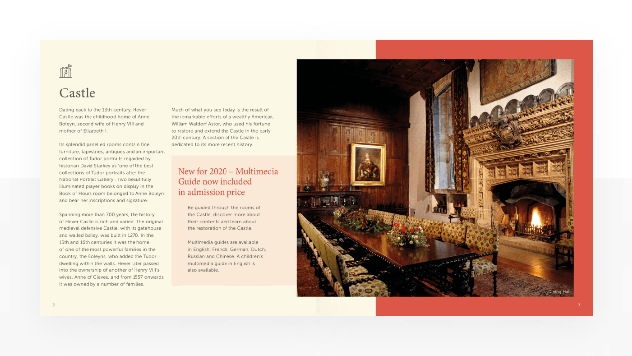
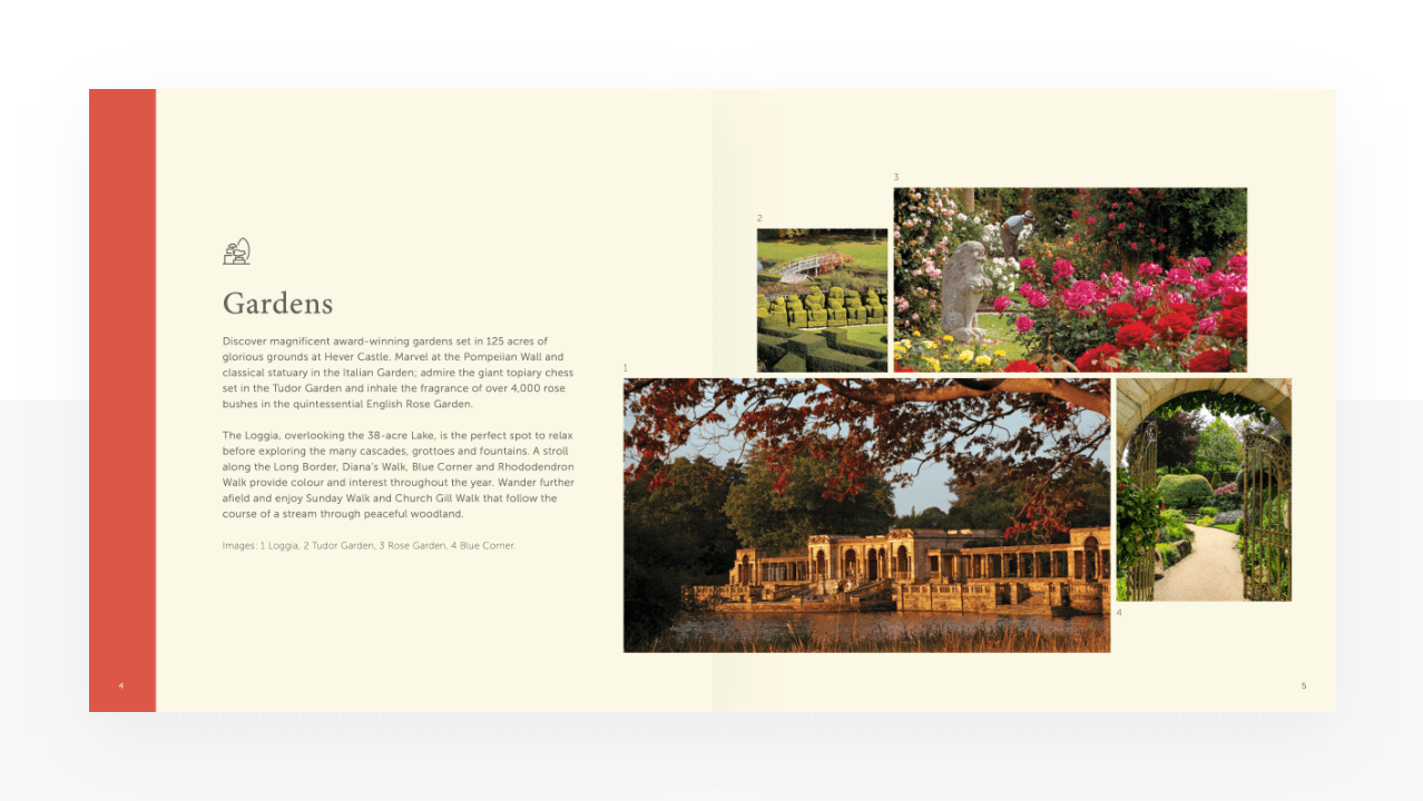
All of the new pieces of collateral weigh heavily towards images and visuals rather than larger areas of copy. These have all been given plenty of white space, allowing the content to breathe, in turn making it easier to digest for the viewer. This has been coupled with clear colour blocking, aimed to quickly indicate which of the brand offering is being referred to, even if multiple feature at the same time.

Trouble finding
your heart?