The Heartbeat
Escapism through the concourses of London
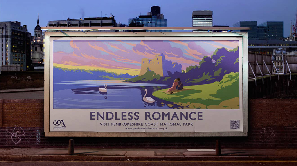
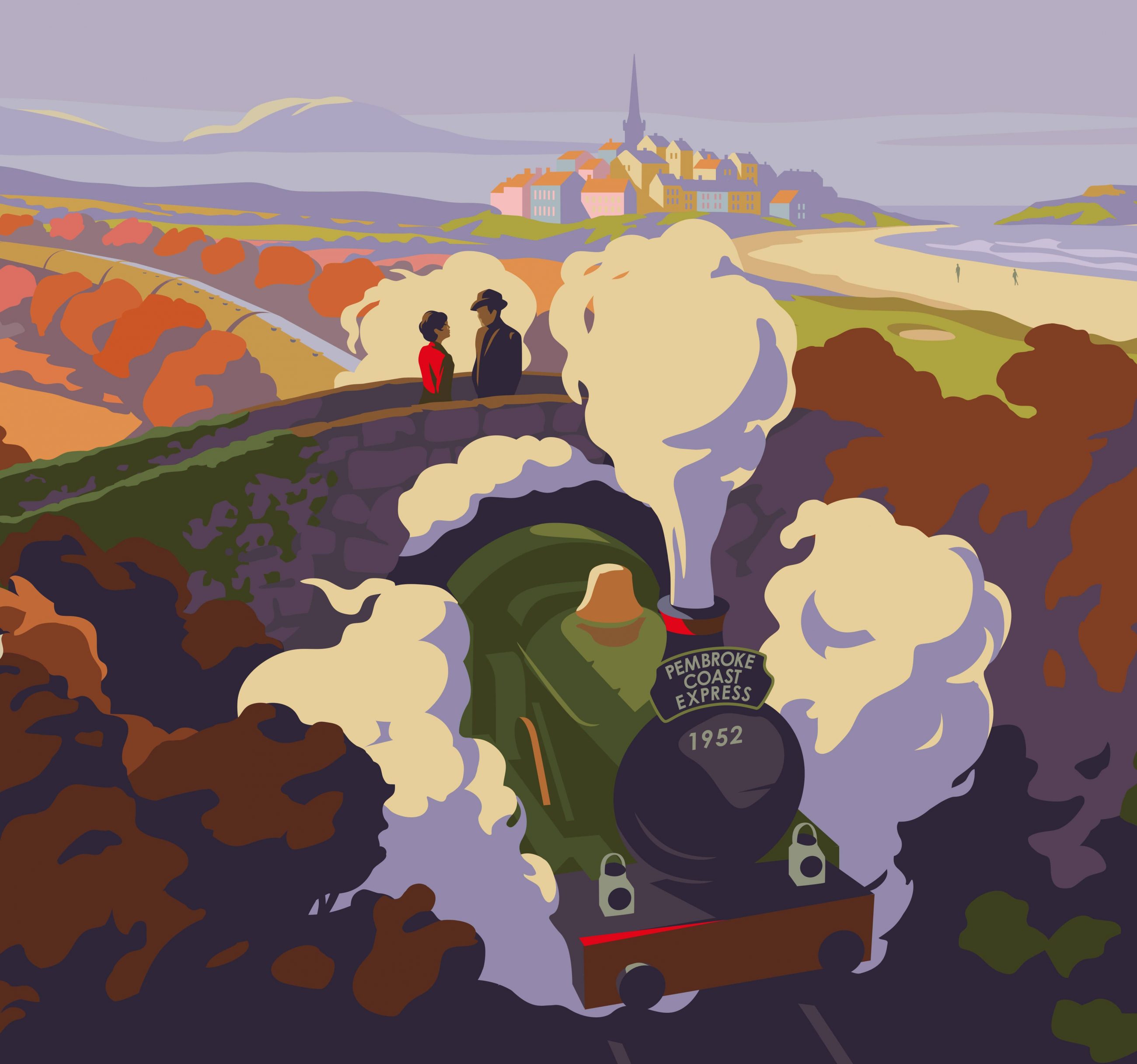
The inspiration behind the campaign was the style of the travel posters from the 1960s. The beautiful, vibrant colours and simple sans-serif typography produced visually striking posters. The vintage style illustration, combined with emotive copy lines, communicated with the target audience on a nostalgic level, capturing the spirit and feel of the area and escapism from the busy city.
‘Escapism’ was key to our strategic thinking, so we decided to show the escape route – to use London as an advertising hub and then plant the ads from the Underground, along the mainline rail, all the way to Pembrokeshire, leading the way. The style of illustration helped us to display windows into that escape and helped transport people to the location by utilising a sense of nostalgia. We wanted to lift spirits and associate ‘a better time’ with Pembrokeshire Coast National Park.