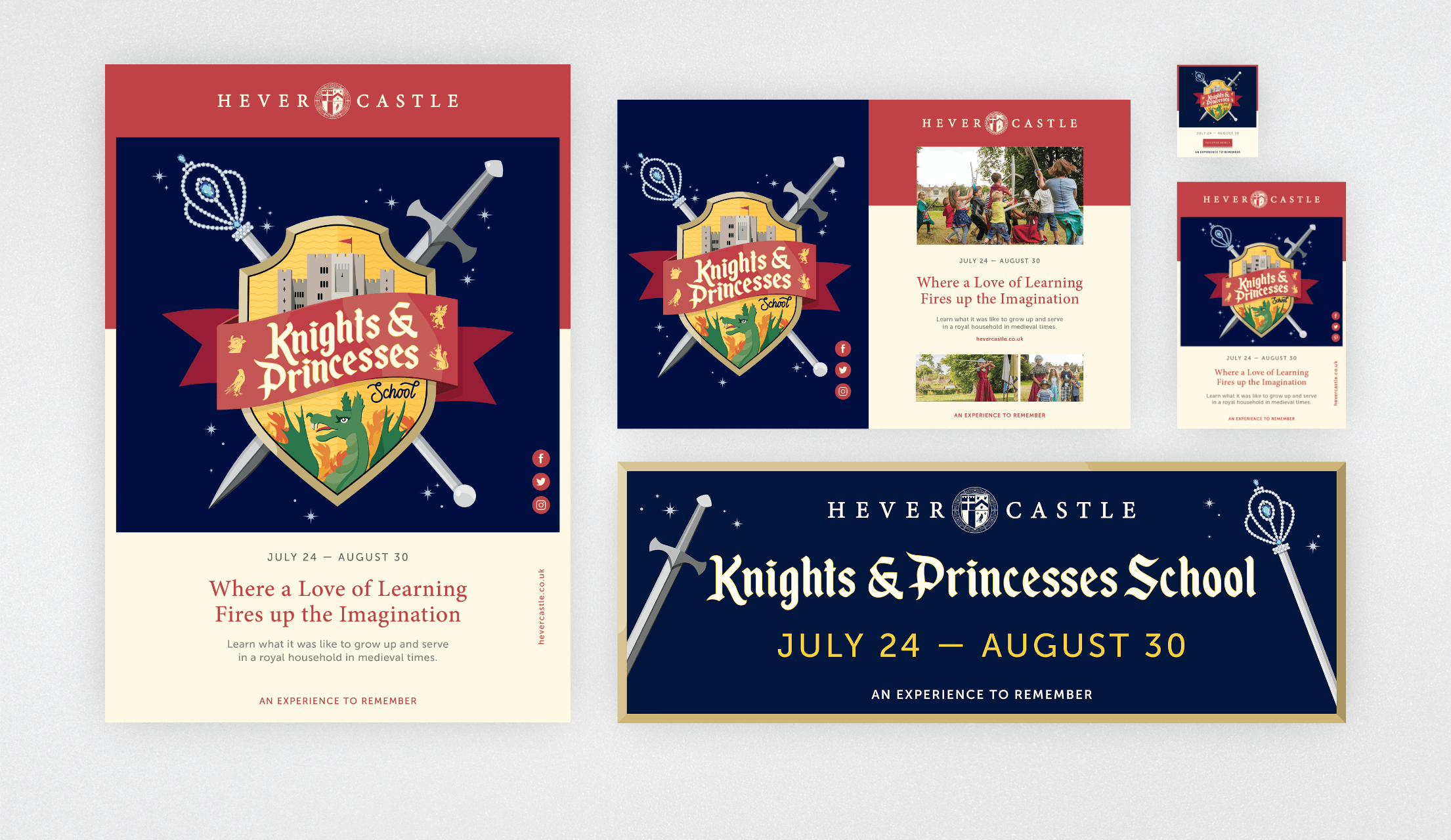
arrow-down arrow-left arrow-left2 arrow-right Arrow-Left arrow-up Circlecreative-brief Facebook instagram linkedin locationplay twitter

Project

Hever Castle & Gardens Brand Identity

Client

Hever Castle

Creating an experience to remember.

Nestled in the idyllic Kent countryside, less than an hour from London, Hever Castle is widely recognised as the childhood home of Anne Boleyn. With a wealth of history dating as far back as 1270, today the goal is to conserve and improve the estate whilst maintaining integrity, and making its important history available to inform and educate. Unlike centuries before, the castle is not just for royalty or nobility, but instead boasts something for everyone, offering a truly unique place to visit, stay, work and experience.
Having built a strong relationship with the team at Hever Castle since undertaking their first rebrand and website design project, the time came to re-evaluate and re-align the brand proposition and identity. With the brand expanding its experiences and services, it was felt that the current strapline of ‘Childhood Home of Anne Boleyn’, though powerful, was creating a glass ceiling in terms of the business and how it communicated with its audience. The same was felt for the brand identity, steeped in history and tradition, it needed a review and refresh in order to become a bit more youthful and contemporary to meet the expectation of the brand, its direction and the expectations of its audience.
Swipe

Redefining the Brand

Moving on from 'Childhood Home of Anne Boleyn'.

With the range moving beyond the castle, gardens and attractions into wellbeing and luxury stays, along with unifying the brand with the golf club, we positioned the brand to be more about experience rather than history. We wanted to focus the brand on the audience rather than the wealth of history bestowed on the grounds. Hever Castle & Gardens and the wider brand hierarchy is about creating escape and experience. To create memories. The first thing we did was to create a strapline that would sit above all segmentations of the business and ring true in each. “An experience to remember” was created to do just that.

The next part of the branding project was to create a brand identity and guidelines that could easily explain that narrative as well as unify the brand as one, whereas before they would be treated as different brands entirely. We’ve been fortunate enough to work on a vast amount of varying briefs for Hever Castle, so knew how we had to encapsulate the positioning through all marketing and communication.

Part of our own brief we set ourselves was to create a brand mechanic that people would remember, creating ‘epic’ visuals, whether photography or illustration, so people could let their imagination run away with them, whether they were picturing the adventures with family at the grounds, a nice relaxing afternoon at the spa, or a round of golf with friends.

Swipe
Swipe
Swipe

Brand Identity

A brand evolution, not revolution.

We addressed all of the areas of the brand that needed a review and set out the initial rules for the new guidelines document. This was around balancing an identity that was quite well-known, with a more well rounded, contemporary vision.
The aim was to create a framework that was simple in its approach, allowing the content to differ and sing out from the unified foundations of the design, using as few elements as possible.
Swipe

Framing the content.

With the goal of making Hever a truly unique place to visit, and harnessing the idea of ‘An experience to remember’ with all of the different offerings, it was important to visually differentiate each from one another so that visitors quickly understood what they were being met with and where they could find it. Utilising a simple framing system coupled with the Hever brand family colour palette meant that whether it’s a row of posters, a grid of leaflets or a section of the website, the audience could begin to recognise each service and pick out which is most relevant to them at any time.

Refining the iconography.

Offering something for everyone, Hever receives a widely diverse range of visitors daily. Attracting people of all ages, and from many different countries, iconography plays a hugely important role when it comes to accessibility of the estate and helping people to find their way around the grounds as easily as possible. With an existing set of icons already in use, the aim here was not to ‘reinvent the wheel’, but instead simplify, stylise and expand the set to create a cohesive palette of icons that work at both the largest and the smallest of sizes, across a range of marketing and comms material.

Illustrating the magic.

Throughout the year Hever Castle puts on a wide variety of different events to attract, educate and amaze visitors. When it comes to advertising the events, it can be a challenge to represent the event in its entirety. We introduced illustration to capture imaginations and a narrative for the event. Mixing illustration with typographic event titles has become a major part of the brand identity. By using different styles within a branded template, we’re able to vividly depict events when imagery is not available or struggles to portray the emotions, senses or magic within.

An adaptive grid system to focus on the visuals.

It’s no secret that a picture is worth a thousand words, so when it comes to advertising Hever Castle, why not use that to our advantage?

With such a diverse range of visitors, imagery; be it photography, illustration or even a mixture of both, is the quickest way to describe exactly what is on offer at the castle at any time. All collateral, whether it’s A2 posters and banners or quarter size press ads and email assets, feature around two-thirds imagery to one-third copy and each will lead with a bold hero image.

Bringing the Brand to Life

Translating new rules into modern, functional designs.

Having laid out the full set of ground rules, our final task was to combine the new palette of brand assets across the most widely used collateral. This allowed the identity system to be properly stress tested in a variety of “worst-case” scenarios before rolling out across the full range of Hever Castle branded items.
All of the new pieces of collateral weigh heavily towards images and visuals rather than larger areas of copy. These have all been given plenty of white space, allowing the content to breathe, in turn making it easier to digest for the viewer. This has been coupled with clear colour blocking, aimed to quickly indicate which of the brand offering is being referred to, even if multiple feature at the same time.
Swipe

Results

The new brand look-and-feel has reflected the development within the Hever Castle estate and firmly brought its identity back into the modern day. The new range of assets have given the brand a new lease of life and have managed to simplify the vast array of offerings so that any of the diverse audience who visit can quickly and easily understand what they are looking at or find what they are looking for.
All of this has been done without compromising the Castle’s rich history and integrity, whilst clearly showcasing its forward thinking and ever-growing offerings to the visitor. The forthcoming website looks to develop the brand identity further as we aim to create more of a digital-first brand mentality.

Related work

Vayyar

100 Reasons. One chip. Infinite impact.

No.1 Living

Start living life from the inside out...

PCNPA

Fall in love again with British escapes.

Macmillan Cancer Support

Be someone extraordinary for everyone living with cancer.

Macmillan Cancer Support

Where there's a will there's a way to help life live on.

Cawston Press

Real ingredients, remarkable taste.

Swipe

Do you have a project you’d like our help with?

Work with us