Quorso helps some of the world’s largest retailers uncover opportunities hidden within vast amounts of operational data. Every day, its AI identifies actions that can improve performance across thousands of stores, but insight only has value if people understand it, trust it and know what to do next.
Following our work on the Quorso rebrand, we were asked to redesign the platform experience. The challenge wasn’t adding more features. It was reducing complexity. Every interaction needed to help busy retail teams move confidently from insight to action.
The heartbeat
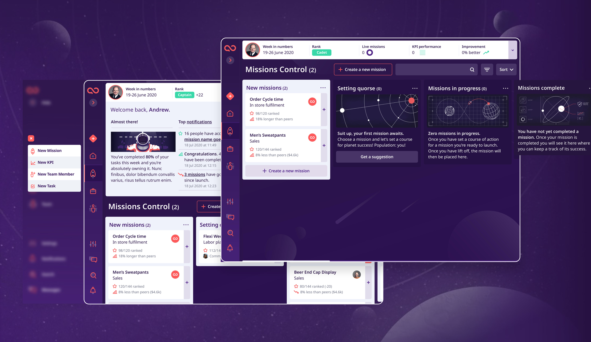
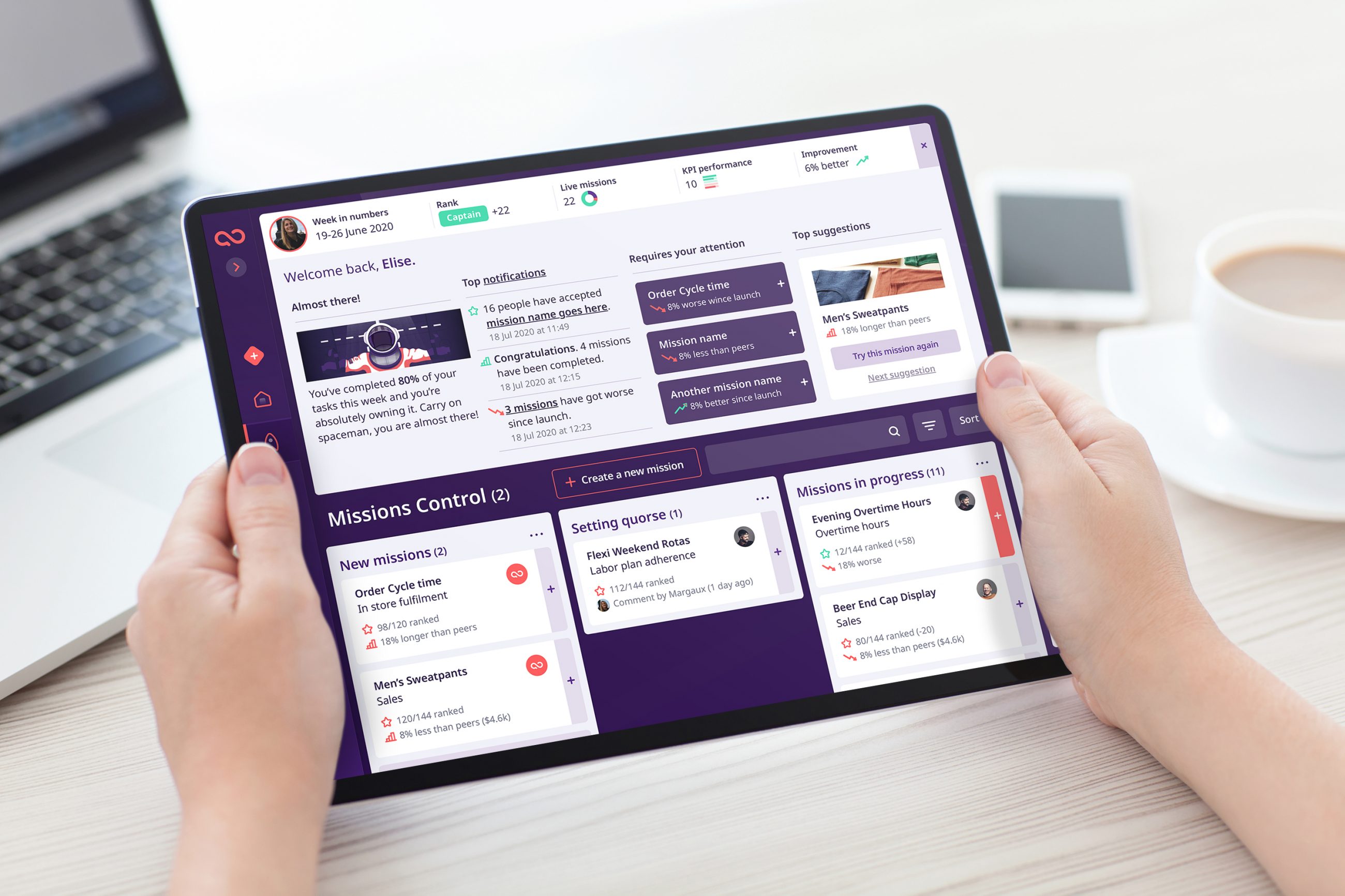
Working closely with the product team, we rethought how information was prioritised, grouped and surfaced throughout the platform. Complex datasets became simpler journeys. AI recommendations became clearer actions. Every screen was challenged against one question:
Does this help someone make a better decision, faster?
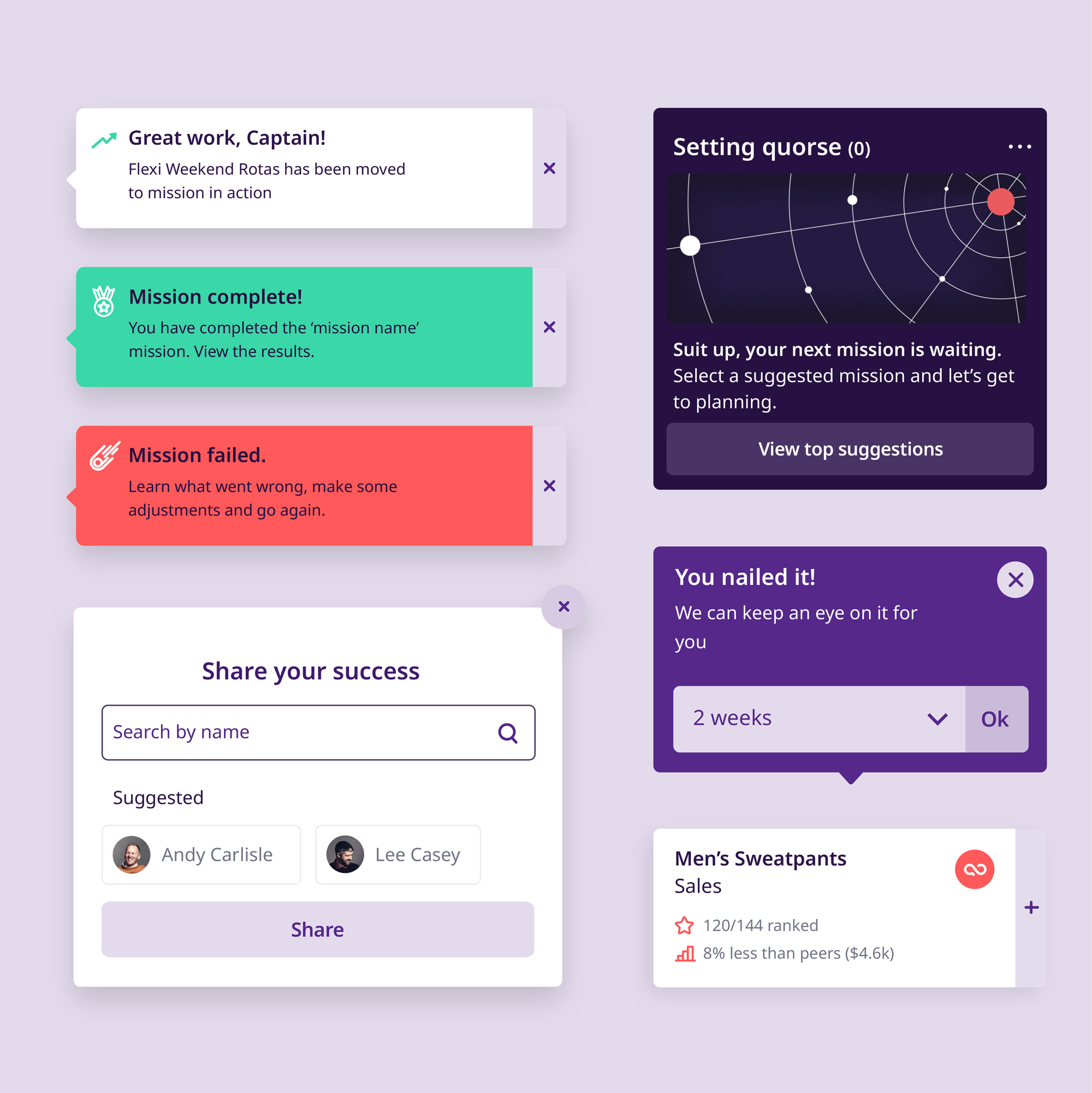
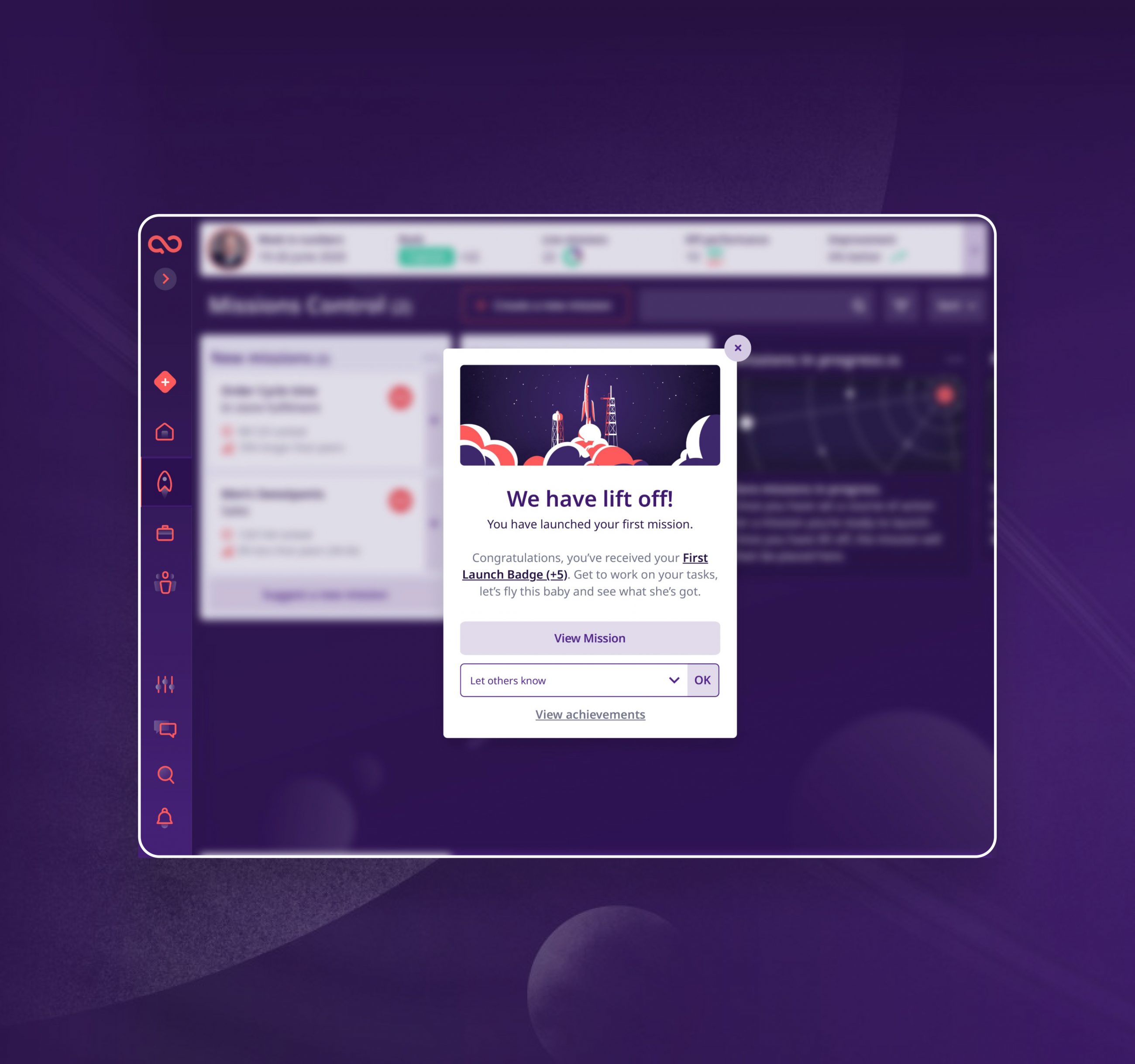
Navigation was simplified. Dashboards became more focused. Components were refined into a scalable design system that balanced clarity with flexibility, allowing the platform to evolve without losing consistency. Small UX decisions—how information appeared, where actions were placed, how success was measured—collectively transformed the experience into something that felt lighter, faster and more intuitive.
Rather than asking users to learn the platform, the platform learned how people naturally work.
The impact
The redesigned experience established a stronger foundation for Quorso’s future product development, providing a robust UI system that supports continuous feature releases while maintaining consistency across the platform.
More importantly, it reinforced the company’s wider proposition that AI should amplify human expertise, not replace it. By making insights easier to understand and actions easier to take, the platform allows retail teams to spend less time interpreting data and more time improving performance.