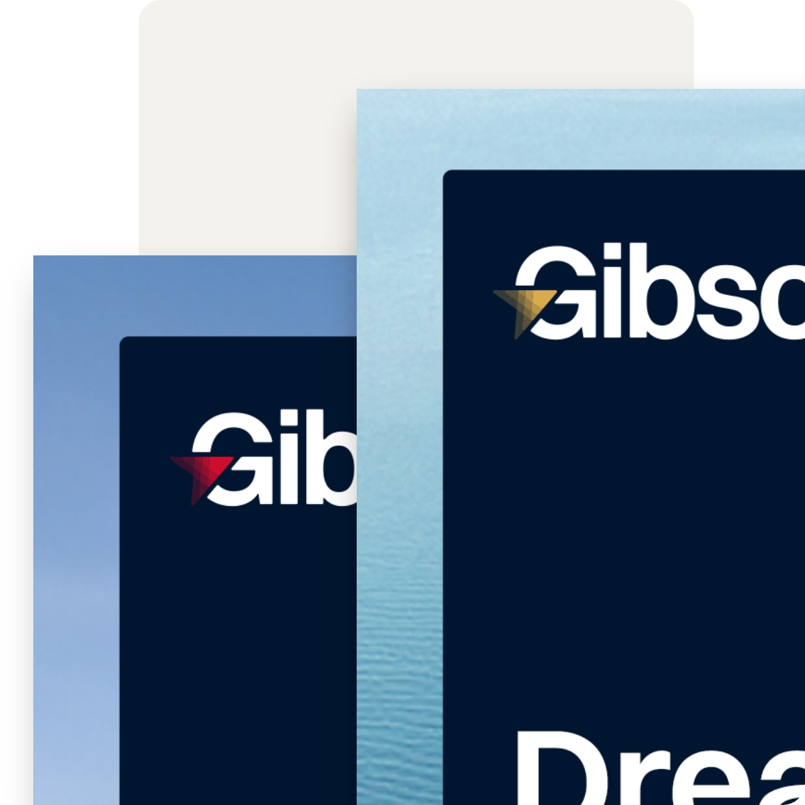
For more than a century, Gibson Shipbrokers has helped shape global maritime trade through trusted advice, market intelligence and commercial expertise. As the business continued to grow internationally, its brand no longer reflected the scale of the organisation or the sophistication of the services it provides.
The ambition wasn’t to reinvent Gibson’s reputation. It was to create an identity that better expressed it. Alongside a completely redesigned website, we developed a new brand strategy and visual identity that modernised the business while remaining true to the confidence and authority clients have relied upon for generations.
Heartbeat
Shipping is an industry defined by uncertainty. Markets shift overnight. Regulations evolve. Geopolitical events can reshape global trade in an instant. In that environment, clients don’t simply look for information. They look for judgement they can trust. That insight shaped the entire identity.
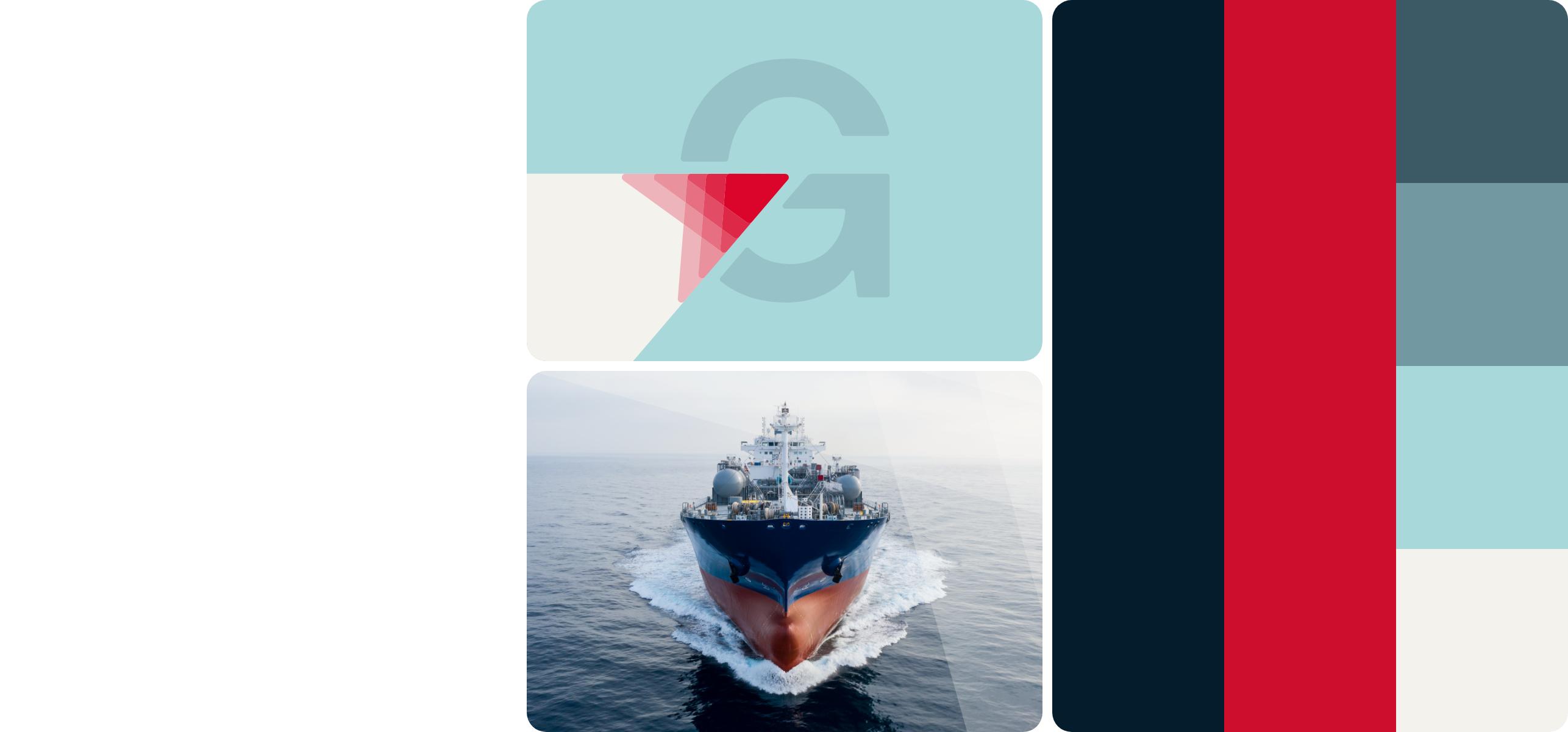
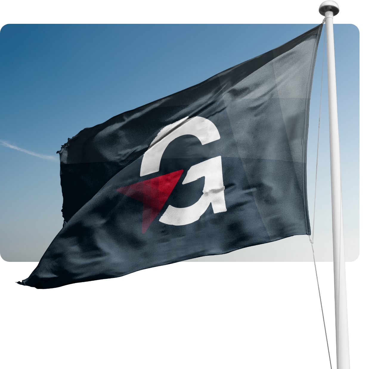
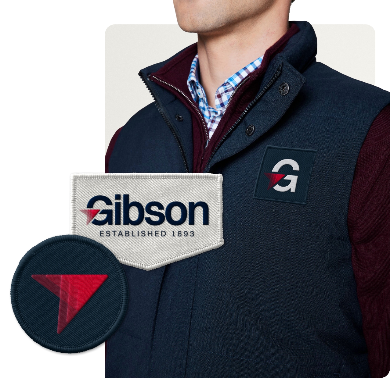
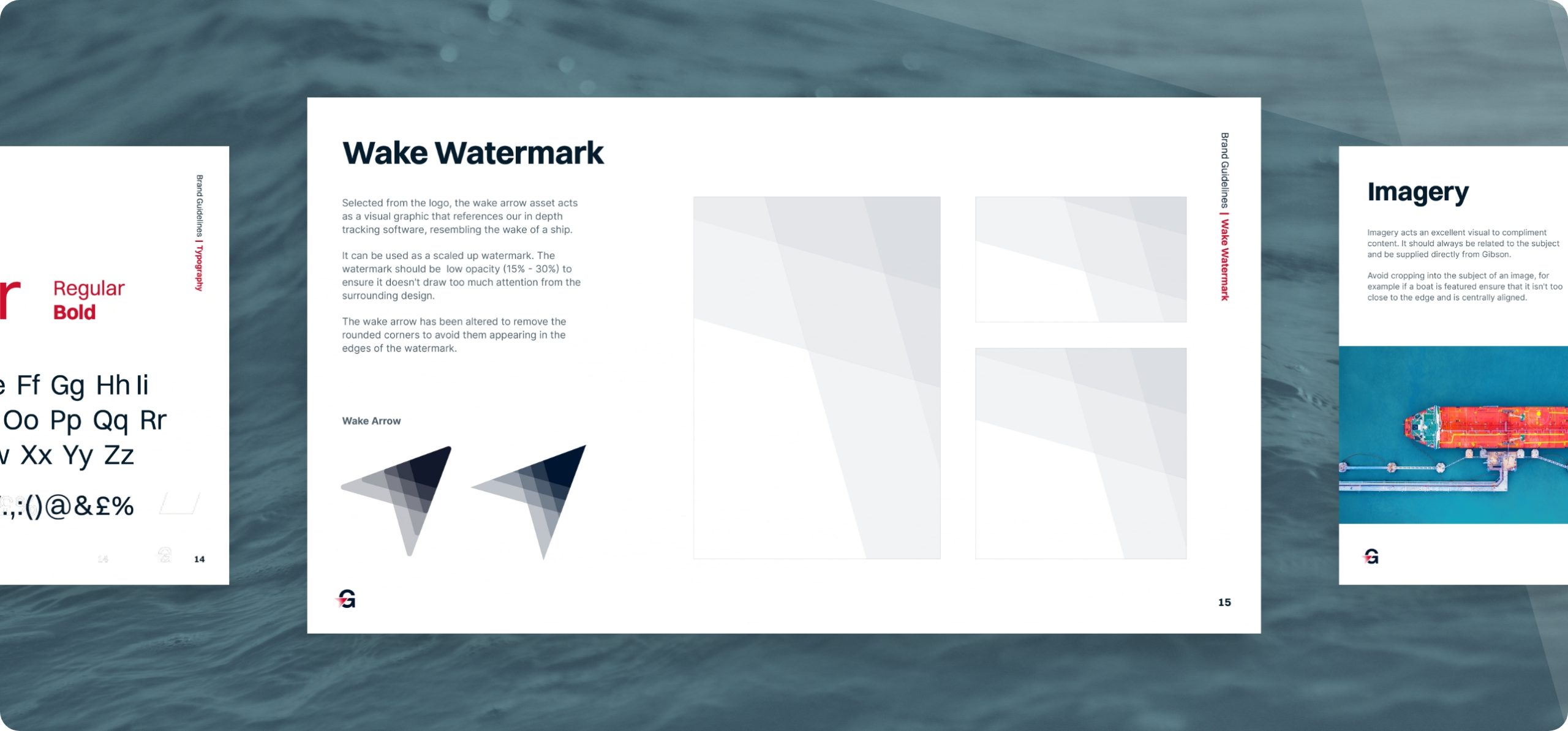
We developed a brand that feels calm, assured and purposeful, reflecting Gibson’s ability to provide clarity in a constantly changing world. At its centre sits the wake arrow, inspired by shipping routes and the movement of vessels through water. It symbolises progress, direction and momentum while expressing the confidence that comes from experience.
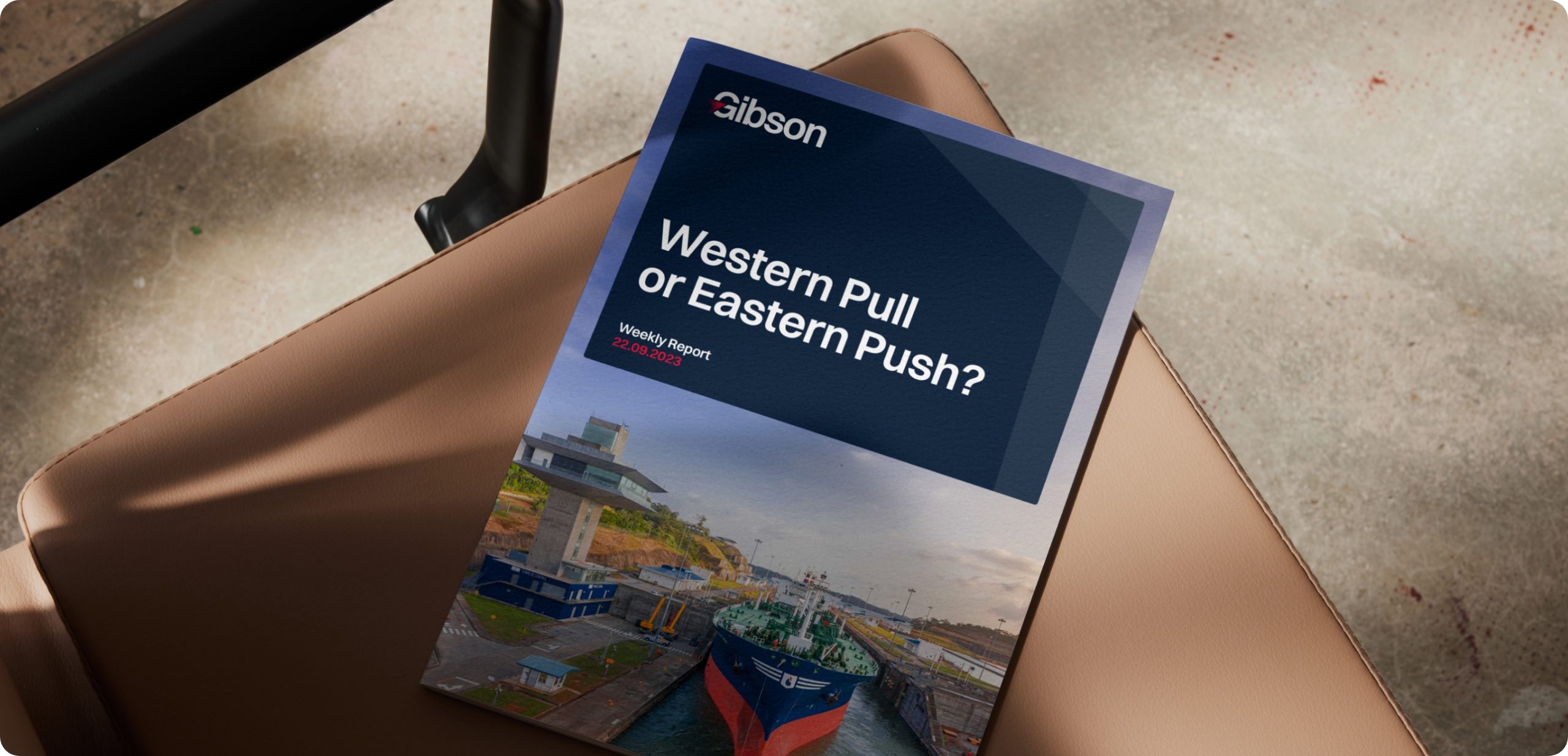
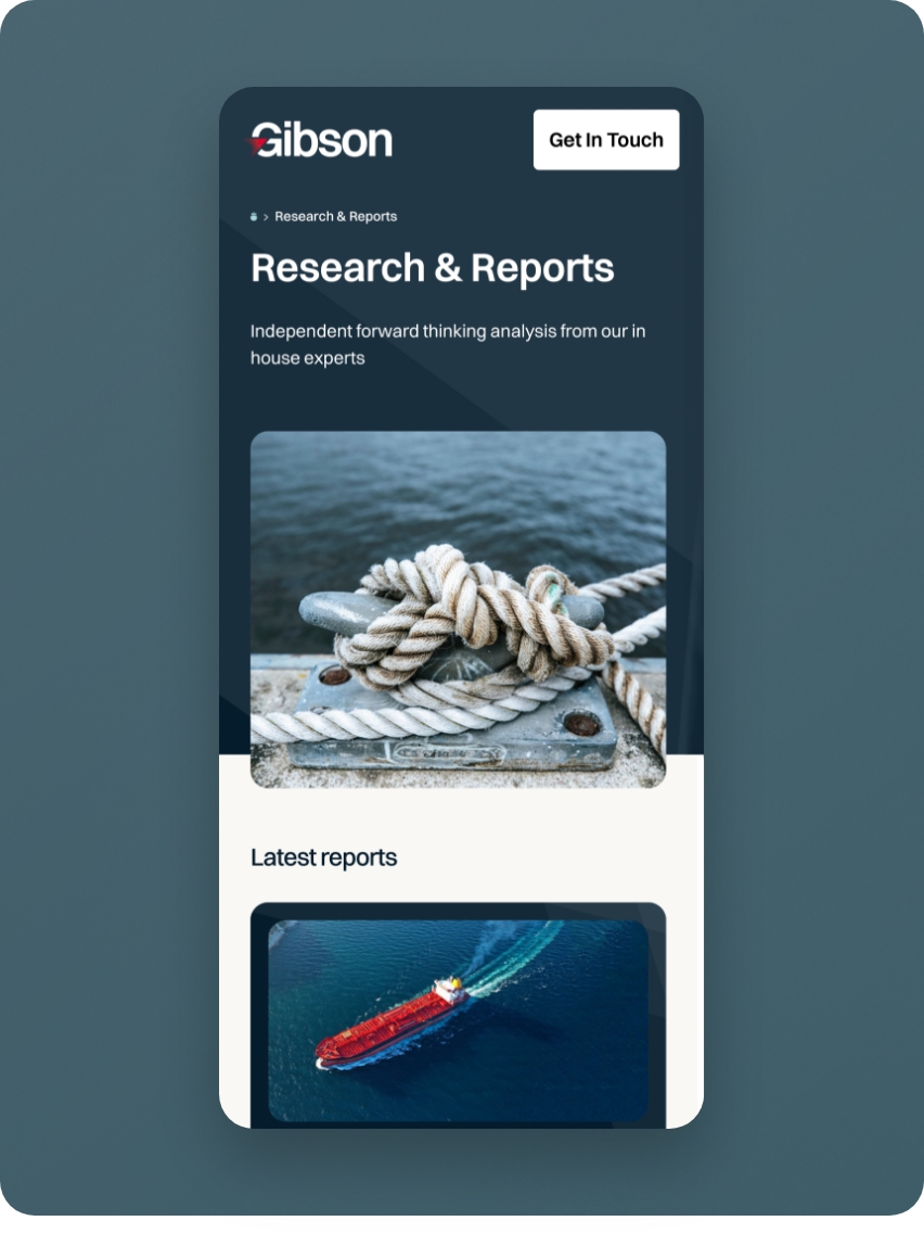
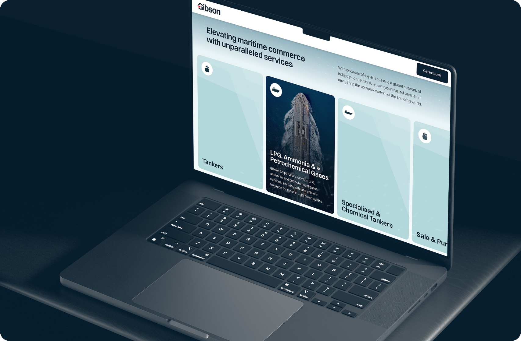
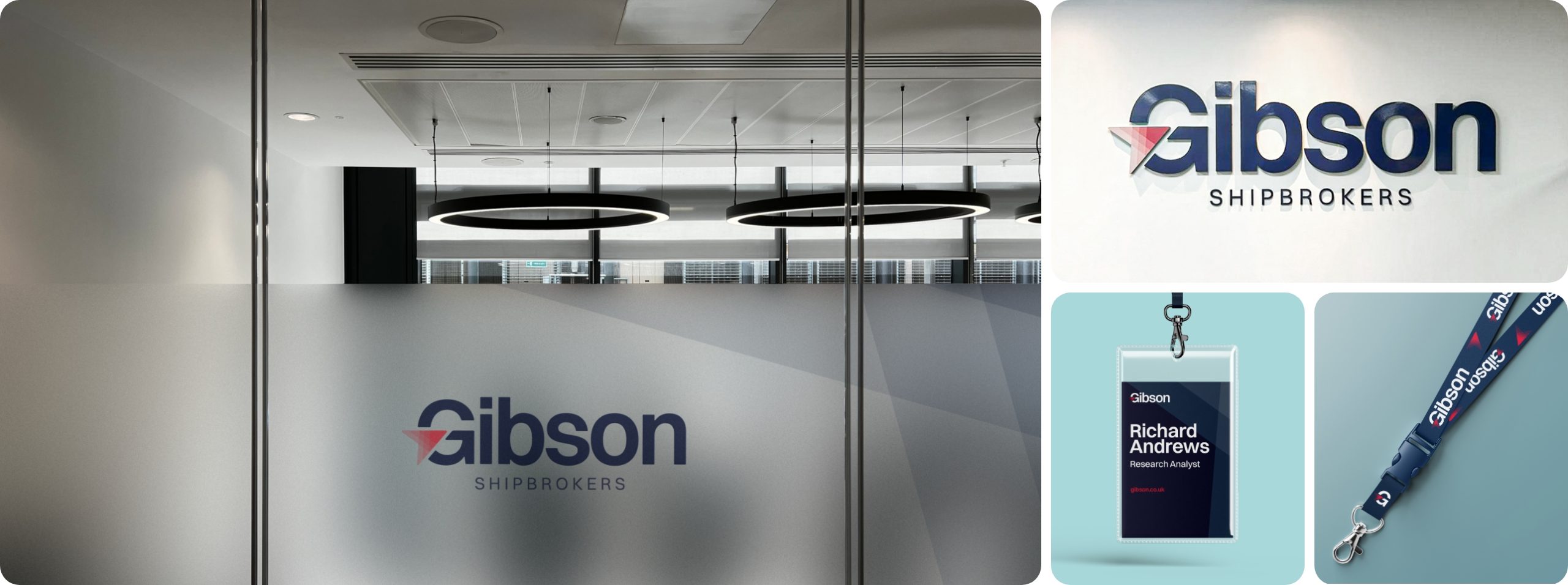
The identity extends across every touchpoint, from a refined visual language and design system to a new website that makes Gibson’s expertise easier to explore. Together, they present a business that is every bit as progressive as the markets it helps navigate.
Impact
Gibson Shipbrokers’ new brand identity and website modernisation represent not just a visual overhaul but a strategic investment in its future. It positions the company as a forward-thinking, adaptable, and client-centric leader in the maritime sector.
With the new brand identity and toolkit in hand, Gibson Shipbrokers is poised to navigate the ever-changing seas of the industry and continue its legacy of excellence for many years to come.
We were delighted to be a part of the rebranding journey and hope to voyage on with Gibson at full speed.