John Ayling & Associates didn’t need reinventing. Founded in 1978, JAA had built an enviable reputation as one of the UK’s original independent media specialists. Its client relationships, strategic thinking and experience were as relevant as ever, but its visual identity no longer reflected the progressive business it had become.
Our role was to refresh the brand without losing the personality and reputation that had been built over four decades, creating a visual identity and website that balanced heritage with the agency’s collaborative, forward-thinking approach.
Heartbeat
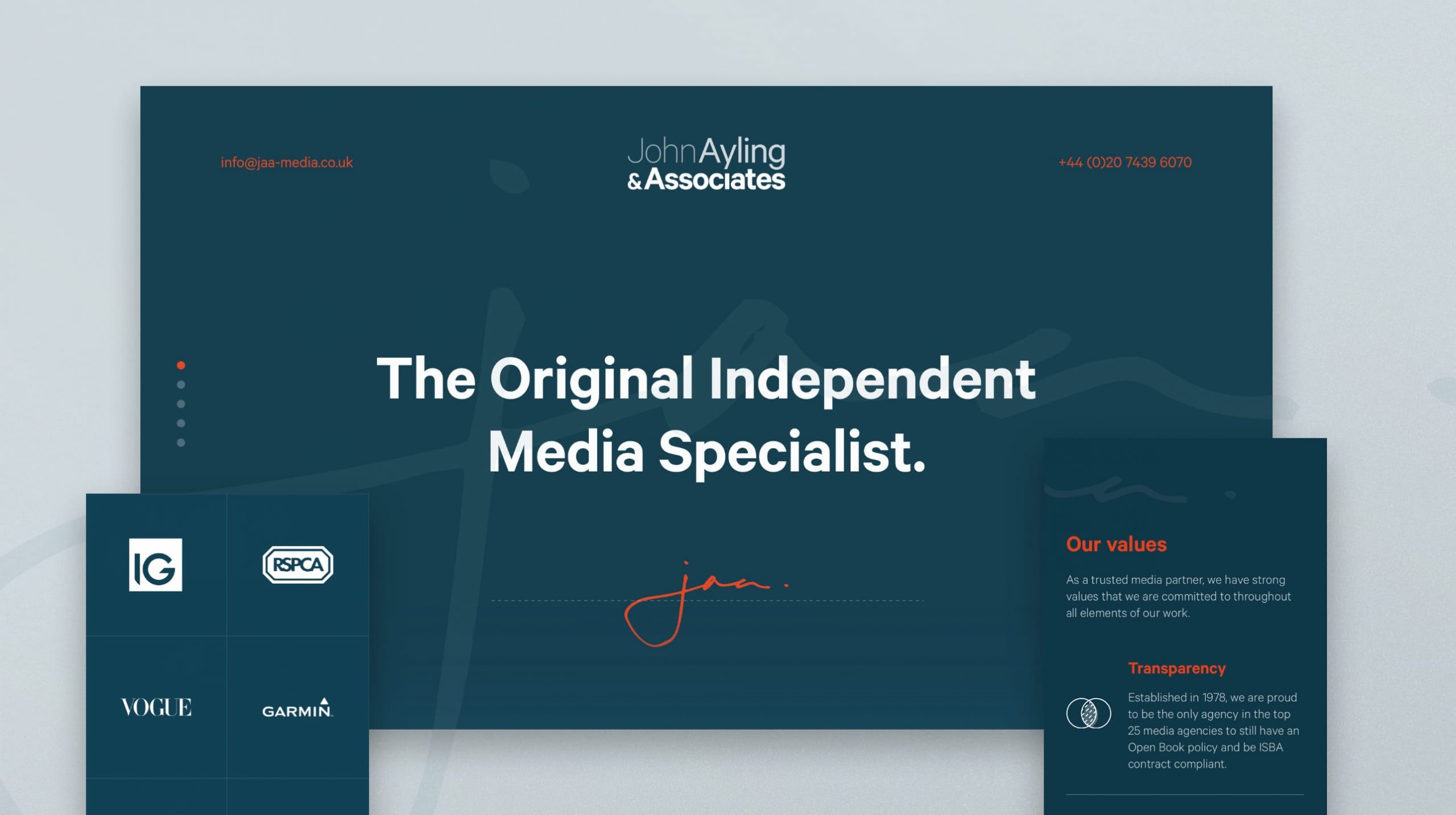
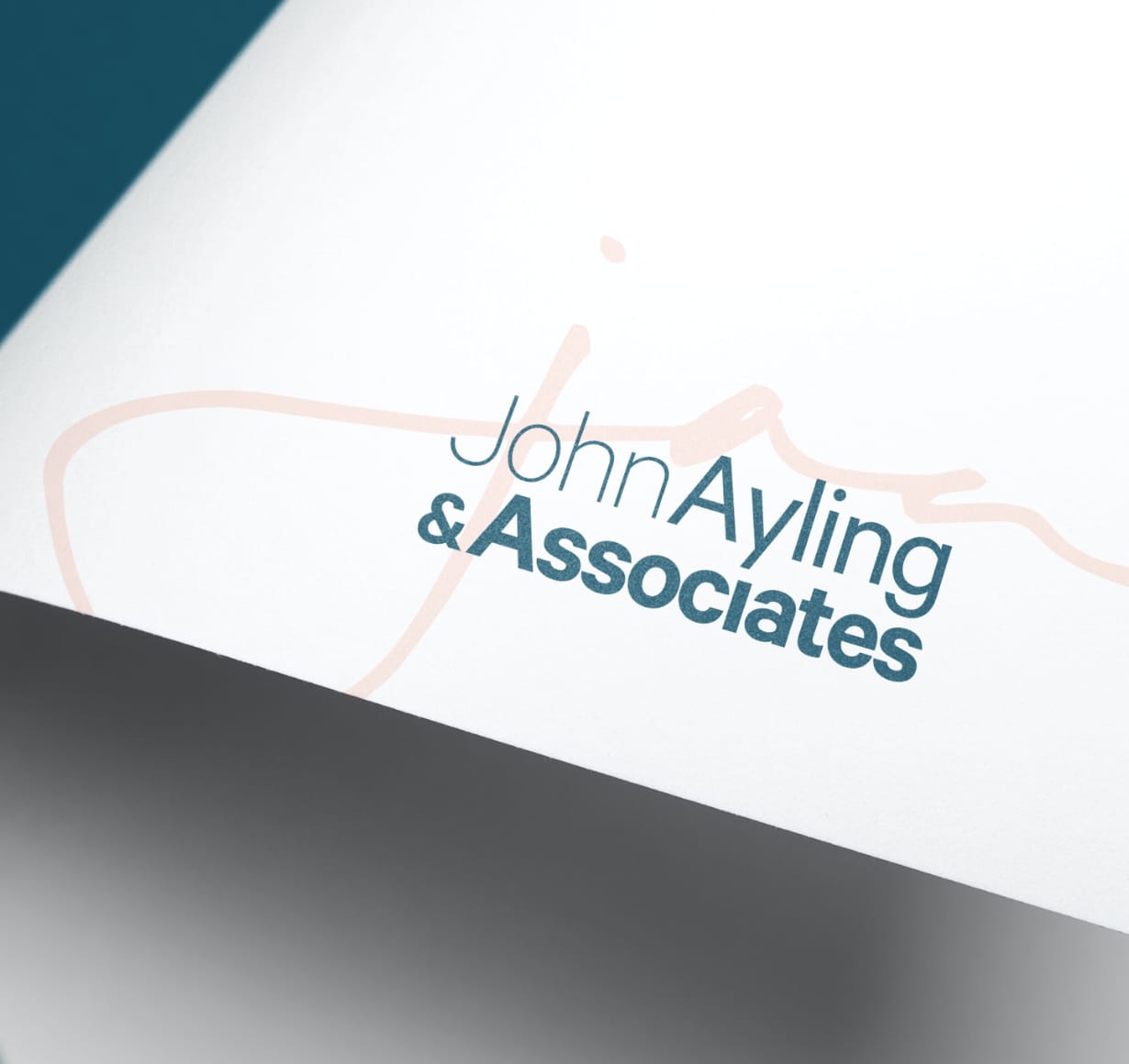
JAA’s experience was its greatest competitive advantage, so we made it visible. The identity draws on the agency’s legacy without feeling nostalgic. A bespoke signature device references founder John Ayling’s personal seal of approval, while the evolving typographic weights symbolise the growth of the business from one respected individual to a team of specialists. A richer, more confident colour palette injected fresh energy into the brand, giving the business greater presence while retaining the trust that had defined it for decades.
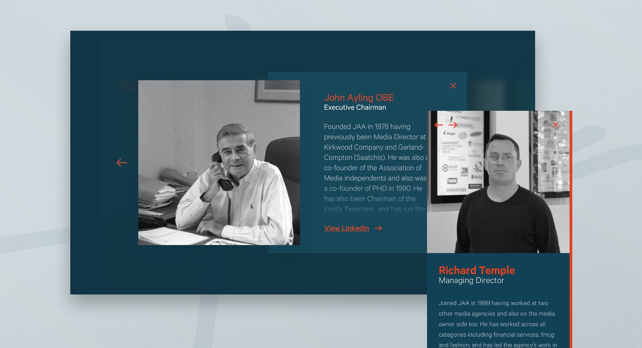
The website followed the same philosophy. Deliberately simple and highly focused, it acts as a digital introduction rather than a digital brochure, making it easy for prospective clients to understand what JAA stands for and start a conversation.
Impact
The rebrand gave JAA a visual identity that finally matched the calibre of the business behind it. Every touchpoint, from presentations and proposals to the website itself, now communicates the confidence, clarity and partnership that have always defined the agency.
Rather than changing perceptions, the project reinforced what existing clients already knew while ensuring future clients experienced the same confidence from the very first interaction. It proved that experience doesn’t need reinventing—it simply needs expressing in the right way.