Project
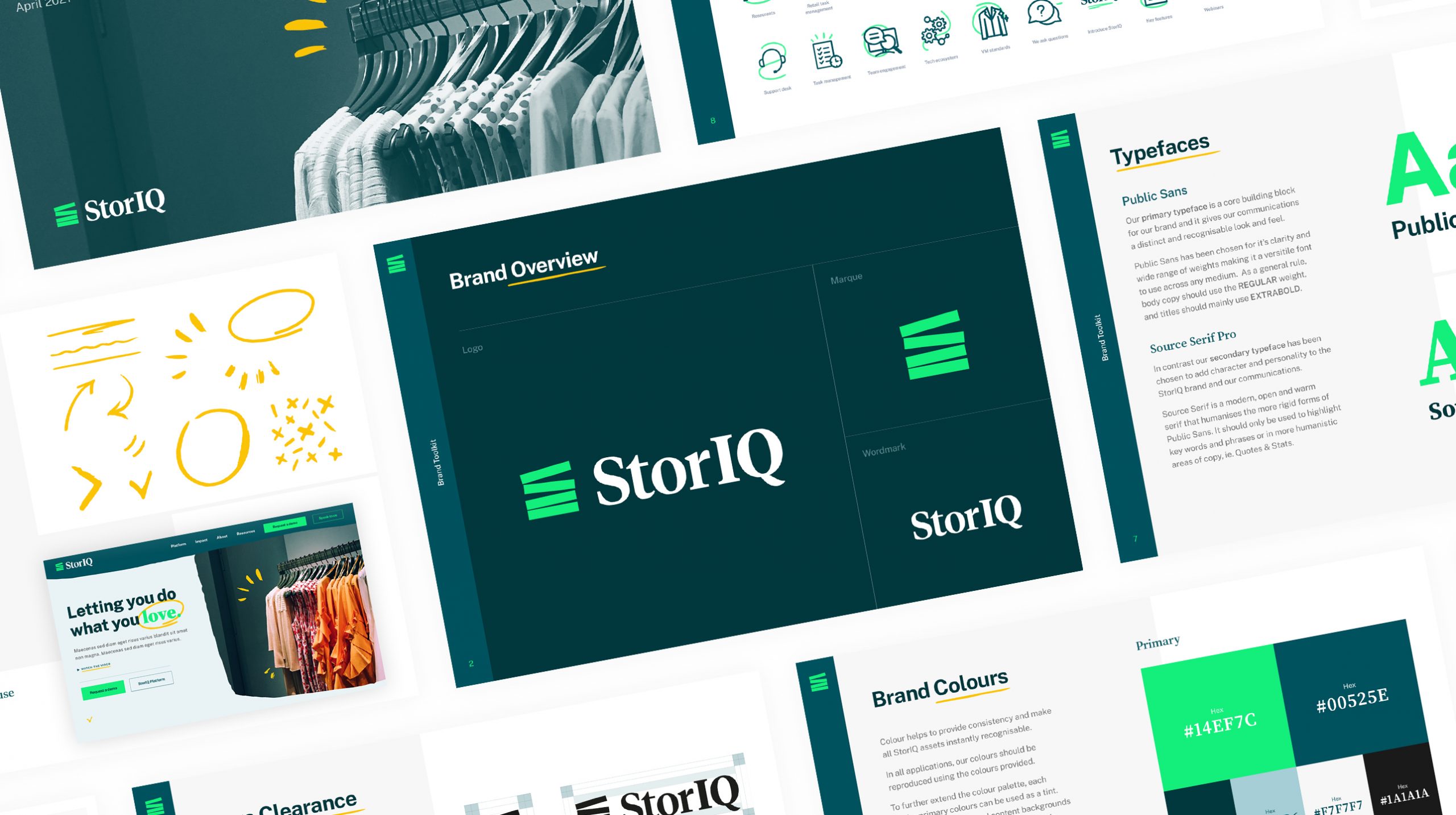
StorIQ Branding & Website Design
Client
StorIQ
Industry
Retail, Technology
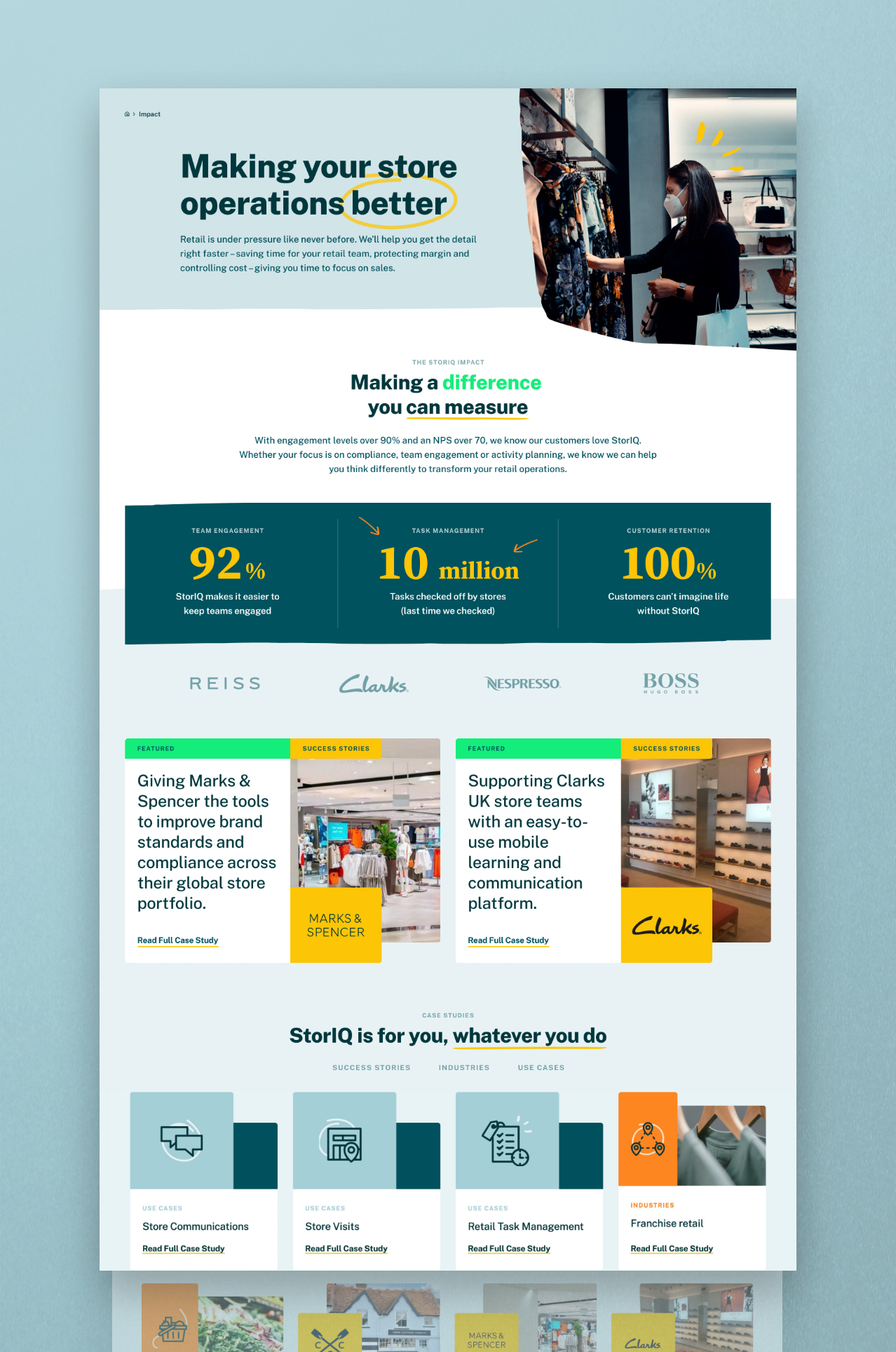
Giving you time to do what you love.
StorIQ is a tech company that believe great customer experiences don’t just happen, but are the result of every detail being right in every single store. Their platform empowers and supports in-store teams to get these details right, driving productivity and in turn generating spectacular results.
Despite developing a highly efficient and complex platform and a wealth of industry expertise, they had struggled to visually communicate their product effectively within a competitive market and needed help simplifying their complex messaging in order to stand out from the crowd.
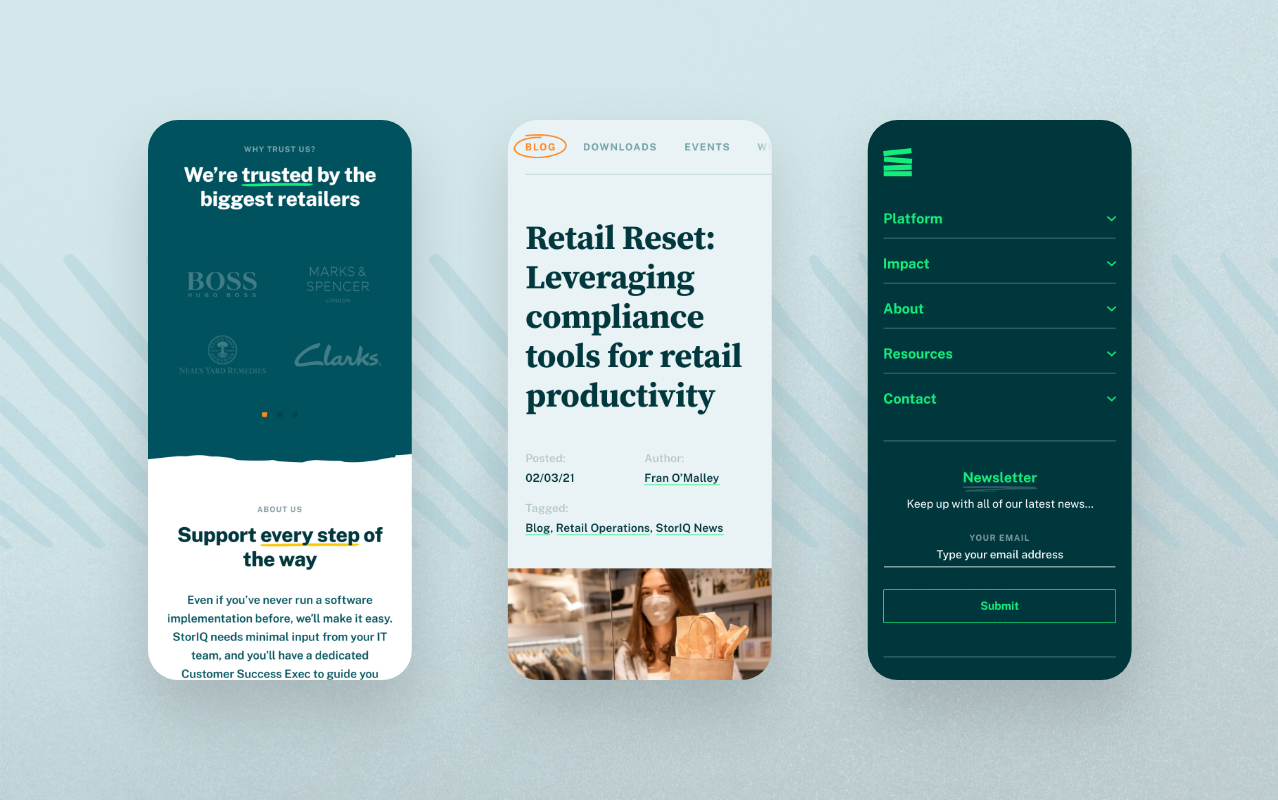
With new and exciting product innovation running in parallel, we were asked to strip the brand back to basics and reinvigorate its dated look to better reflect their modern and dynamic approach to business. Our task was to create a brand experience that showcased the advantages of the StorIQ product but with a more humanistic and empathetic approach.