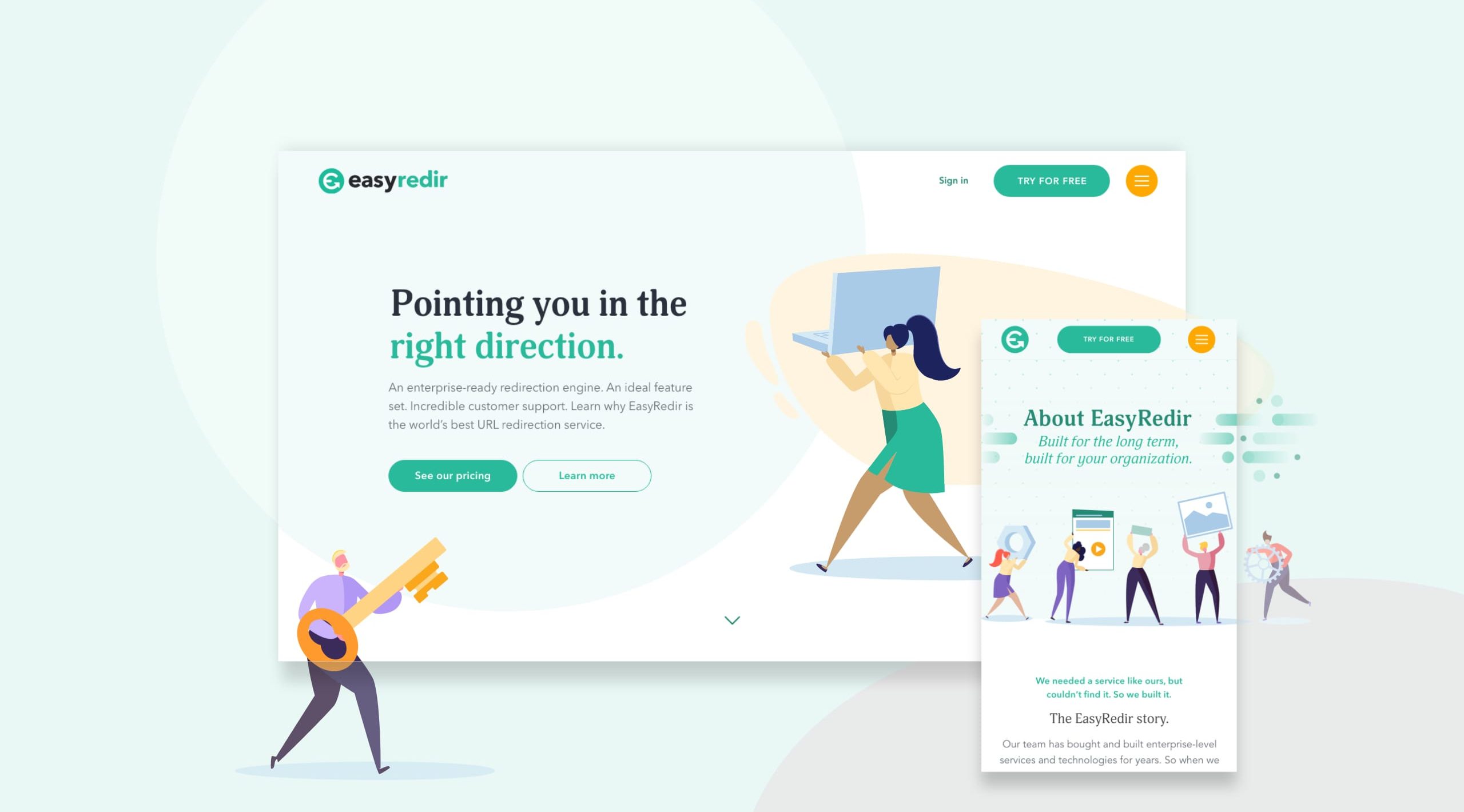
Pointing you in the right direction.
Whether you’re looking for secure HTTPS redirection, link analytics or website migration, EasyRedir have everything you need covered. With clients such as Harvest, Eurostar and Ding, an expansive range of tool features and boasting incredible customer support, it’s no wonder that EasyRedir has quickly become the world’s leading URL redirection service.
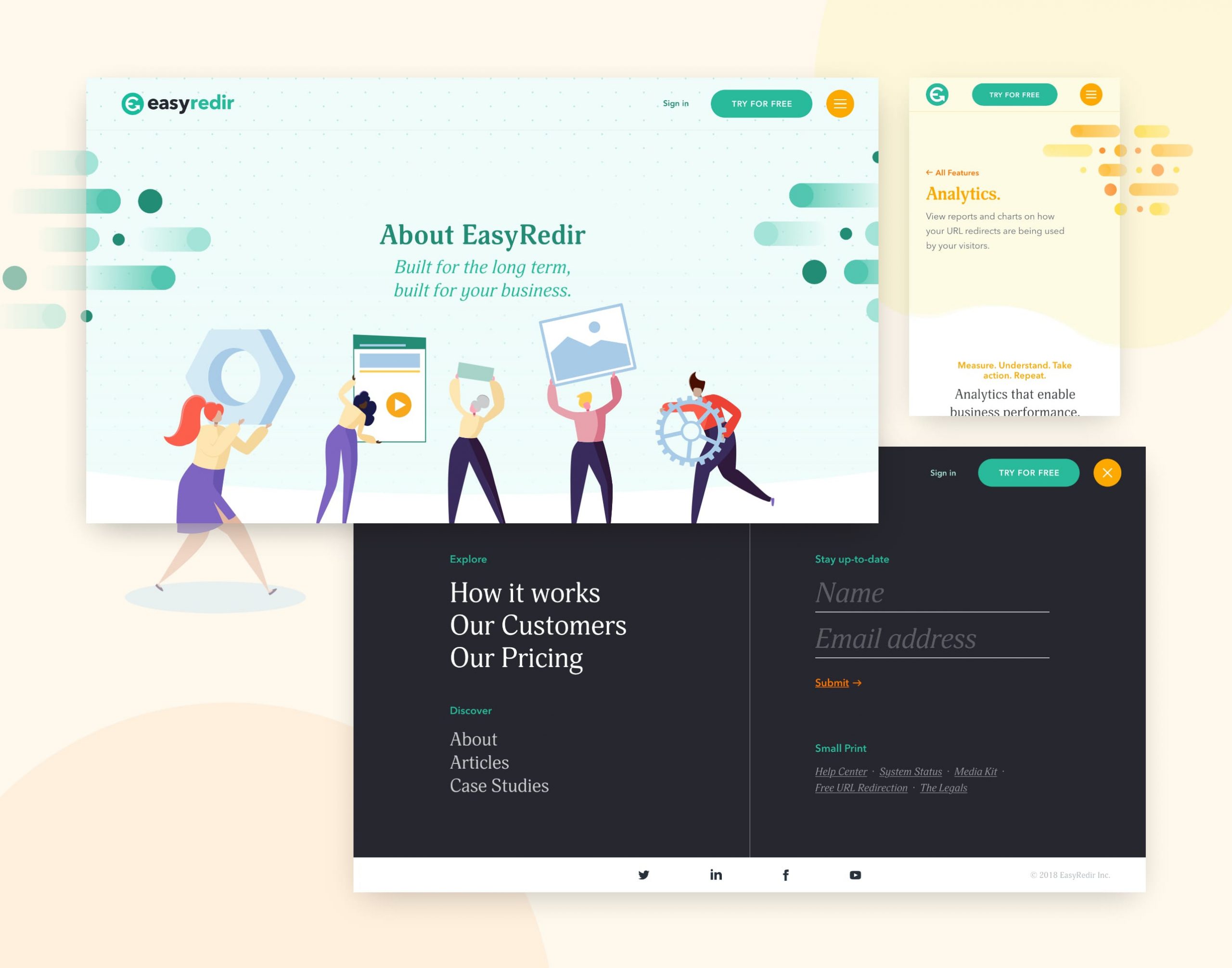
Having previously worked with the EasyRedir team to create the brand identity and create a unique and easy to understand look-and-feel, it was time to update their digital presence; creating a website that projected the growth and success of the EasyRedir platform and instil a confidence of the brand in new prospect customers.