arrow-down arrow-left arrow-left2 arrow-right Arrow-Left arrow-up Circlecreative-brief Facebook instagram linkedin locationplay twitter

Project

Moma’s UX & Website Design

Client

Moma

Breakfast served with a side of awesome.

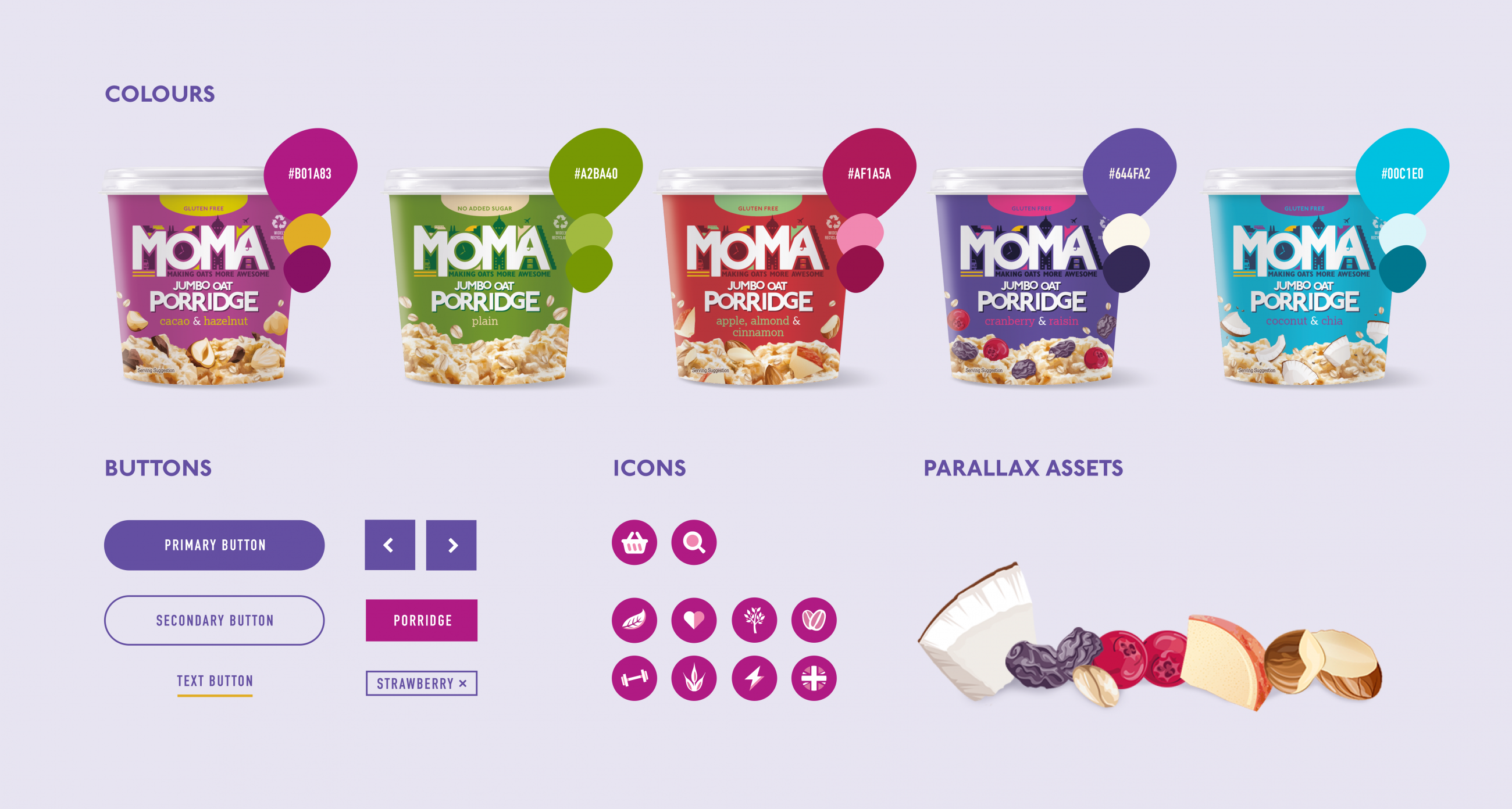
Moma is a brand that has been revolutionising the breakfast market through on-the-go healthy recipes made from oats, fruits, nuts and seeds and served in take-away pots. MOMA stands for Make Oat More Awesome and has been dedicated to revitalising a flat arena of bagged milled oats by developing and innovating new flavours and combinations for consumers to enjoy.

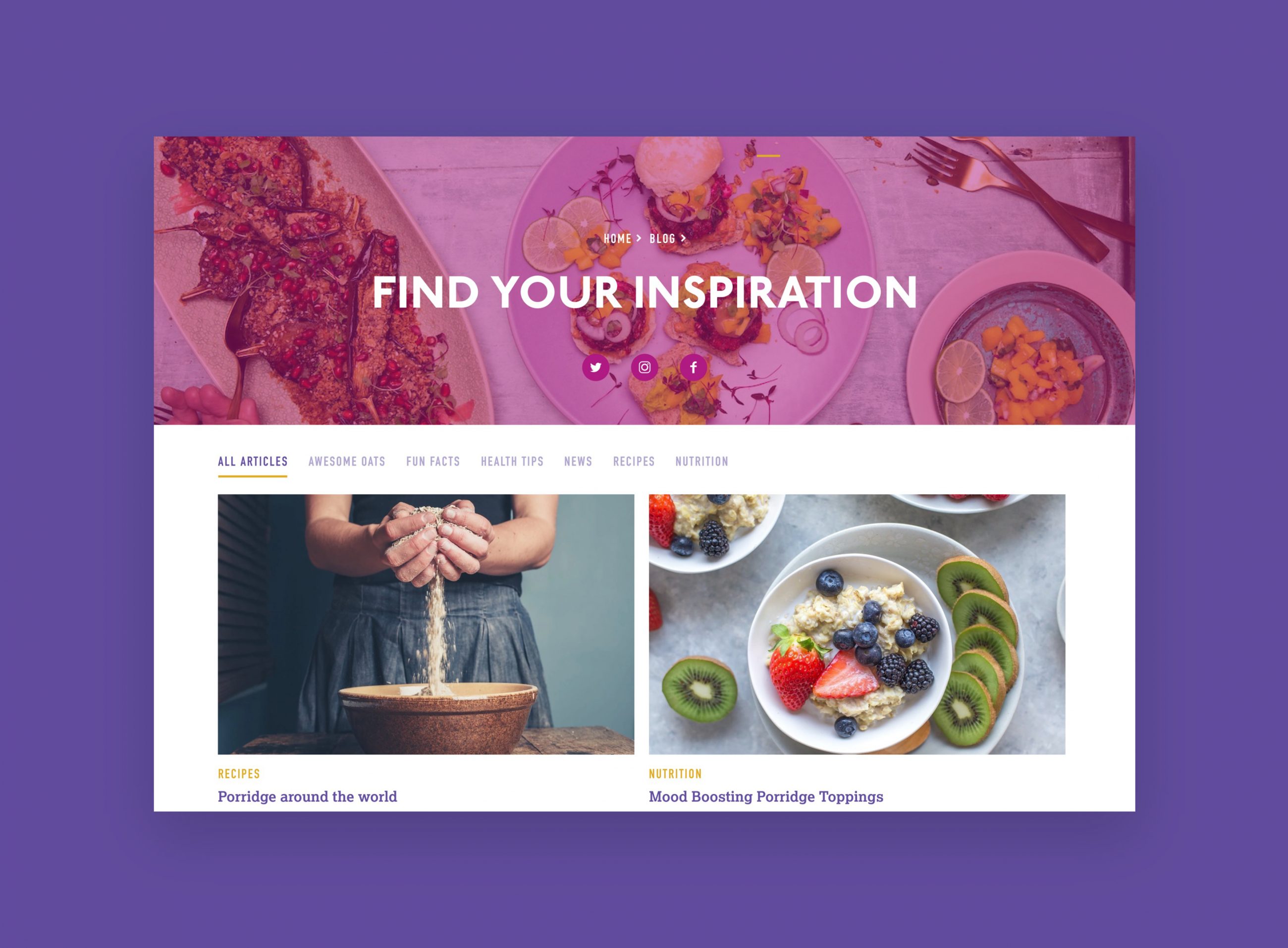
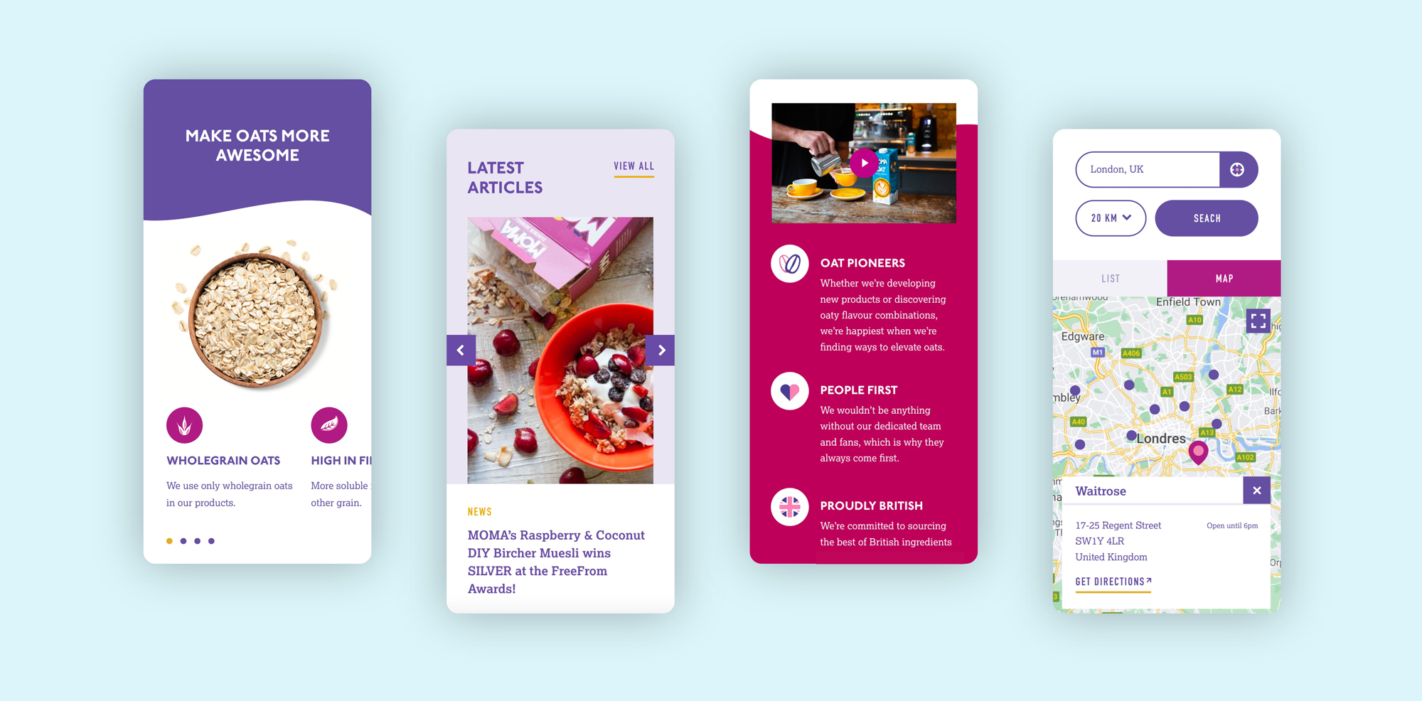
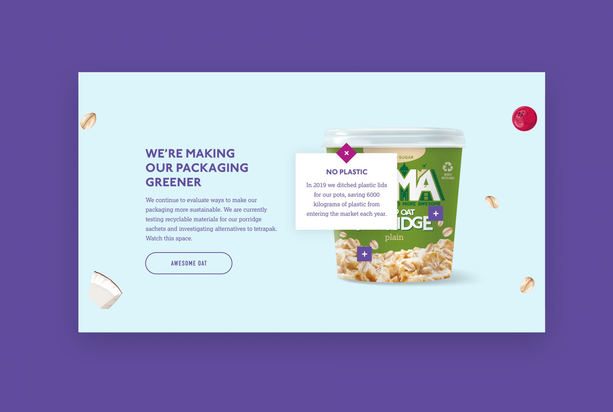
MOMA entrusted us with strengthening their online distribution strategy by launching a new e-commerce and subscription model website. Our role was to evolve our previous website design so that the UX and design focussed on a fully integrated and bespoke Shopify approach that could expand as the business and product does.

Swipe

The heartbeat

Making online more awesome.

The challenge of the brief was to create an online platform showcasing the products’ unicity by transforming a strong print-based design into a dynamic and impactful online experience. We wanted to create a bright, vibrant design to make their online presence more ‘awesome’.

From the products’ origins and ingredients to the brand’s values, the new eCommerce focussed platform highlights, with clear transparency, their product offering, allowing the customer to discover as much information as necessary before adding it to their basket. With the website being mobile-focused, incorporating an e-commerce platform and subscription model meant that users could not only buy their breakfast for the week without even getting out of bed, but could set up repeat order so they never forget, or go without breakfast. After all, it is the most important meal of the day.

Swipe

UX strategy

Our first desire was to understand the users movement through Moma website before creating a new flow based on prioritising an easy e-commerce experience. By creating a user strategy, we could spot all the key interaction to ensure a user experience that allowed a quick, easy and informed purchase path.

Though the website we’d previously created was responsive, we further developed how the website was centred on a mobile first approach, looking at the underlying framework of the website and creating something that maintained form and content regardless of screen.

Finally, we looked at introducing an in-page title navigation system that helps users browse a product ranges through fast switching between PLPs and PDPs.

Swipe
Swipe
Swipe
Swipe

The Results

The new e-commerce and subscription model platform now has a cleaner and more focused design that helps to showcase the range of products but still educates the user clearly about the brand and their vision. Our vision is that the website will garner far more online sales, certainly now, but beyond short-term ‘life from home’ and can eventually balance or even outsell in store sales. Regardless, the website design is another project for MOMA we’re very proud of in continuing to help them revolutionise the breakfast market.

Related work

Puccinos

Your favourite coffee delivered to your door.

No.1 Living

Get more out of living.

Quorso

Effortlessly improving business performance.

Dune London

Totally devoted to shoes.

No.1 Living

Inspiring a taste for life and for living.

MOMA

Making online more awesome.

Swipe

Do you have a project you’d like our help with?

Work with us