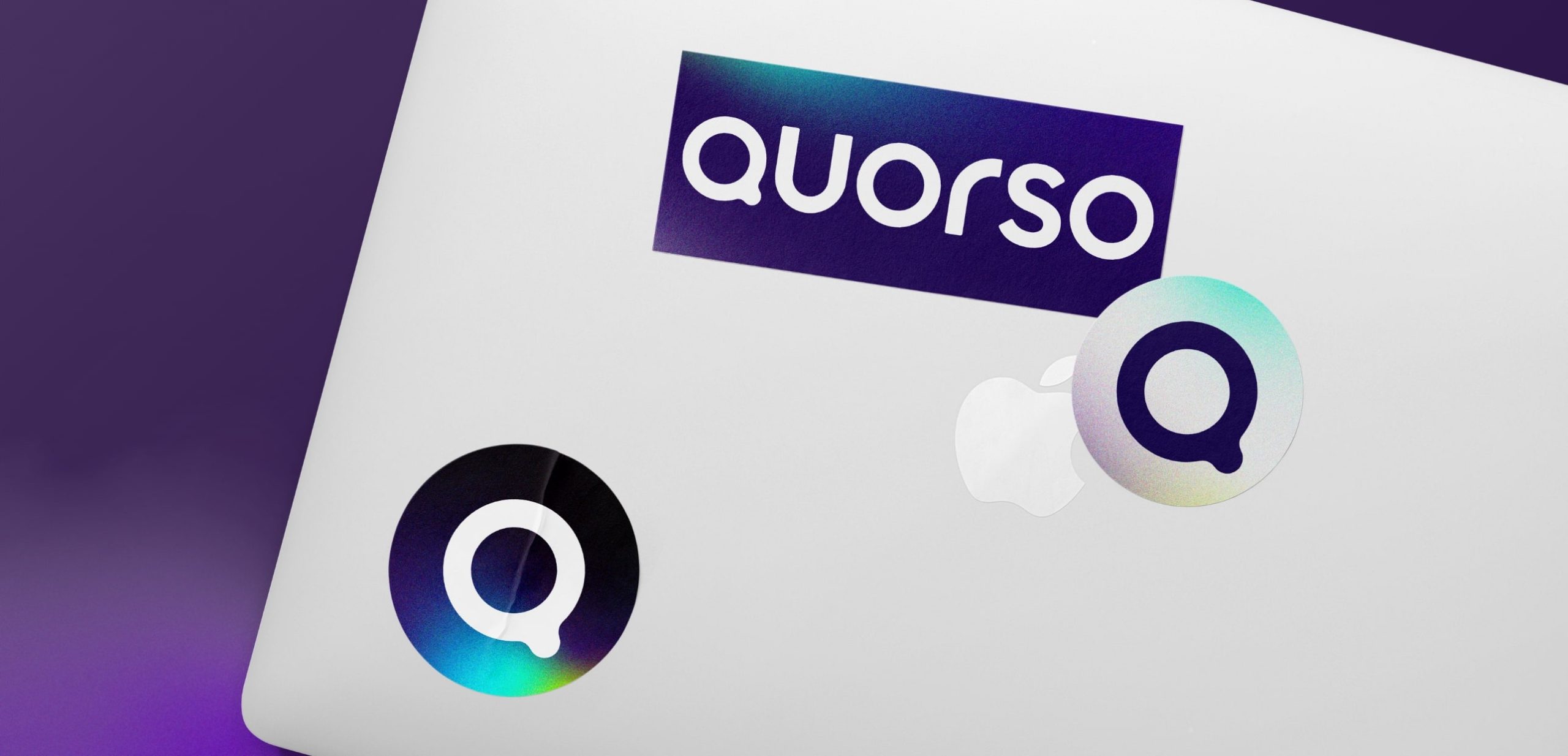
Since being recognised as one of the UK’s leading technology start-ups, Quorso has evolved into an AI-powered retail operations platform trusted by some of the world’s largest retailers. As the business approached its tenth year, the brand no longer reflected the sophistication of the technology or the confidence of the organisation behind it.
Our role was to help define the next chapter. Building on years of partnership, we developed a new brand strategy, proposition, identity and design system that repositioned Quorso as a mature technology leader while preserving the ambition and entrepreneurial spirit that had fuelled its success.
Heartbeat
Quorso’s original identity was inspired by exploration. It captured the excitement of discovering new opportunities, an idea that reflected the business during its early years.
As the platform evolved, so did its purpose. Customers weren’t looking for a tool that simply uncovered new possibilities. They wanted technology that worked alongside them, helping retail teams make faster, smarter decisions every day.
That insight led to a new strategic direction built around one simple belief:
AI + Human > AI or Human.
Rather than replacing people, Quorso’s technology continuously learns from them. The new identity expresses that relationship through a dynamic visual system that places the customer at the centre, with intelligent technology constantly evolving around them.
Impact
The rebrand gave Quorso an identity that reflects the scale and maturity of the business today while providing the flexibility to support its future ambitions.
Every element of the new system, from the visual language to the design principles, creates greater consistency across product, marketing and communications. More importantly, the strategy gives Quorso a clearer story to tell, shifting the conversation from software features to the partnership between human expertise and artificial intelligence that sits at the heart of the platform.