arrow-down arrow-left arrow-left2 arrow-right Arrow-Left arrow-up Circlecreative-brief Facebook instagram linkedin locationplay twitter

Project

IWA Brand Identity

Client

Inland Waterways Association

Representing 6,500 miles of Britain's rivers and canals.

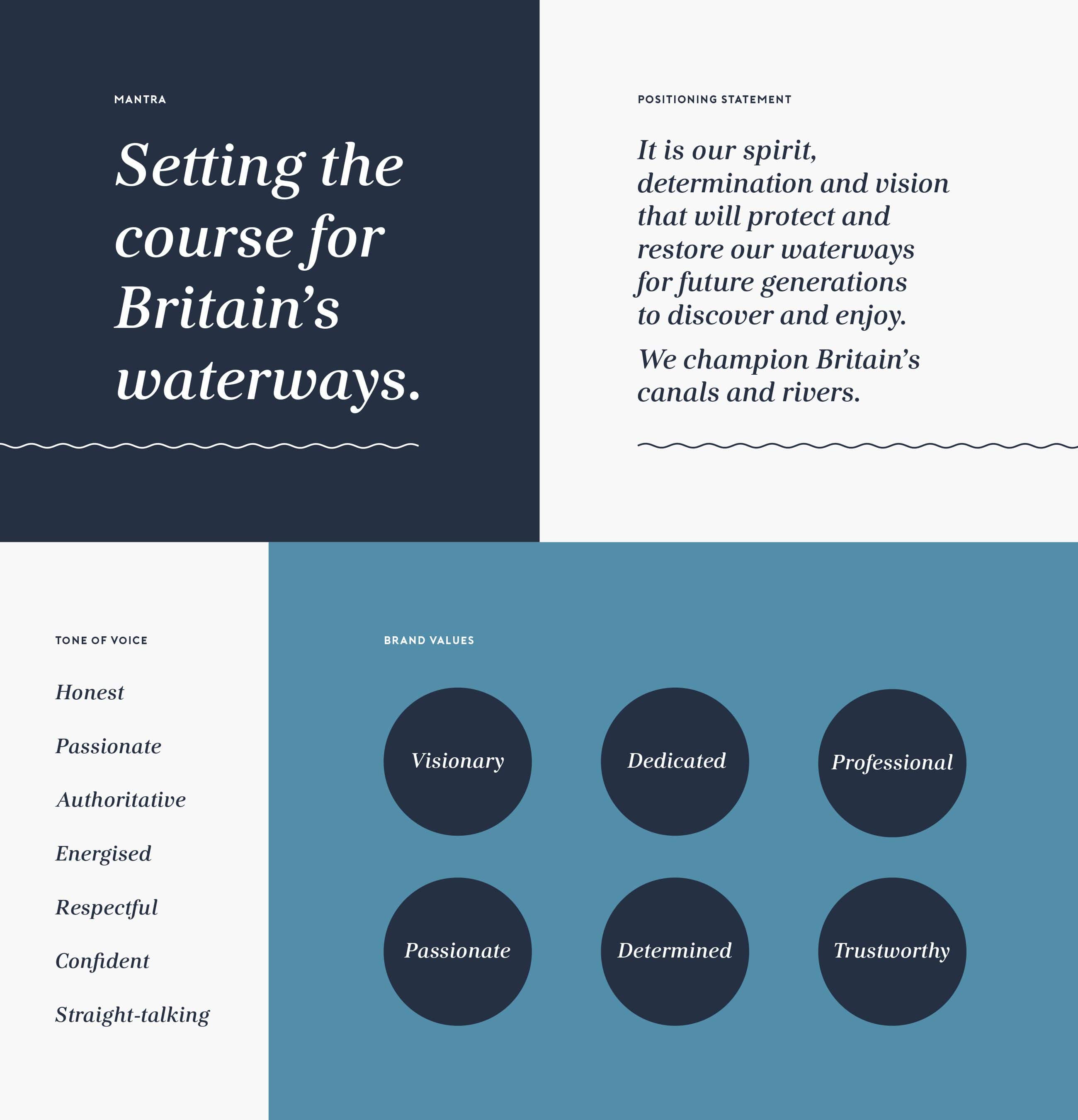
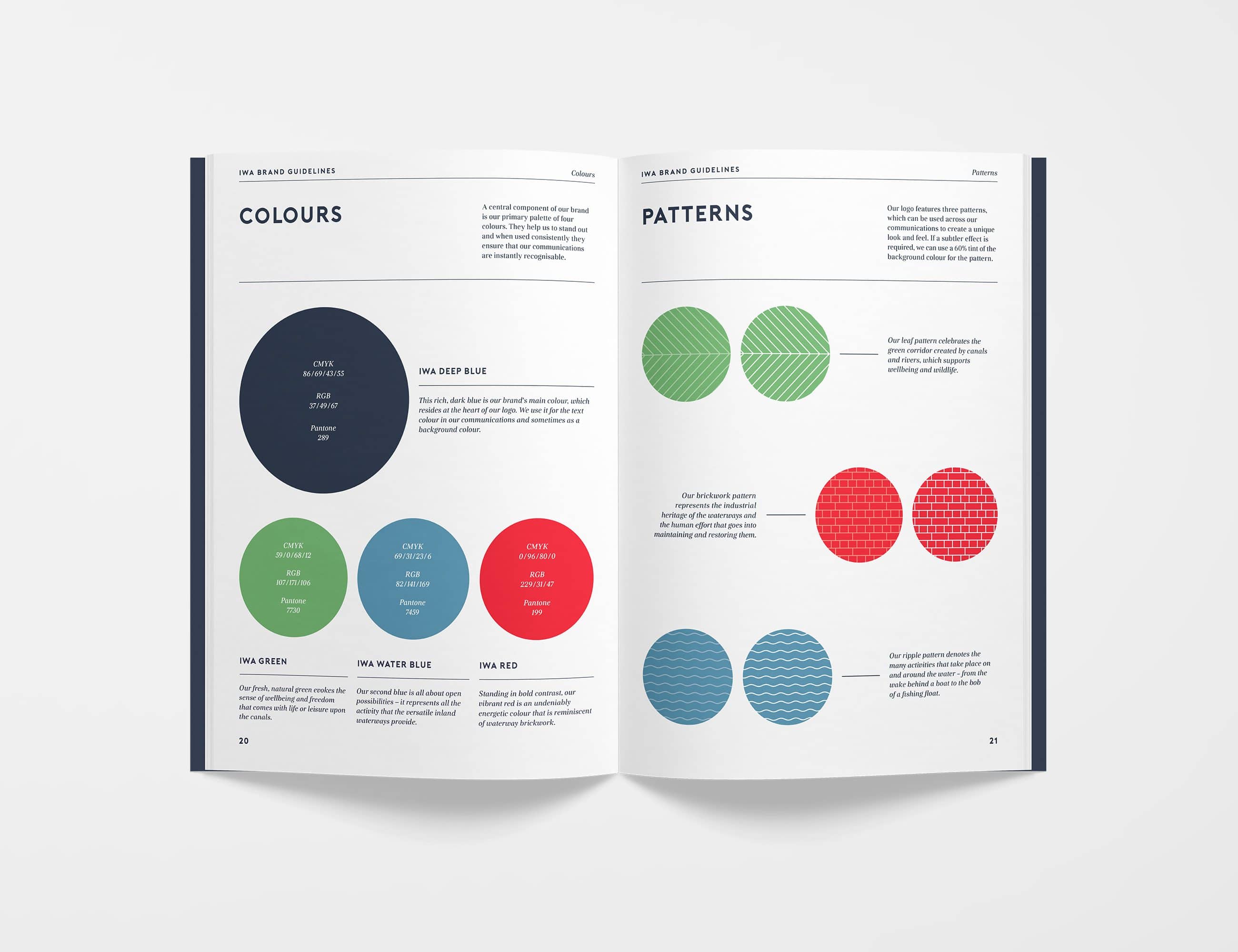
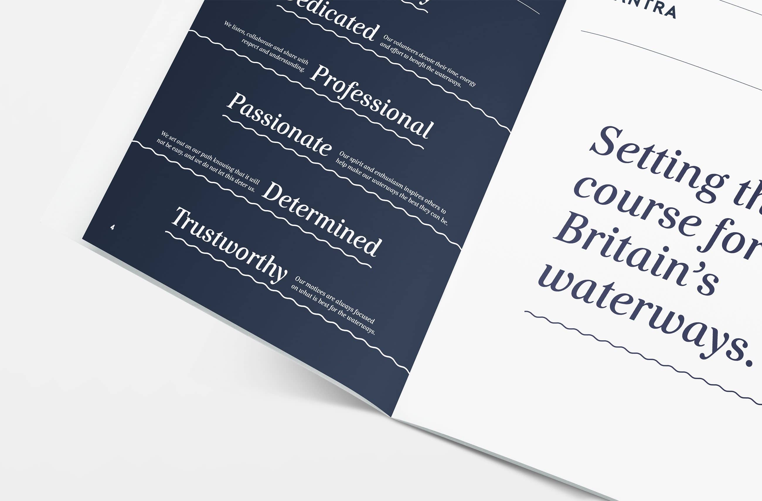
Founded in 1946, the Inland Waterways Association has worked non-stop to protect and restore the country’s 6,500 miles of canals and rivers. Comprised of a huge variety of sub-organisations, members and volunteers, IWA needed a strong, consistent brand to unify people behind their cause. Equally, it was essential that the new brand do justice to the contrasts and diversity within the organisation.

Our brief was to conduct a thorough brand review, creating a solid foundation for the brand strategy to build upon, and from this craft a comprehensive visual identity.

Swipe

The Heartbeat

Setting the course

After undertaking a 360º brand strategy workshop with IWA, we got to the crux of what drove the charity. At the centre of everything IWA does are its members and volunteers that work tirelessly because of their passion for the waterways.

However, there did not seem to be a bold or unified brand for them to rally around; members were not lacking in enthusiasm, but they didn’t have a defined purpose or goal. We needed to hone the brand to encourage members to stand up, join the force and take control.

With this understanding of what drives IWA, we defined a set of core brand values which would underpin everything decision we made. We also created the mantra ‘Setting the course for Britain’s waterways’ as a rallying call for the organisation and something to steer the brand as a whole.

Swipe

Logo design

IWA is the driving force for positive change for the waterways. We presented this through a propeller logomark – the three blades of which illustrate the balance between aspects of IWA.

The logomark features three patterns, housed in each blade, as well as a central ‘hub’ representing the people at the centre of all IWA does – the part that drives the motion.

We paired this with a strong, modern and geometric font, made unique via its custom wave-shaped ‘A’s – ensuring IWA’s name was ownable and recognisable.

Design

Representing the diversity of the waterways

When creating a visual identity for IWA, we wanted to ensure that the diverse world of the waterways was represented; the joy of life and leisure upon the water; the human ingenuity and hard graft involved in creating and maintaining them; the wonderful range of wildlife they support. And at the core of all this, the members and volunteers that are the force driving the action. Therefore, we opted for a boat’s propeller to symbolise the momentum, driven by a central core to represent the heart that drives everything.

As well as featuring in the logo, the trio of patterns, which we developed to represent three core sides of IWA, form a central part of the brand look-and-feel – adding instant recognisability to all collateral. The blue wave, green leaf and red brickwork can both work together or stand alone, to create a flexible and instantly recognisable brand look-and-feel.

IWA’s new colour palette consists of bright, strong colours to ensure the brand stands out on the waterways – be it on vans, t-shirts or boat flags.

Related work

Ostique

Designed with life in mind

StorIQ

Giving you time to do what you love.

Inland Waterways Association

Navigating the waterways

Michael J. Lonsdale (MJL)

Bringing buildings to life.

Croydex

Thinking bathrooms.

Refillabell

Watford's first refill store.

Swipe

Do you have a project you’d like our help with?

Work with us